
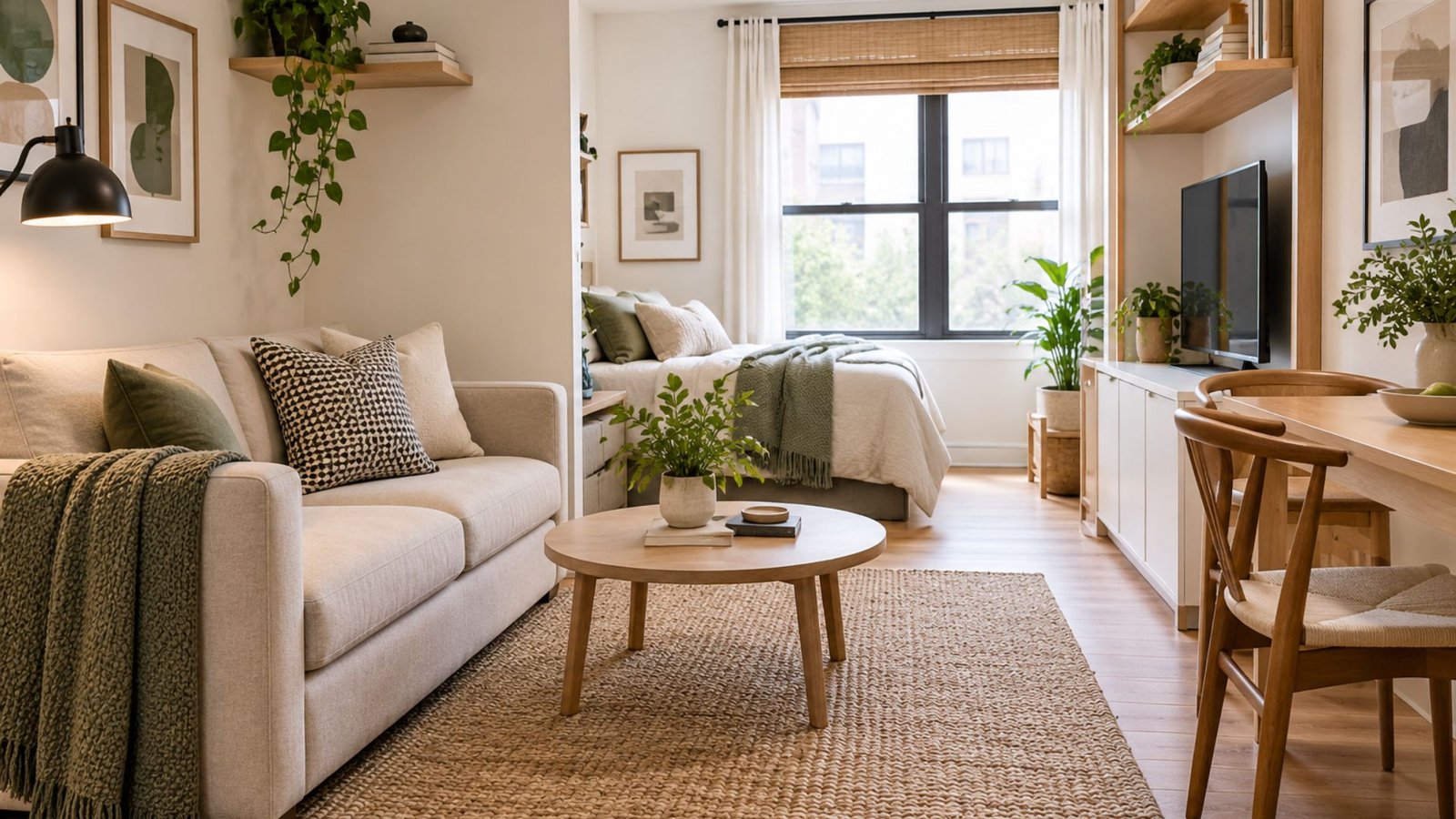

Small space ideas work best when they focus on how a compact room functions, not simply on making it look larger. Much of the usual advice centers on white walls, mirrors, and glass furniture. While those tactics can genuinely help in the right conditions, none of them are universal fixes, and treating them as such can leave a room feeling stripped rather than resolved.
This guide is about making a compact space function deliberately and feel coherent on its own terms, whether or not it ever “reads” as bigger than it is.
What actually makes a small space work
Two things are easy to confuse: physical space and visual space.
Physical space is the square footage you actually have. It doesn’t change no matter what you do to the room. Visual space is how open or closed the room feels, and it responds to furniture choice, color, light, and what’s visible around the room.
Most small-space advice focuses entirely on visual space. That’s useful, but it isn’t the whole picture. A room can be physically small and still function well without every decision being aimed at making it visually disappear.
The goal is a room that works on its own terms, not one that’s constantly trying to look like a bigger room in disguise.
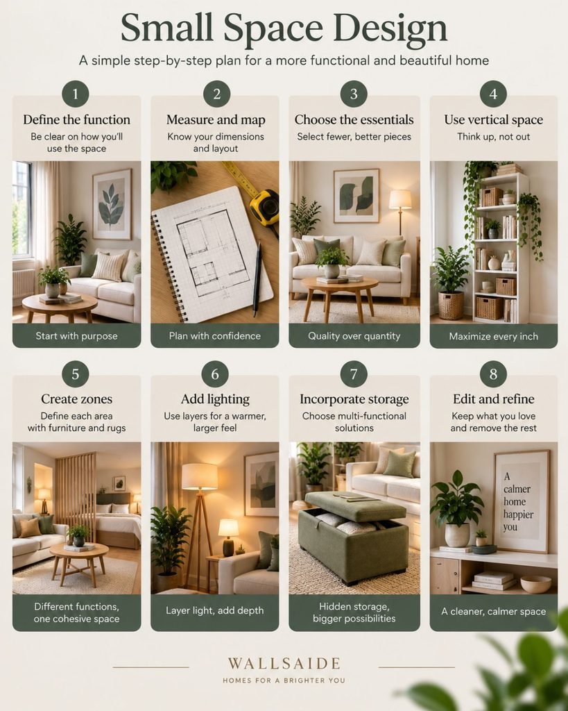
The most useful small space ideas become easier to apply when the major decisions are made in a deliberate order.
The Wallsaide Small-Space Decision Order
Most small-space advice is a flat list of tactics with no sense of priority. In practice, some decisions constrain every later one, and making them in the right order avoids a lot of backtracking.
This is Wallsaide’s own editorial framework: a useful starting point, not an industry standard.
- Define the function first. Decide what the space needs to support most often and which activities are secondary.
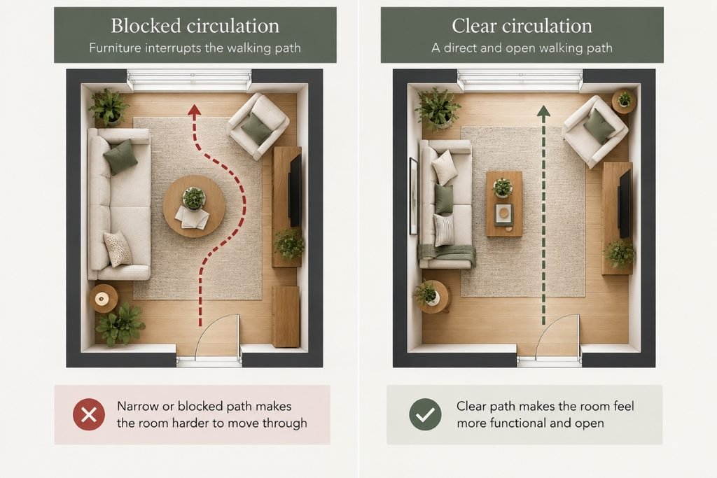
- Protect circulation. Decide where people actually need to walk before furniture gets placed.
- Choose footprint over quantity. Prioritize the footprint and usefulness of each piece rather than assuming more small pieces will use the room better.
- Manage visual weight, not just physical size. Two pieces with similar dimensions can occupy a room very differently depending on form, material, color, and how much floor remains visible around them.
- Use vertical volume deliberately. Treat walls as usable design surfaces rather than waiting until the floor is full.
- Zone with furniture and rugs, not necessarily walls. A compact open space can support more than one function without physical division.
- Let light and color do structural work. Value and contrast can influence how the room’s boundaries and different functional areas read.
- Edit last. Remove what isn’t earning its place before adding anything new.
These eight steps describe the order in which the major decisions get made. They are not a checklist where every later section of this guide maps to exactly one step.
Ideas such as sightlines, storage, and editing influence several of the steps rather than sitting neatly under a single one. The sections that follow work through those principles in more depth.
Define the function before anything else
A space may need to serve as a living room, home office, and occasional guest room. The useful question isn’t simply, “What could this room be used for?” It is, “What does it need to support most often, and what only needs to happen occasionally?”
That distinction changes the furniture plan.
A daybed that converts for occasional guests, for example, solves a different problem from furniture chosen to permanently divide a room into three equally important functions.
Start with the activities that happen most often. Let occasional uses adapt around them rather than allowing every possible use to dictate the permanent layout.
Circulation and usable floor area
Usable floor area and usable layout aren’t the same thing.
A room can have open square footage and still function poorly if that space is fragmented into awkward areas by furniture placement, or if the clearest path through the room cuts directly through the seating area.
Identify the routes people actually use before placing the major furniture. That might mean the path from the entrance to a kitchen, bathroom, closet, balcony, or another frequently used part of the home.
Protecting those routes early can prevent a layout that looks acceptable in isolation but feels obstructed in daily use.
Footprint over quantity
A common instinct in a small space is to buy smaller versions of everything: a smaller sofa, smaller table, smaller shelf, and smaller chairs.
Small furniture can certainly be appropriate, but size alone doesn’t determine whether a piece belongs in a compact room.
Several undersized pieces can consume as much combined floor area as fewer larger pieces while introducing more edges, gaps, legs, and objects for the eye to process.
In some compact layouts, fewer appropriately scaled pieces can create a clearer composition than several undersized pieces occupying a similar combined footprint.
Think about what each piece contributes relative to the floor area it consumes.
Managing visual weight, not just size
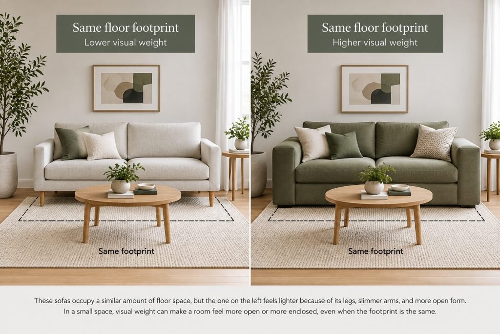
Two pieces of furniture with nearly identical dimensions can occupy a room very differently.
A sofa on visible slender legs exposes more of the floor beneath it than a low, solid sofa of similar dimensions. Thick arms, deep upholstery, dark finishes, tall backs, and enclosed bases can also increase the visual mass of a piece.
Color and material contribute too. A dark solid form can read differently from the same general form in a lighter or more textured upholstery.
In a compact room, visual weight is especially noticeable because large furniture occupies a greater share of the visible composition.
This doesn’t mean every piece should be pale, leggy, or visually lightweight. A heavier piece can provide a useful anchor. The important distinction is recognizing that physical dimensions and visual weight are related, but they are not the same thing.
Edit a room before adding more to it
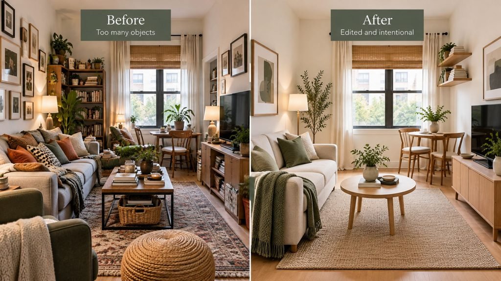
When a small room feels crowded, the immediate response is often to buy another cabinet, basket, shelving unit, or storage bench.
Before adding anything, remove something.
Removing unnecessary objects can make the room easier to read visually before additional storage or furniture is introduced.
This doesn’t mean a compact home should be minimal or devoid of personality. Books, art, plants, textiles, collections, and useful everyday objects can all belong.
The point is to distinguish between things that contribute to the room and things that remain simply because no decision has been made about them.
Use vertical volume deliberately
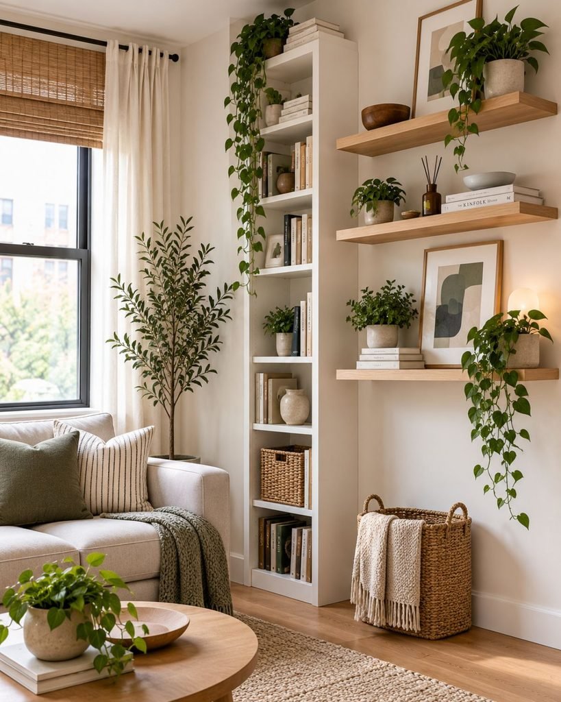
In many compact rooms, vertical wall space offers useful capacity without taking additional floor area.
A tall narrow bookcase, wall-mounted cabinet, floating shelf, or thoughtfully placed artwork can use height rather than increasing the room’s furniture footprint.
But “use the walls” shouldn’t become another universal small-space rule.
Covering every available wall with small shelves and storage can make the vertical surfaces feel as busy as an overfilled floor. The objective is to use height where it solves a genuine problem, while preserving enough visual breathing room for the architecture to remain legible.
Multifunctional furniture: when it helps and when it doesn’t
Multifunctional furniture earns its place when the second function solves a real constraint.
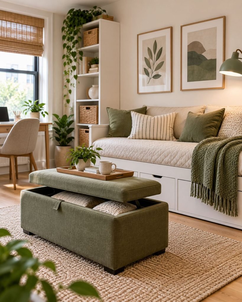
A storage ottoman that also works as a coffee table can eliminate the need for a separate storage unit. A daybed can provide everyday seating while accommodating occasional overnight guests.
But multifunctionality isn’t automatically better.
A piece that tries to serve several purposes may require folding, moving, clearing, converting, or resetting every time its function changes. That complexity can become more inconvenient than the floor space it saves.
Ask a simple question:
Will I use the additional function often enough to justify the additional complexity?
If the answer is no, a well-chosen single-purpose piece may be the better small-space decision.
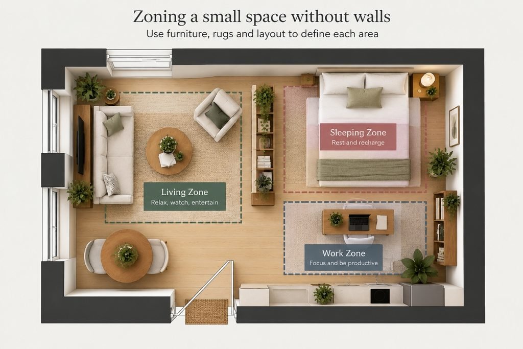
Zone a small space without building walls
A compact open room can support several activities without physical partitions.
Furniture placement can establish boundaries. So can rugs and lighting.
A sofa with its back toward a work area can distinguish living from working. A rug can visually contain a seating group. A separate light source can reinforce a reading or work zone without changing the architecture.
The goal isn’t to create miniature rooms inside one room. It is to give each activity enough visual definition that the overall space remains understandable.
This can be particularly useful in open-plan and studio-style spaces where adding solid dividers could interrupt circulation or sightlines.
Pay attention to sightlines
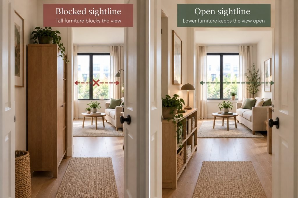
What you see when entering a room affects how the space is perceived.
A tall solid cabinet directly inside a major sightline can stop the eye near the entrance even when usable space continues behind it. A lower or more open piece in the same location can preserve a longer view through the room.
That doesn’t mean tall storage should be eliminated. Instead, consider where visually substantial pieces sit relative to entrances, windows, and the routes people use most.
Keeping important sightlines relatively clear can help the different parts of a compact room feel connected.
Use light and color as structural tools
A small room doesn’t have to be white, and dark or saturated colors aren’t automatically inappropriate.
The more useful questions concern value, contrast, continuity, and the room’s actual lighting.
A darker scheme can be deliberate and cohesive. A pale room can still feel flat or poorly defined. Neither outcome is determined by wall color alone.
If several functional zones share one compact space, maintaining some color continuity can also prevent every area from feeling visually disconnected.
For the complete method behind choosing undertones, coordinating materials, and testing colors under actual room lighting, see our complete guide to interior color ideas.
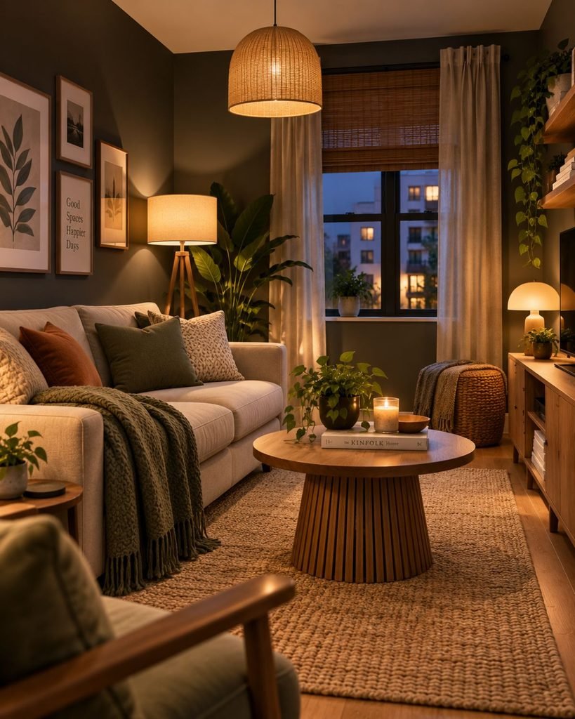
Using several light sources can create separate pools of illumination and give different activities their own lighting, rather than asking one overhead fixture to serve the entire room.
A floor lamp might support the seating area while a desk lamp serves the work zone. Their purpose is functional first; the layered effect follows from giving different activities appropriate sources of light.
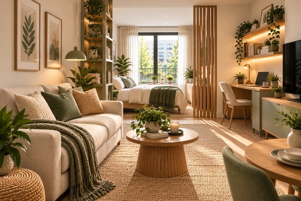
Putting the method into practice: a compact studio apartment
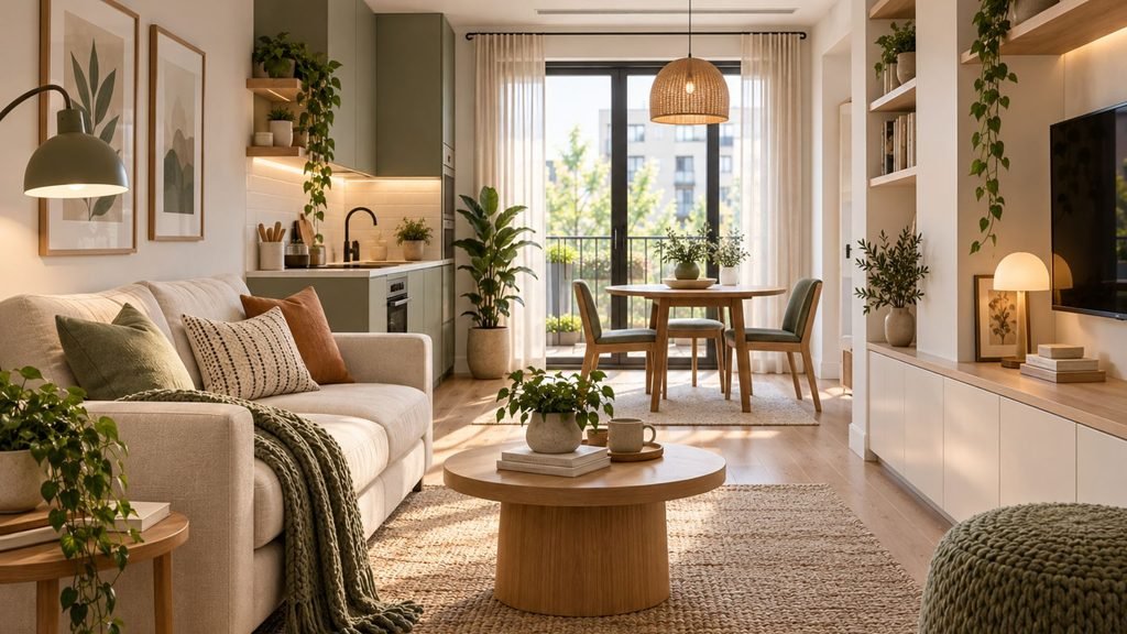
Small space ideas are easier to evaluate when you can see how function, circulation, furniture, zoning, lighting, and storage affect one another.
Consider a compact studio apartment that needs to support sleeping, working from home, and relaxing in the evening: three functions, one main room, and limited floor area.
Define the function
The room is used for living during evenings and weekends, working during weekdays, and sleeping every night.
Rather than trying to give all three activities equal floor area, the permanent layout supports living and sleeping comfortably while allowing the work function to occupy a smaller dedicated zone.
Protect circulation
The route from the entrance toward the kitchenette and bathroom is identified first.
Furniture stays outside that path. This immediately eliminates several possible layouts before anything is purchased.
Choose footprint over quantity
Instead of filling the room with a bed, full sofa, armchair, large desk, and several small tables, each major function receives only what it needs.
A queen bed serves sleeping, a compact desk serves work, and a two-seat loveseat establishes the living zone.
Manage visual weight
The loveseat sits closer to the main entrance and therefore uses a lighter upholstery and visible legs.
The bed can carry more visual mass because it sits farther from the entry and outside the primary sightline.
Use vertical volume
A wall-mounted shelf above the desk provides accessible storage without requiring another floor-standing bookcase.
Additional closed storage can occupy wall space where it doesn’t interfere with circulation.
Zone the functions
A rug defines the living area, while the sleeping area uses its own textile boundary.
The loveseat’s orientation reinforces the distinction between the living and work zones without requiring a solid divider.
Use light and color structurally
One consistent wall color runs through the studio, allowing the zones to remain visually connected.
The living area receives its own lamp, while task lighting serves the desk. The functional separation comes from furniture, rugs, and lighting rather than several competing wall colors.
Edit last
After the main layout is established, anything that doesn’t contribute enough to justify its footprint is reconsidered.
An occasional floor seat, extra side table, or decorative storage piece may seem harmless individually, but removing one unnecessary item can sometimes improve circulation more effectively than finding another way to store it.
Small-space myths worth retiring
Some familiar small space ideas become less useful when conditional design choices are turned into universal rules. Many familiar small-space rules contain a useful idea but become misleading when treated as absolutes.
“Small furniture is always best.”
Not necessarily. Furniture should be judged by its footprint, function, proportion, and visual weight rather than by size alone.
“White always makes a room feel larger.”
White can be useful, but it isn’t the only workable choice. Lighting, value, contrast, furniture, and visual continuity all contribute to how a compact room reads.
“Every small room needs mirrors.”
Mirrors can reflect light or extend a view in the right location, but they are a tool rather than a requirement.
“Furniture should always be pushed against the walls.”
Sometimes that protects circulation; sometimes it creates an awkward perimeter of unrelated pieces. Furniture placement should follow the room’s function and walking paths instead.
“Open shelving always makes a space feel larger.”
Open shelving exposes its contents. A carefully edited shelf may feel visually light, while a heavily filled one may introduce more visual activity than closed storage.
“Every piece should be multifunctional.”
Only when the additional function is genuinely useful. Complexity isn’t valuable simply because a piece can technically perform several jobs.
Common small-space mistakes
Several problems can be traced back to decisions being made in the wrong order.
Skipping the function step. Furniture gets chosen for appearance before anyone decides what the room actually needs to support.
Placing furniture before mapping circulation. The room may look acceptable in a photograph but become frustrating to move through.
Buying many small pieces automatically. Their combined footprint and visual activity can undermine the reason they were chosen.
Adding storage before editing. More capacity isn’t always the first solution to a crowded room.
Treating lighting and color as finishing touches only. Both influence how zones, surfaces, and boundaries relate to one another and deserve consideration alongside the layout.
Where this leaves you
The most useful small space ideas aren’t tricks for disguising square footage. They are decisions about what the room needs to do, how people move through it, how much floor area each piece earns, and how furniture, storage, light, and color work together.
If your compact space is specifically a living room, our small living room guide goes deeper into layouts and furniture decisions for that room type.
If your space includes a dedicated sleeping area that functions more like its own bedroom, our bedroom design guide covers bed placement, furniture scale, lighting, and other bedroom-specific decisions in greater depth.
And if color is the decision holding you back, our complete guide to interior color ideas explains how to build a palette around existing materials, undertones, wood tones, metals, and real lighting conditions.
Small space ideas FAQ
Do small spaces have to be painted white?
No. White is one option, not a requirement. Wall color works alongside lighting, contrast, furniture, materials, and the amount of visible visual activity in the room. Darker and more saturated colors can also be used deliberately in compact spaces.
Are mirrors necessary in a small room?
No. A mirror can reflect light or extend a useful sightline depending on where it is placed, but not every compact room benefits from one. Treat mirrors as a design tool rather than a default small-space requirement.
Should all furniture in a small space be multifunctional?
No. Multifunctional furniture is useful when its additional function solves a problem you encounter regularly. If converting or rearranging the piece creates more inconvenience than value, a simpler single-purpose item may work better.
What’s the difference between physical space and visual space?
Physical space is the room’s actual dimensions and available floor area. Visual space describes how open, enclosed, busy, or continuous that room appears. Furniture form, sightlines, color, lighting, and the amount of visible floor or wall can change the visual experience without changing the room’s physical dimensions.
About the author
Daniel Brooks writes about space planning, furniture layouts, and functional interiors for Wallsaide. He focuses on practical ways to make rooms work better through proportion, circulation, storage, and thoughtful furniture placement.