
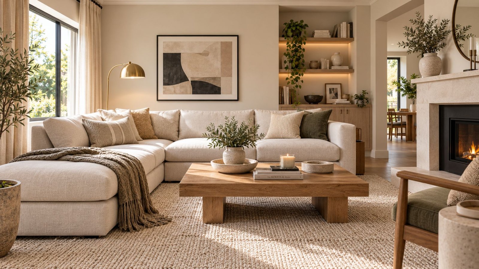

Neutral living room ideas work best when the palette is layered deliberately rather than built from one pale tone repeated across every surface. A neutral room isn’t automatically calm, and it isn’t automatically boring. The difference comes from how tone, texture, materials, contrast, and lighting work together.
This guide explores four neutral directions to consider, followed by Wallsaide’s own method for building a neutral living room that feels intentional rather than flat.
Why neutral rooms end up feeling flat
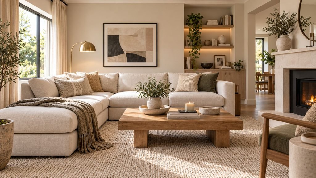
The best neutral living room ideas create enough variation between walls, furniture, textiles, and accessories for each surface to retain its own character. A room can feel flat when those elements sit at roughly the same value, temperature, and texture.
Neutral itself isn’t the problem. Sameness is.
The solution isn’t necessarily adding more color. Depth can come from subtle changes in tone, contrasting values, natural materials, different textures, furniture forms, and lighting.
Neutral living room ideas: 4 directions to start from
These four neutral directions build on Wallsaide’s broader living room ideas framework, but focus specifically on how tone, material, and contrast shape a neutral palette.
Warm neutral
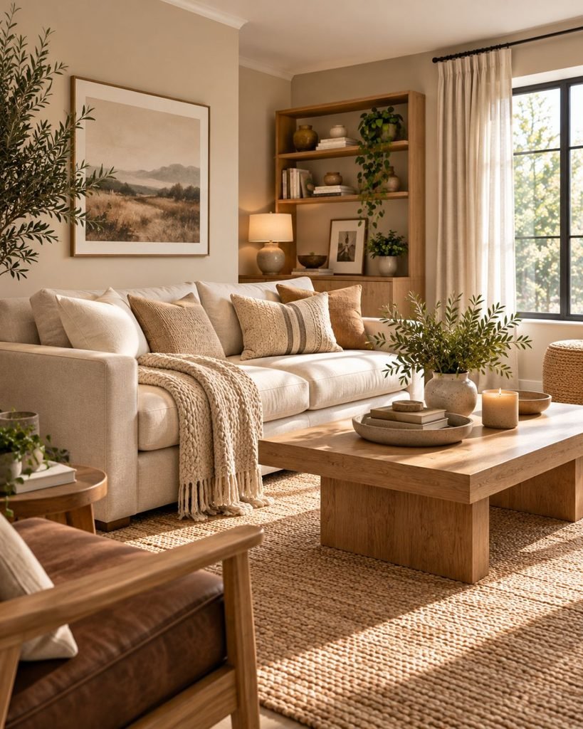
Warm neutrals can be particularly effective when you want to counter cooler-looking light or connect the room to warm existing materials such as oak, walnut, brass, jute, or cream textiles.
The important decision is whether the undertones work with the room’s actual light and fixed finishes rather than whether the room belongs to a particular compass direction.
A warm-neutral living room might combine greige walls, cream upholstery, honey-toned wood, woven fibers, and warm metal accents without relying on one identical beige across every surface.
Cool neutral
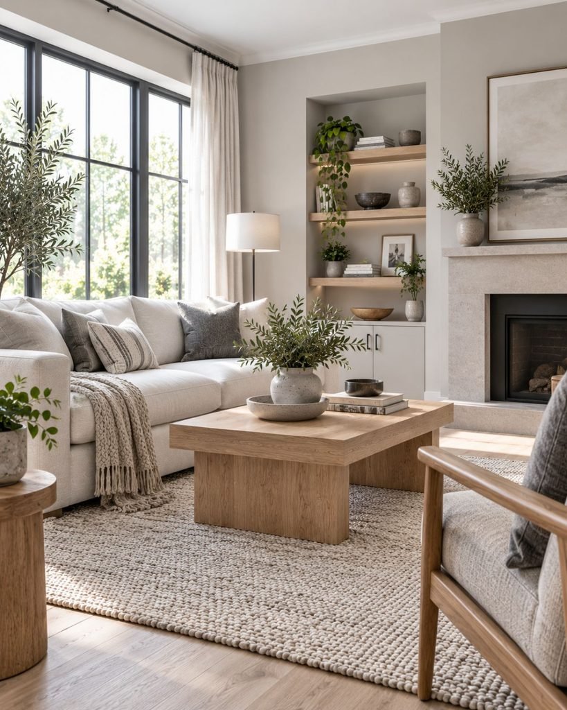
Cooler neutrals can bring clarity to a room that already receives plenty of visual warmth from sunlight, wood, or other finishes. They can also support a deliberately crisp palette built around white oak, charcoal, chrome, or similarly restrained materials.
As with warm neutrals, test the combination in the room rather than choosing it from orientation alone.
The goal isn’t to make the room visibly “cool.” It is to create an undertone relationship that works with the light and materials already present.
Tonal neutral
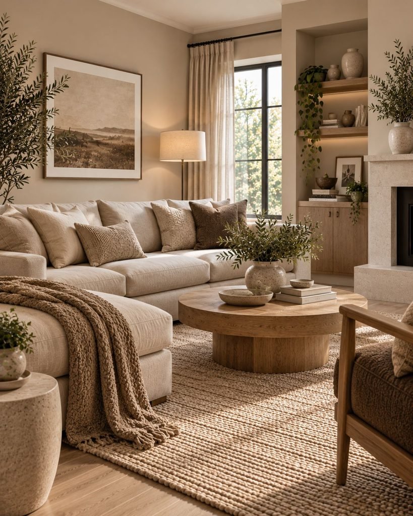
A tonal room stays largely within one neutral family while varying its lightness and depth.
Pale sand walls, a mid-tone taupe sofa, and a deeper cocoa-brown chair, for example, can create visible separation without introducing several competing color families.
Texture becomes especially important in a tonal scheme because subtle differences in linen, wool, wood, stone, and woven materials help distinguish surfaces that otherwise sit close together in color.
High-contrast neutral
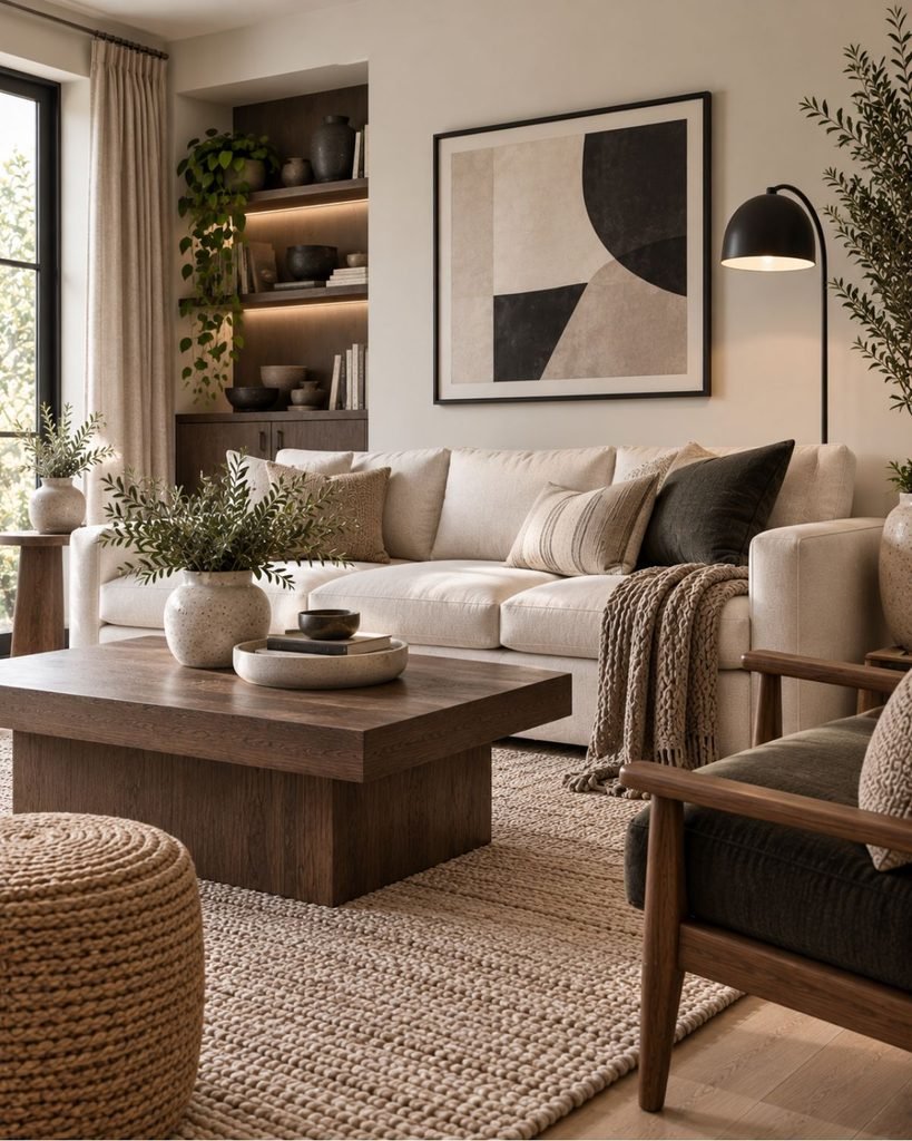
A higher-contrast neutral room introduces a noticeably deeper value against a predominantly pale or mid-tone palette.
That contrast could come from a black-framed mirror, charcoal upholstery, dark wood, an espresso-toned table, or simply a substantially deeper version of the room’s existing neutral.
The purpose isn’t to satisfy a rule that every neutral room needs black. It is to create clearer visual definition when the composition benefits from it.
A softer tonal room may deliberately use much less contrast.
The Wallsaide Neutral Layering Method
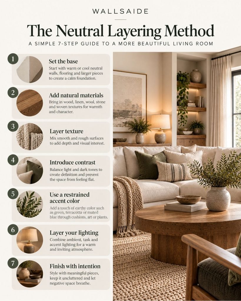
The most useful neutral living room ideas become easier to apply when the major design decisions are made in a deliberate order. Most neutral-room advice tells you what to add: texture, wood, contrast, and lighting. It is less clear about when those decisions should be made.
The Wallsaide Neutral Layering Method is our editorial framework for putting those decisions into a practical sequence. It is a starting point, not an industry rule.
1. Choose your undertone temperature
Start by deciding whether the room works better with warmer, cooler, or more balanced neutrals based on its actual light and existing finishes.
2. Establish a base and secondary neutral
Instead of repeating one neutral everywhere, create a relationship between a primary tone and a related secondary tone.
3. Integrate wood and natural materials
Treat flooring, furniture woods, stone, woven fibers, and similar materials as part of the palette rather than additions made after the colors are chosen.
4. Layer distinct textures
Introduce surfaces that respond differently to light and touch, such as linen, wool, woven fiber, wood, ceramic, or stone.
5. Decide how much contrast the room needs
Introduce deeper value where the composition needs definition, through black, charcoal, dark wood, or simply a deeper version of the existing neutral. A deliberately soft tonal room may need very little.
6. Consider a restrained accent color
Once the neutral composition works on its own, decide whether a small amount of another color improves it or whether the room is already complete.
7. Design the lighting for both day and evening
Consider how the palette, materials, and textures read after daylight fades, and use appropriate lighting at different positions or heights where the room needs it.
Choosing your undertone temperature
The right undertone temperature depends on the light the room actually receives and the finishes already present.
Window orientation can influence both the intensity and color of daylight, but it should be treated as a clue rather than a rule. A warm neutral may help balance cooler-looking light, while a cooler or more balanced neutral can work well where the room already receives abundant warmth.
Existing flooring, stone, wood, upholstery, and metal finishes matter too.
Wallsaide’s complete guide to interior color ideas explains how to identify undertones and test a palette under the changing light in your own room.
Building the base: two neutrals, not one
Using exactly the same neutral across walls, upholstery, rugs, and other large surfaces can reduce the visual separation between them.
Instead, establish a relationship between a base and a secondary neutral.
A warm greige wall might sit behind slightly lighter cream upholstery. Pale ivory walls could work with a deeper oatmeal or taupe sofa. A cooler gray-beige base might be paired with softer off-white textiles.
The difference doesn’t need to be dramatic. It only needs to be visible enough for the major surfaces to retain their own character.
Wood tones as part of the palette
Wood carries significant visual presence in a neutral room because flooring, tables, shelving, and cabinetry often occupy large areas of the composition.
Rather than choosing those pieces independently of the palette, consider their undertones alongside the walls and textiles.
Wood tones don’t have to match exactly. What matters is that their relationship looks intentional.
Repeating a similar undertone across several pieces can create continuity, while a contrasting wood can work when that contrast is repeated or clearly integrated with the wider palette.
Layering texture
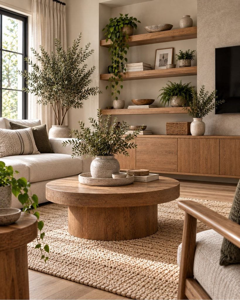
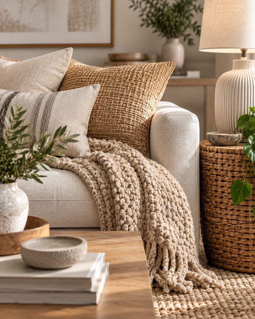
Texture is particularly useful in a neutral room because it creates distinction without requiring additional color.
But simply adding several textured objects isn’t the objective. The useful difference comes from combining surfaces with visibly different characteristics.
A linen sofa, wool rug, woven basket or chair, smooth timber table, and ceramic lamp can all sit within a restrained palette while responding differently to light.
The result is depth created through material rather than through a collection of competing colors.
Adding contrast without breaking the palette
Contrast gives the eye clearer differences between surfaces, but it doesn’t have to mean adding black to every neutral room.
A black-framed mirror, dark metal lamp, espresso-toned table, or charcoal chair can create a strong anchor. A softer tonal scheme might instead use a deeper taupe, brown, or wood tone.
The useful question is how much definition the composition needs, not whether every neutral room contains a prescribed dark object.
If the room already has enough separation through value, texture, furniture shape, and natural materials, additional dark accents may not be necessary.
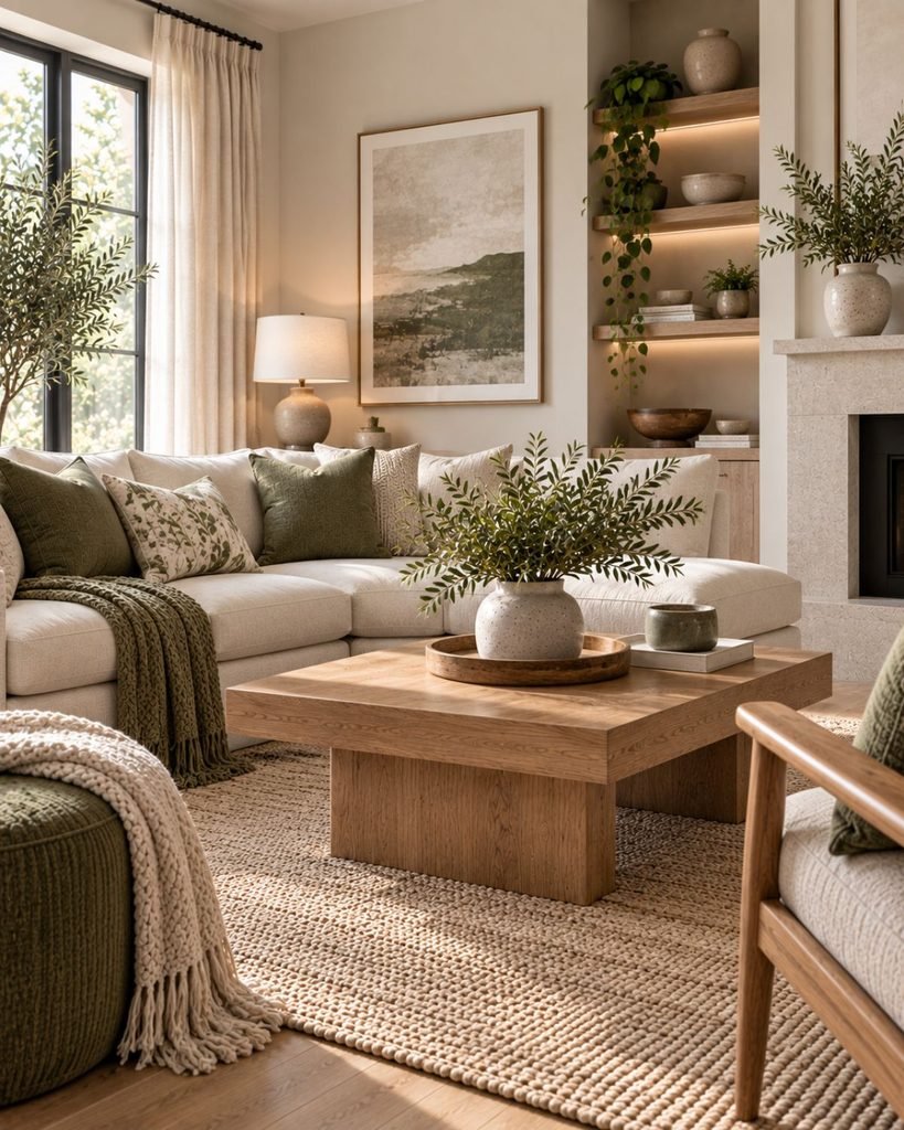
Where a restrained accent color fits
A neutral living room can include color without losing its neutral character.
Muted green, dusty blue, terracotta, burgundy, or another restrained color might appear through a cushion, throw, artwork, ceramics, or another relatively small element.
But an accent isn’t mandatory.
In the Wallsaide method, accent color comes late in the sequence so you can first judge whether the room already has enough depth through tone, material, and contrast. If it does, an additional color may not be necessary at all.
Lighting a neutral room for evening
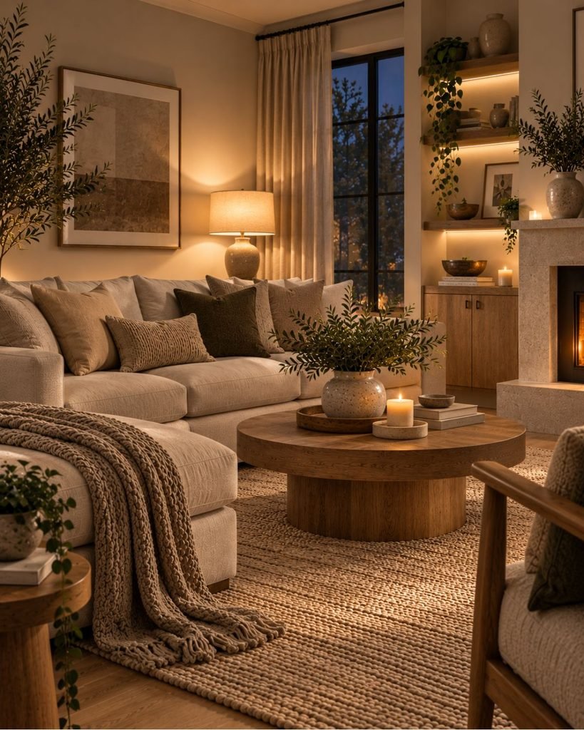
A neutral room can change significantly after daylight fades.
Subtle differences between cream, greige, taupe, wood, and textured fabrics may appear differently under artificial light, which is why the room should be evaluated in both daytime and evening conditions.
Layering more than one appropriate light source can preserve the differences between surfaces after daylight fades.
A floor lamp might support the seating area while a table or wall light adds illumination at another height, reducing reliance on a single overhead source.
The objective isn’t simply to make the room warmer. It is to give the activities and surfaces in the room appropriate illumination while maintaining the depth created through tone and texture.
Flat vs. layered: seeing the difference
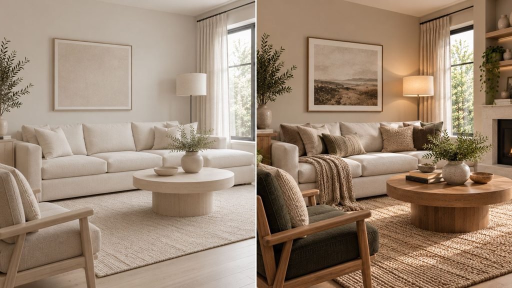
Neutral living room ideas are easier to evaluate when you can compare the same basic room before and after tone, texture, materials, contrast, and lighting are layered deliberately.
Consider two versions of the same neutral living room with the same basic furniture footprint.
In the first, the walls, sofa, and rug sit close together in tone. The surfaces have similar textures, there is little value contrast, and one general light source handles the room.
In the second, the layout hasn’t changed. Instead, the base and secondary neutral are separated slightly, wood contributes another material tone, textiles introduce different textures, contrast is added where useful, and lighting comes from more than one position.
The room hasn’t become more colorful.
It has become easier to read.
That distinction is central to the Wallsaide approach to neutral interiors: layering is about creating relationships between surfaces, not filling a pale room with more objects.
Neutral living room mistakes
Even a restrained palette involves several decisions that can work against one another.
Repeating one neutral indiscriminately.
When every major surface has nearly the same value, temperature, and texture, the room can lose definition.
Adding texture without enough variety.
Five cushions in similar fabrics don’t necessarily create meaningful material depth. Look for differences between surfaces rather than quantity alone.
Assuming every neutral room needs black.
Dark contrast can be effective, but tonal rooms can also work with softer differences in value.
Trying to match every wood exactly.
Natural variation can look intentional. Pay attention to undertones and repetition rather than demanding identical finishes.
Adding accent color because the room is neutral.
Color should solve a visual problem or support the intended mood, not appear simply because a decorating formula says it must.
Evaluating the room only in daylight.
A palette that works beautifully in natural light should also be checked under the artificial lighting used at night.
Bringing it together
The strongest neutral living room ideas rely less on a particular shade of beige and more on the relationships between the room’s surfaces.
Start with an undertone direction that works with the actual light and fixed finishes. Build separation between the base and secondary neutral. Treat wood and natural materials as part of the palette, vary texture deliberately, decide how much contrast the room needs, and introduce another color only when it improves the composition.
Then evaluate the room again after daylight fades.
A successful neutral room doesn’t need to prove that beige can be exciting. It needs enough variation, material character, and visual structure to feel deliberate.
Neutral living room ideas FAQ
How do you keep a neutral living room from looking boring?
Create visible differences between the room’s major surfaces through tone, texture, material, furniture form, and contrast. A neutral palette can feel flat when the same value and texture are repeated everywhere, but adding more color isn’t the only solution.
Should a neutral living room be warm or cool toned?
Either can work. Choose according to the room’s actual daylight and existing finishes rather than relying on a universal compass-direction rule. Flooring, wood, stone, upholstery, and metals can influence whether warmer or cooler neutrals feel more coherent.
Can a neutral living room have color in it?
Yes. A neutral room can include a restrained accent color through textiles, art, ceramics, or other details. The room can also remain completely neutral if tone, texture, materials, and contrast already provide enough depth.
Do all the wood tones in a neutral living room need to match?
No. Wood finishes can vary. Similar undertones can create continuity, while contrasting woods can also work when their relationship appears intentional and connects with other elements in the room.
About the author
Emma Carter writes about interior color, home décor, and practical styling for Wallsaide. She focuses on helping readers combine colors, materials, textiles, and decorative elements into rooms that feel balanced and cohesive.