
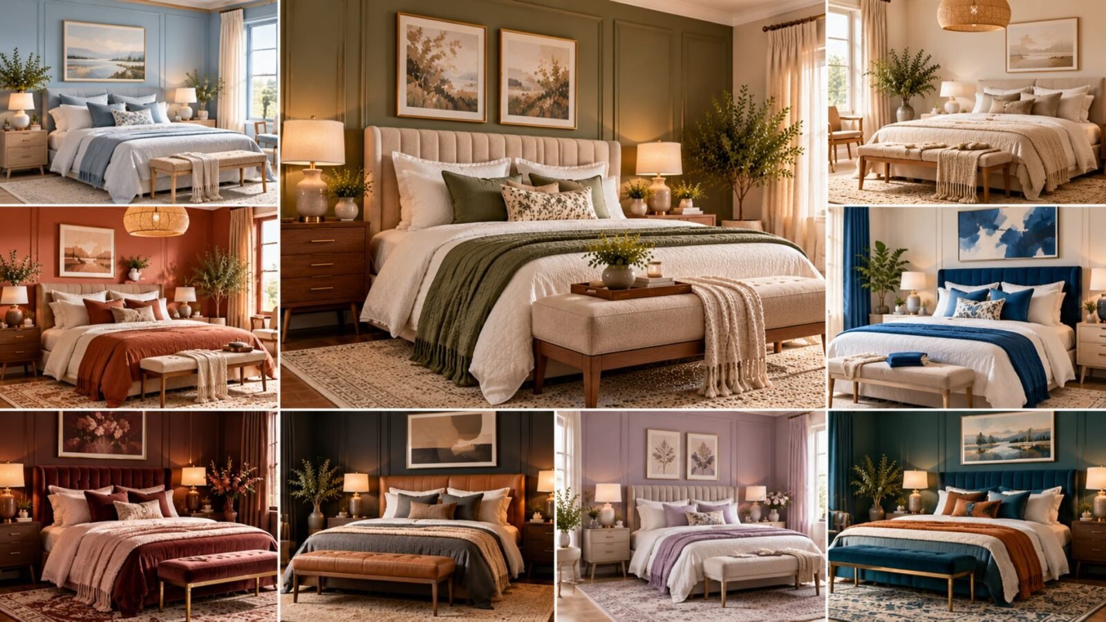

From butter yellow and powder blue to forest green and deep plum, discover bedroom color combinations that feel beautiful, balanced and right for your space.
Choosing a bedroom color is about more than finding a beautiful paint shade. The right palette needs to work with your natural light, furniture, flooring, bedding and the atmosphere you want to create.
Soft blues and greens can give a bedroom a fresh, understated appearance. Warm neutrals and earthy shades create a more grounded look, while deeper colors such as burgundy, charcoal and plum can add intimacy and drama.
This guide explores 21 bedroom color ideas, with practical combinations you can adapt to different decorating styles. You’ll also learn how to evaluate undertones, balance contrast and test colors before committing.
What colors work best in a bedroom?
The best bedroom colors are the ones that suit your space and make it feel comfortable to you.
Warm white, cream, beige, muted blue and soft green are versatile starting points because they pair easily with many materials. However, darker colors can work just as well when combined with appropriate lighting, furnishings and textures.
Rather than choosing a color because it is considered fashionable or relaxing, ask three questions:
- What atmosphere do I want when I enter the room?
- How will this color look beside my existing furniture and flooring?
- Does it still look attractive in both daylight and evening lighting?
A successful bedroom palette should feel intentional across the whole room, not just on the walls.
The Wallsaide Bedroom Color Compass
Before choosing paint, consider four elements that influence how a bedroom color scheme works.
1. Light
Natural and artificial light change how colors appear.
A pale blue may look fresh in bright daylight but cooler under certain lamps. A warm beige may appear soft in the morning and more yellow in late-afternoon sunlight.
Evaluate colors under the lighting conditions you actually experience.
2. Undertone
Every color has an underlying character.
Beige can lean pink, yellow or gray. Green can lean blue or olive. White can appear warm, cool or slightly creamy.
Undertones become especially noticeable when two surfaces sit next to each other.
3. Contrast
Contrast determines how clearly the elements of a room stand apart.
A bedroom with cream walls, ivory bedding and pale oak furniture has relatively low contrast. A room with charcoal walls, a caramel headboard and white bedding has much stronger contrast.
Neither approach is inherently better. Choose the level of visual definition that suits your preferred style.
4. Material
Materials affect the overall impression of a color.
Walnut adds richness to blue and green palettes. Pale oak makes soft colors feel lighter. Linen, wool, velvet, leather and metal can all change the mood of a scheme.
A bedroom color combination is most successful when the materials support the chosen colors.
The Wallsaide Color Combinations Factor
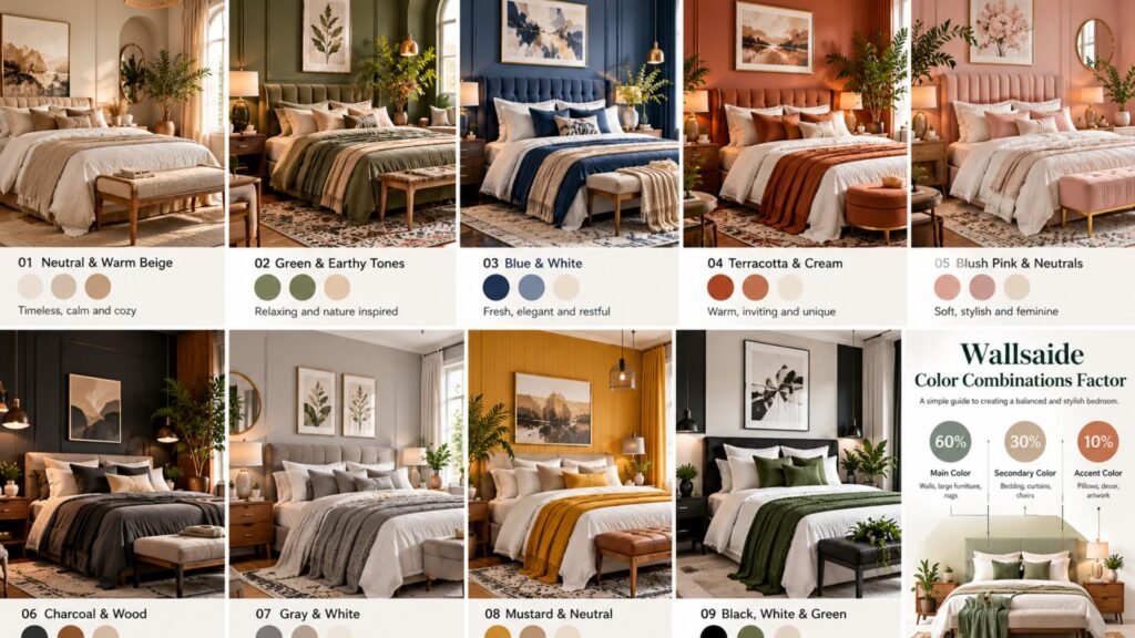
A useful way to organize a bedroom palette is to establish one dominant color, one supporting color and one smaller accent.
The familiar 60-30-10 decorating guideline provides a starting point:
- 60% main color: Usually walls or other dominant surfaces.
- 30% supporting color: Bedding, curtains, upholstery or larger furnishings.
- 10% accent color: Cushions, artwork, lamps and decorative details.
These percentages are approximate, not measurements you need to calculate. A tonal bedroom may use several closely related shades, while a colorful bedroom may need a different balance.
The important principle is visual hierarchy: let one color lead, another support it and smaller accents add interest.
21 bedroom color ideas worth trying
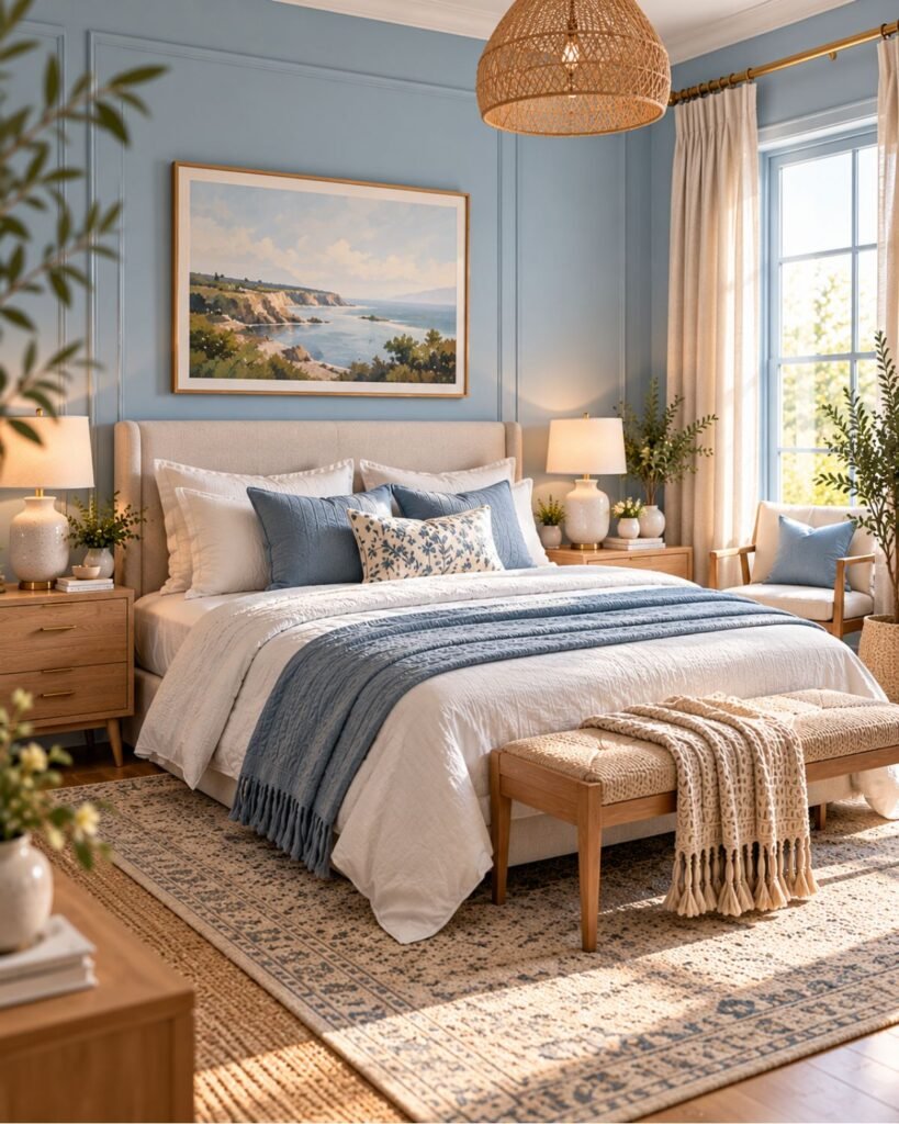
1. Powder blue and warm white for a fresh, gentle bedroom
Powder blue is a beautiful option when you want a bedroom that feels light and airy without relying entirely on white.
Choose a muted blue for the walls and pair it with warm-white bedding, pale timber and natural linen. The warmer supporting materials help prevent the palette from appearing overly cold.
This combination works especially well in coastal, traditional and understated contemporary bedrooms.
Try this combination: Powder blue walls, ivory curtains, pale oak furniture and brushed nickel or antique brass details.
Design tip: Test the blue in evening light. Some shades develop a stronger gray appearance after sunset.
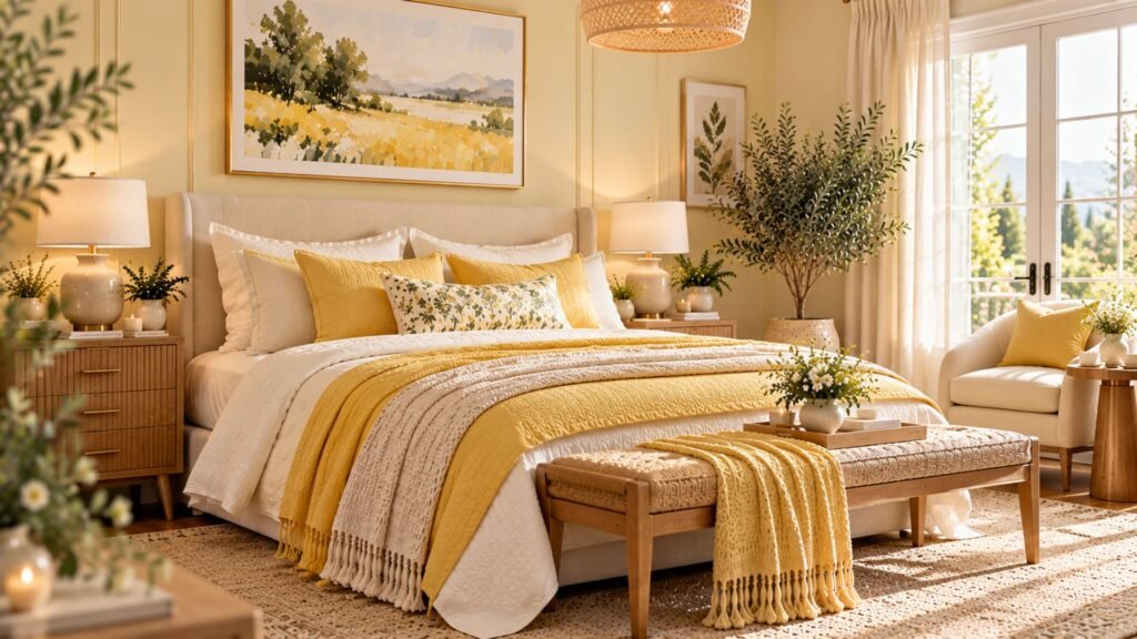
2. Butter yellow and cream for soft warmth
Butter yellow brings gentle warmth to a bedroom without the intensity of bright sunshine yellow.
Use a pale, creamy yellow on the walls and combine it with ivory bedding, natural wood and woven accessories. These materials reinforce the welcoming character of the palette.
This scheme is particularly attractive in cottage-inspired, Scandinavian and relaxed traditional bedrooms.
Avoid combining butter yellow with too many strongly yellow-toned accessories. Variation in cream, white and natural wood will make the room feel more balanced.
Try this combination: Butter yellow walls, cream bedding, honey-toned wood and subtle botanical accents.
3. Terracotta and sand for an earthy bedroom
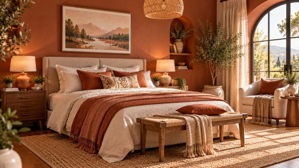
Terracotta creates warmth and character, especially when paired with sandy neutrals.
A muted clay color works beautifully with natural linen, walnut furniture and handmade-looking ceramics. The combination can feel Mediterranean, rustic or contemporary depending on the furniture.
If a fully terracotta room feels too intense, use the color on the headboard wall and keep the surrounding walls a warm neutral.
Try this combination: Muted terracotta, sand, walnut and off-white.
Design tip: Select a terracotta with a softened, earthy character rather than a vivid orange undertone for a more understated result.
4. Chocolate brown and ivory for rich comfort
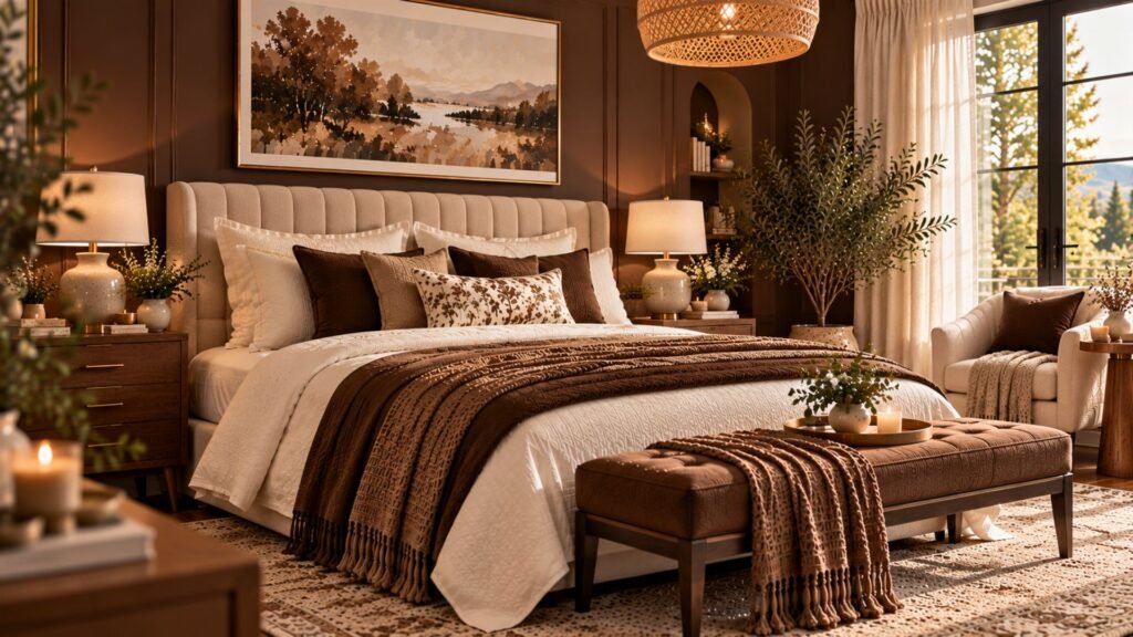
Chocolate brown can make a bedroom feel intimate and sophisticated without relying on black.
Deep brown walls create a striking background for ivory upholstery, cream bedding and warm metal accents. The lighter elements prevent the room from feeling visually heavy.
Introduce different textures through linen, velvet, wool or a patterned rug to give the palette depth.
This combination suits modern-classic interiors and boutique-hotel-inspired bedrooms.
Try this combination: Chocolate brown paneled walls, ivory upholstered bed, walnut furniture and antique brass lighting.
5. Sage green and natural oak for an organic feel
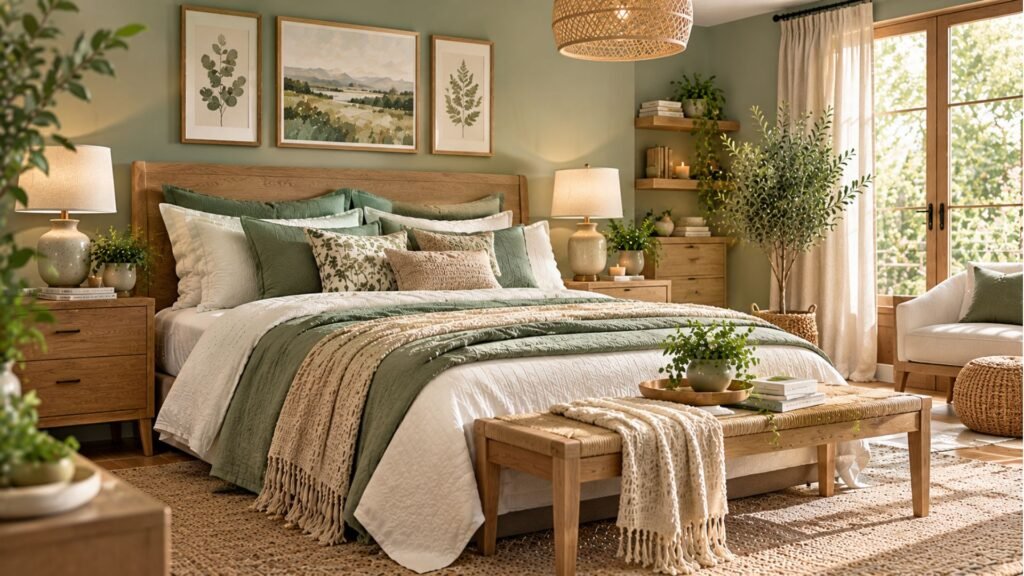
Sage green is a versatile choice for bedrooms because it complements natural materials.
Pair muted sage walls with pale oak furniture, oatmeal linen and warm-white bedding. This creates a gentle, organic appearance without requiring elaborate decoration.
A little darker contrast through artwork, lighting or accessories can stop the palette from becoming overly uniform.
For a more contemporary interpretation, choose furniture with simple profiles and keep decorative accessories restrained.
Try this combination: Sage green, natural oak, cream and small touches of charcoal.
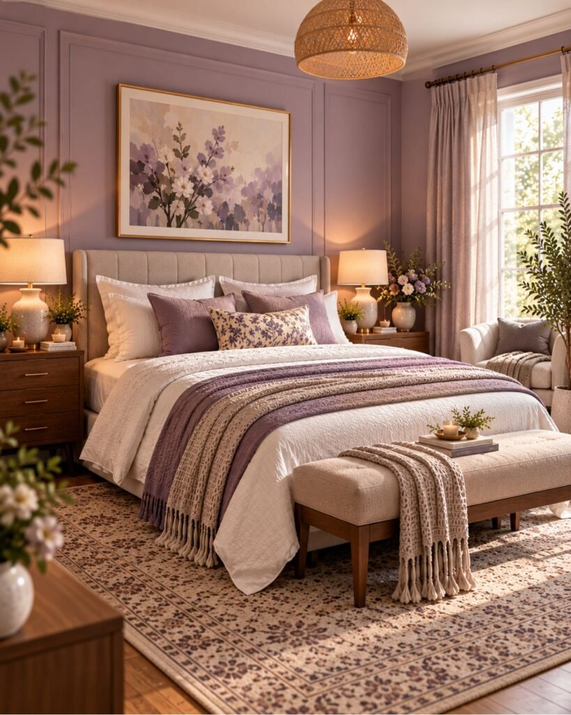
6. Dusty lavender and taupe for subtle color
Lavender can look sophisticated when it is muted and balanced with warmer neutrals.
Choose a dusty lavender with a slightly gray undertone and pair it with taupe upholstery, mushroom-colored textiles and dark wood.
The result offers visible color without the intensity of plum or burgundy.
Avoid introducing too many additional pastel shades. Let the lavender remain the main color while the neutral materials provide structure.
Try this combination: Dusty lavender walls, taupe headboard, ivory bedding and dark walnut furniture.
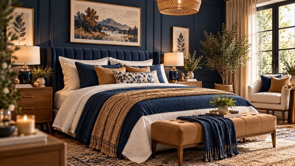
7. Navy blue and camel for a tailored look
Navy blue adds depth and definition, while camel introduces warmth.
A navy paneled wall behind a camel upholstered bed can create a strong focal point. Alternatively, use a navy headboard against warm-white walls for a lighter result.
Cream bedding provides separation between the darker blue and warmer brown tones.
This combination suits modern-classic, transitional and tailored contemporary interiors.
Try this combination: Navy walls, camel upholstery, cream bedding and walnut furniture.
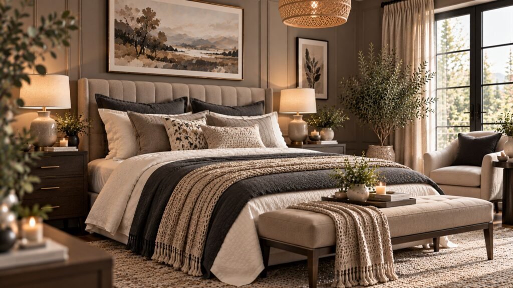
8. Mushroom and charcoal for a refined neutral palette
Mushroom sits between beige, taupe and gray, making it a flexible foundation for a neutral bedroom.
Combine mushroom walls with charcoal bedding, warm-white textiles and natural wood.
This creates visual depth without introducing a strong accent color.
Because mushroom shades can lean pink, green or gray, compare paint samples directly with your flooring and upholstery.
Try this combination: Mushroom walls, charcoal textiles, taupe upholstery and cream accents.
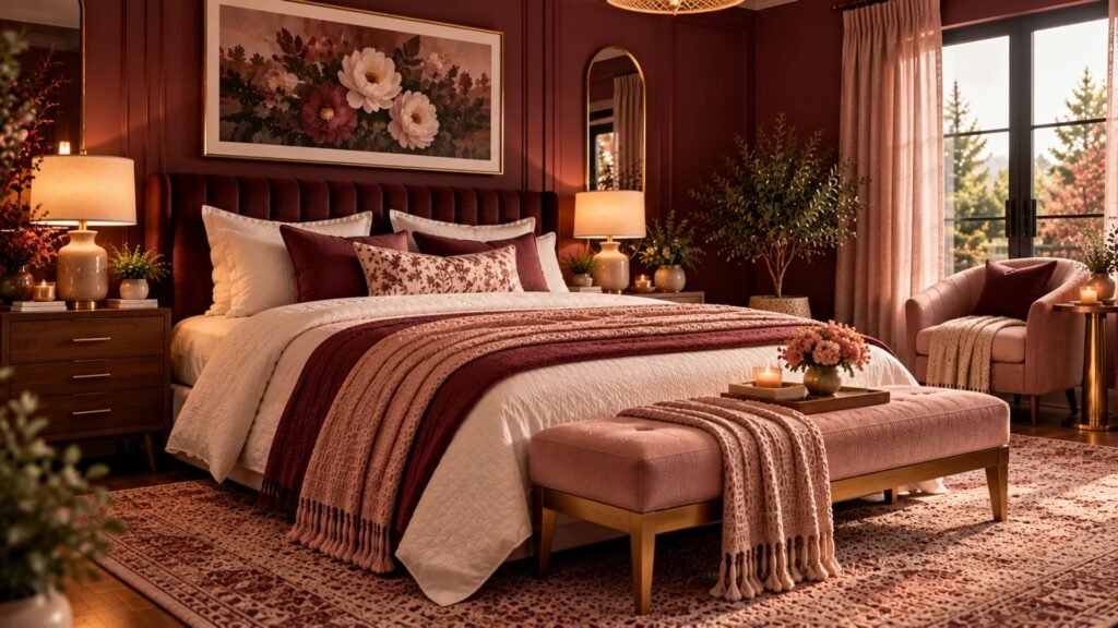
9. Muted burgundy and blush for a romantic bedroom
Burgundy creates a rich and intimate atmosphere when balanced with softer colors.
Choose a muted wine or oxblood shade and pair it with dusty blush, cream and walnut. The blush lightens the overall palette without creating harsh contrast.
A burgundy headboard wall is a practical way to introduce the color without covering the entire room.
Keep decorative details selective so the result feels elegant rather than overly ornate.
Try this combination: Muted burgundy, dusty blush, cream and warm brass.
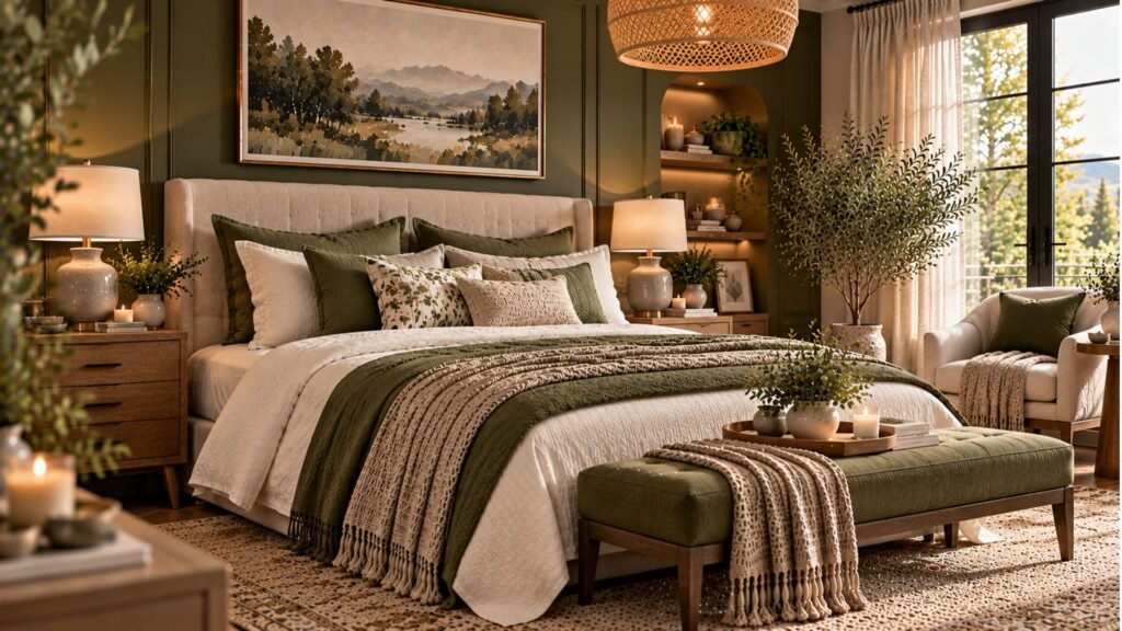
10. Olive green and warm stone for natural depth
Olive green has a warmer, earthier character than many sage greens.
Its yellow and brown undertones work beautifully with warm stone, walnut, antique brass and cream textiles.
Use olive on the walls for a richer appearance or introduce it through upholstery against neutral walls.
This combination adapts well to rustic-modern, traditional and contemporary bedrooms.
Try this combination: Olive green walls, stone-colored upholstery, cream bedding and walnut furniture.
11. Peach and warm white for a light, inviting space
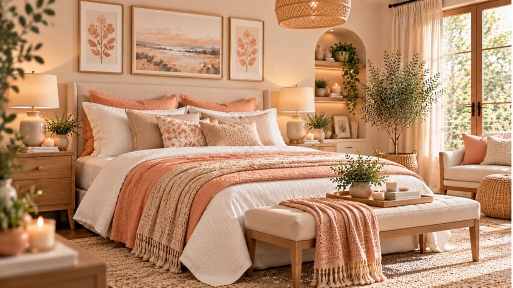
Muted peach introduces warmth without the intensity of terracotta.
Choose a soft apricot or peach-beige and pair it with warm-white bedding, pale wood and understated decorative accessories.
This palette can make a bedroom feel cheerful and inviting while remaining relatively subtle.
For a more refined appearance, avoid combining peach with several other strong pastel colors.
Try this combination: Soft peach, warm white, natural oak and touches of muted terracotta.
12. Charcoal and caramel for a dramatic modern bedroom
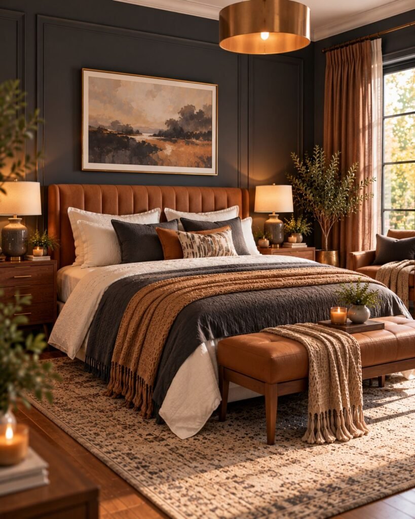
Charcoal provides a strong architectural backdrop, while caramel adds warmth and softness.
Pair charcoal walls with a caramel upholstered headboard, ivory bedding and dark walnut furniture.
Layered lighting is especially important in this palette. Bedside lamps, wall lights and softer ambient lighting help prevent the darker surfaces from feeling flat.
Choose a charcoal undertone that complements your existing flooring and furniture.
Try this combination: Charcoal walls, caramel upholstery, ivory bedding and dark wood.
13. Soft mint and cream for a refreshing bedroom
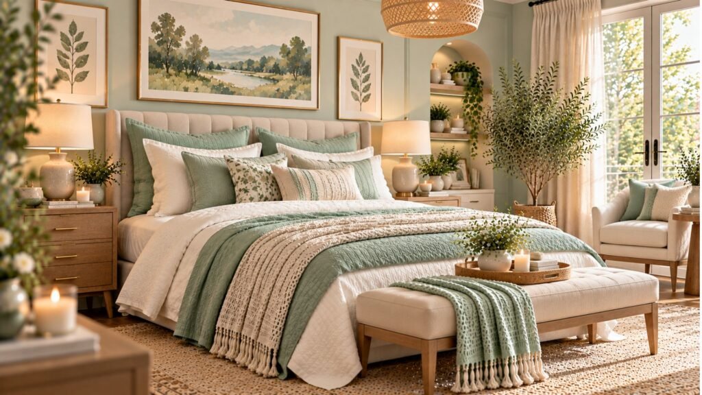
Soft mint can create a fresh, airy bedroom when the shade is sufficiently muted.
Pair mint walls with cream upholstery, pale wood and understated warm-metal accents.
A gray-influenced mint often feels more restrained than a vivid green-blue shade.
Keep patterns and decorative colors relatively quiet so the palette remains cohesive.
Try this combination: Soft mint walls, cream bedding, natural wood and warm brass details.
14. Warm beige and black for quiet contrast
Warm beige provides a soft foundation, while black creates definition.
Use beige on the walls and introduce black through bedside furniture, lamps, artwork frames or small decorative details.
Cream textiles and natural wood help soften the contrast.
The key is restraint. Black works best as a deliberate accent rather than something repeated across every surface.
Try this combination: Warm beige walls, cream upholstery, black furniture accents and natural textures.
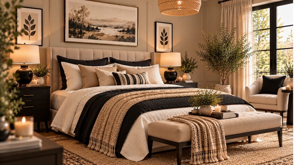
15. Deep teal and walnut for an enveloping bedroom
Deep teal combines blue and green character, creating a distinctive alternative to navy.
It pairs particularly well with walnut furniture, ivory bedding and warm brass.
A teal headboard wall can provide a strong focal point. Using the color on additional walls creates a more immersive appearance.
Test the shade carefully because some teals lean strongly blue while others appear greener.
Try this combination: Deep teal walls, walnut furniture, ivory bedding and warm brass lighting.
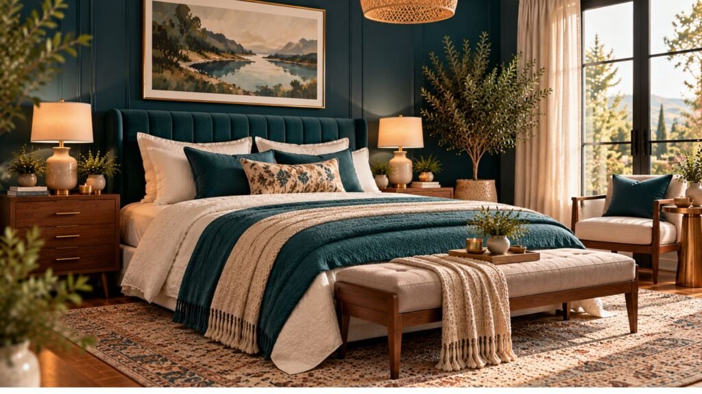
16. Dusty rose and chocolate for warmth without sweetness
Dusty rose becomes more grounded when combined with chocolate brown.
Try muted rose walls or bedding alongside a dark brown headboard, walnut furniture and cream textiles.
The deeper brown introduces structure, while the rose softens the overall impression.
This combination can work in contemporary, traditional and romantic interiors without relying on decorative pink accessories.
Try this combination: Dusty rose, chocolate brown, ivory and warm neutral walls.
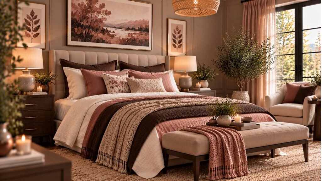
17. Forest green and antique brass for classic elegance
Forest green creates a rich backdrop for traditional detailing and warm metal finishes.
Pair deep green walls with cream bedding, antique brass lamps and medium-to-dark wood furniture.
Wall molding can reinforce the classic character, but the same palette can also work with streamlined furniture.
If the room receives limited daylight, compare a full-room green scheme with a single feature wall before deciding.
Try this combination: Forest green walls, cream upholstery, dark timber and antique brass.
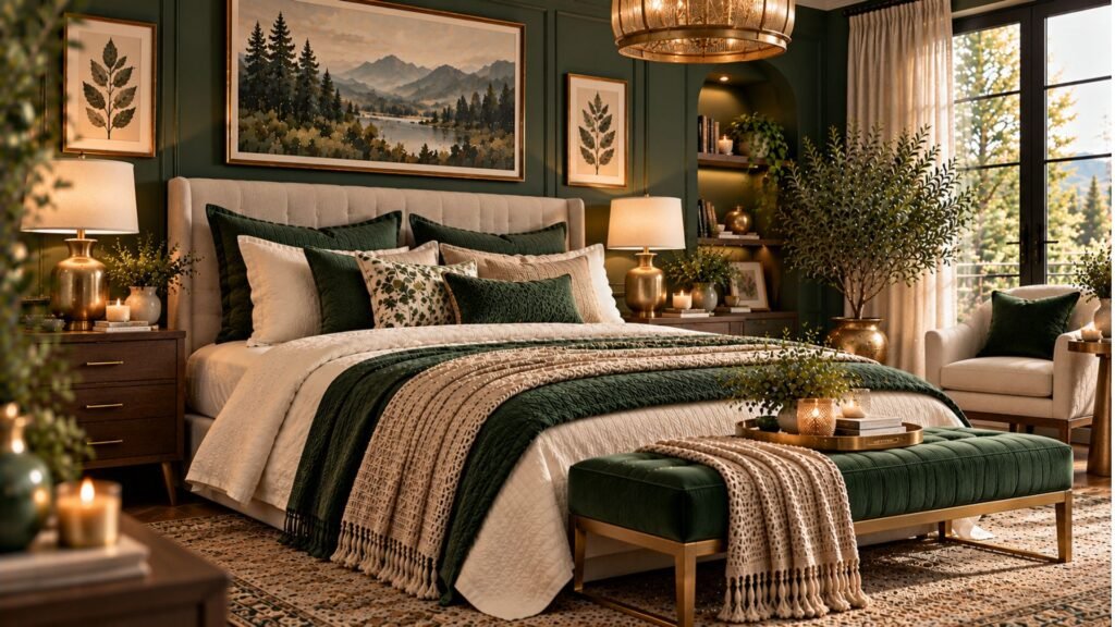
18. Warm white and natural linen for a layered neutral bedroom
A light bedroom doesn’t need strong color to feel interesting.
Warm-white walls, oatmeal linen, ivory upholstery and pale wood can create a beautiful tonal scheme.
The secret is variation in texture and shade. Combine smooth cotton, loosely woven linen, a textured rug and natural timber.
Introduce a small amount of darker contrast if the room needs more definition.
Try this combination: Warm white, oatmeal, ivory, natural linen and pale oak.
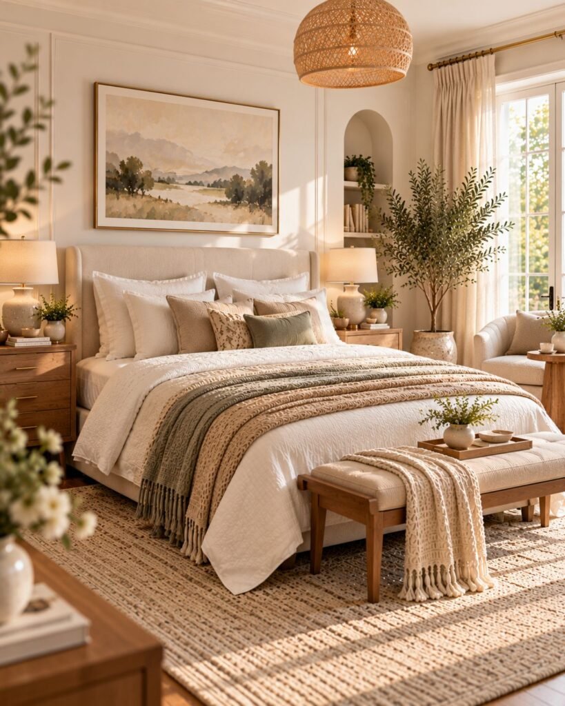
19. Slate blue and rust for balanced contrast
Slate blue offers a muted, slightly gray alternative to brighter blues.
Pair it with earthy rust accents to create contrast between cool and warm tones.
Use slate blue on the walls and introduce rust through cushions, throws or artwork. Cream bedding and walnut furniture can connect the two colors.
Keep the rust accents selective so they support rather than compete with the blue.
Try this combination: Slate blue walls, rust textiles, ivory bedding and walnut furniture.
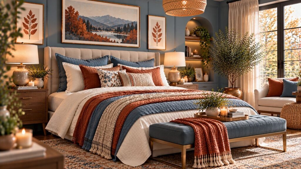
20. Plum and mushroom for a moody, elegant bedroom
Plum creates a dramatic bedroom palette without relying on black or charcoal.
Pair a muted plum with mushroom upholstery, cream bedding and warm brass lighting.
The mushroom tone softens the richness of the plum and prevents the room from feeling overly saturated.
For a contemporary interpretation, use furniture with simple shapes and avoid excessive decorative detailing.
Try this combination: Deep plum walls, mushroom upholstery, ivory bedding and antique brass.
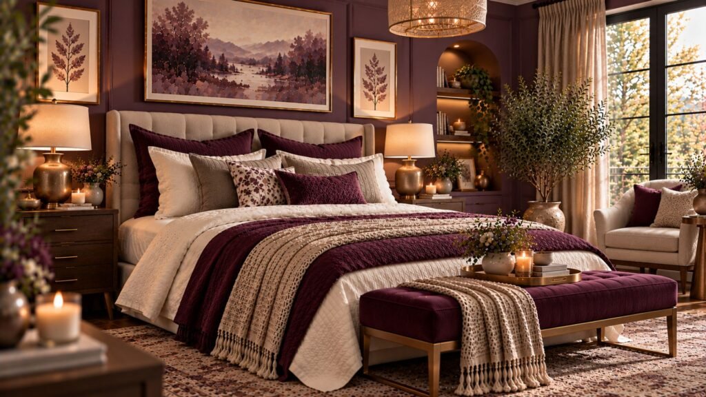
21. Cobalt blue and warm ivory for confident color
Cobalt blue offers a stronger, more energetic alternative to powder blue or navy.
Because it is visually bold, it often works best as a concentrated accent rather than covering every wall.
Try a cobalt upholstered headboard, statement artwork or painted bedside cabinet against warm-ivory walls.
Repeat the blue in one or two smaller details to make the palette feel intentional.
Try this combination: Warm ivory walls, cobalt blue upholstery, pale wood and restrained black accents.
How to choose bedroom colors based on natural light
A color that looks beautiful in one bedroom may appear very different in another.
Natural light changes throughout the day, and its direction can influence how warm, cool, bright or muted a paint shade appears.
North-facing bedrooms
In the Northern Hemisphere, north-facing bedrooms generally receive cooler, more indirect daylight.
Warm whites, peach-beiges, mushroom and gentle earth tones can help balance this appearance.
Cool colors can also work, but test them carefully under the room’s actual lighting conditions.
South-facing bedrooms
South-facing rooms in the Northern Hemisphere may receive stronger direct daylight.
This can make certain shades appear brighter or warmer.
Muted blues, greens and richer neutrals can work well, but highly saturated colors may appear more intense during sunny periods.
East-facing bedrooms
East-facing bedrooms often receive stronger morning sunlight and softer light later in the day.
A paint shade that appears bright in the morning may look considerably different in the evening.
Test your samples at both times, particularly if you mainly use the bedroom after sunset.
West-facing bedrooms
West-facing rooms may receive stronger afternoon and evening sunlight.
Warm colors can become more pronounced during those hours.
Check how the palette looks before and after sunset rather than relying on one daytime observation.
These are general tendencies for the Northern Hemisphere. Actual conditions depend on latitude, season, window placement and surrounding buildings.
How to match bedroom colors with furniture
Before selecting wall paint, identify the furniture and flooring you plan to keep.
These finishes form part of the palette even if you aren’t changing them.
Light oak: Pairs well with powder blue, sage, warm white, muted peach and mushroom.
Walnut: Complements deep teal, terracotta, burgundy, olive and slate blue.
Dark wood: Creates attractive contrast with cream, dusty rose, lavender and lighter neutrals.
Cream upholstery: Works with many colors, but its undertone should be checked against the wall paint.
Black furniture: Can look striking against warm beige, ivory, pale blue and mushroom.
Treat these as starting points rather than strict rules. The actual undertones of your furniture are more important than their general color names.
How many colors should a bedroom have?
Most bedrooms benefit from a clear visual hierarchy rather than a fixed number of colors.
A practical approach is to choose one dominant shade, one supporting shade and a smaller accent.
For example, a slate blue bedroom could have blue walls, ivory bedding and rust-colored cushions, with walnut furniture providing natural warmth.
You can also build a bedroom around several variations of one color. A neutral palette might combine warm white, cream, oatmeal, mushroom and taupe without a conventional accent color.
The goal is balance, not mathematical precision.
Should you paint a small bedroom dark or light?
Both approaches can work.
Light colors often reflect more available light and make boundaries appear less visually pronounced. Dark colors can create depth, intimacy and a stronger architectural identity.
The better choice depends on the atmosphere you prefer and how much natural and artificial light the room receives.
Furniture proportions, storage and circulation also affect how spacious a bedroom feels. Paint alone cannot compensate for an overcrowded layout.
For additional practical ideas, explore our small bedroom ideas guide.
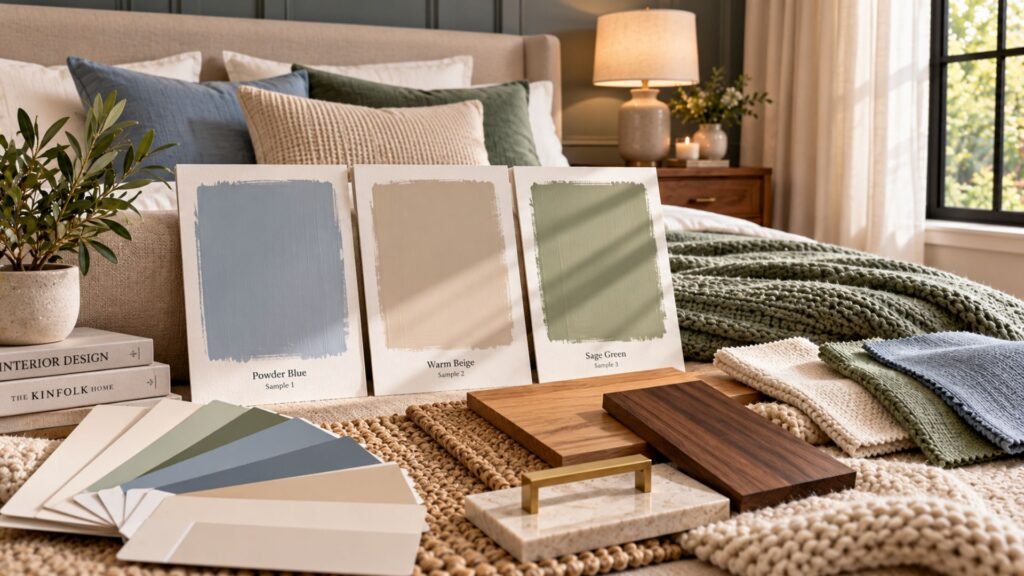
How to test bedroom paint colors before committing
A small paint chip rarely gives you enough information to choose confidently.
Use this process instead.
- Shortlist three shades. Include colors with noticeably different undertones rather than three nearly identical options.
- Create large samples. Follow the paint manufacturer’s recommendations or use movable sample boards.
- Compare samples beside existing finishes. Position them near flooring, curtains and upholstery.
- Observe the colors throughout the day. Check morning, afternoon and evening light.
- Turn on your bedroom lamps. Artificial lighting can significantly change color appearance.
- Make the final decision inside the room. Online photographs and digital color previews are useful for inspiration but cannot reliably reproduce the exact finish.
If you are considering a dark or saturated color, test it in more than one position where practical. Different walls can receive different amounts of light.
Common bedroom color mistakes
Choosing paint from an online photograph alone
Photography, editing and screen settings can alter color appearance.
Use photographs for inspiration, then evaluate real samples in your own room.
Ignoring flooring undertones
Warm oak, cool gray tile and reddish timber can influence how wall colors appear.
Compare the entire combination before committing.
Matching every surface too closely
A bedroom where the walls, bedding, curtains and rug are almost identical may lack visual definition.
Introduce subtle tonal differences, texture or a small amount of contrast.
Relying on one light source
A palette that looks attractive during the day may feel harsh or flat under unsuitable evening lighting.
Combine general lighting with softer bedside or accent lighting.
Adding too many competing accents
Strong colors need hierarchy.
Choose which color should lead and allow the others to support it.
Frequently asked questions
What is the most relaxing color for a bedroom?
There is no universally relaxing bedroom color. Muted blues, greens and warm neutrals are popular choices, but personal preference, lighting and the overall room design matter more than any single shade.
What bedroom colors are timeless?
Warm white, cream, beige, muted blue, soft green and many earth tones have lasting appeal because they combine easily with different furniture and materials.
Are dark bedroom colors a good idea?
Yes. Navy, charcoal, chocolate brown, forest green and plum can create beautiful bedrooms. Balance them with suitable lighting, contrasting textiles and complementary finishes.
What colors make a bedroom look luxurious?
No particular color guarantees a luxurious result. Cohesive palettes, considered furniture proportions, layered lighting and well-chosen materials generally matter more than the wall color alone.
Can you use two wall colors in a bedroom?
Yes. Two colors can work well when they have a clear relationship. A darker headboard wall paired with lighter surrounding walls is one option, although the contrast should complement the furniture and architecture.
Should bedroom ceilings match the walls?
They can. Matching walls and ceilings creates a more continuous appearance, while a contrasting ceiling introduces visual separation. Consider ceiling height, lighting and your preferred atmosphere.
Is gray still a good bedroom color?
Yes. Warm grays and mushroom tones can feel inviting, while cooler grays create a crisper appearance. Check undertones carefully against flooring and upholstery.
Choose a bedroom palette that feels right for your space
The best bedroom color ideas aren’t simply attractive combinations. They’re palettes that make sense with the room’s natural light, furniture, materials and the atmosphere you want to create.
Use the Wallsaide Bedroom Color Compass to evaluate light, undertone, contrast and material before committing.
Whether you prefer powder blue, earthy terracotta, rich chocolate brown or dramatic plum, a considered palette will help your bedroom feel cohesive, comfortable and distinctly yours.
References
- Sherwin-Williams — Color Advice https://www.sherwin-williams.com/homeowners/color/color-advice
- Benjamin Moore — Color Inspiration https://www.benjaminmoore.com/en-us/color-overview/color-inspiration
- Farrow & Ball — Inspiration https://www.farrow-ball.com/inspiration
About the author
Emma Carter writes about interior color, home décor, and practical styling for Wallsaide. She focuses on helping readers combine colors, materials, textiles, and decorative elements into rooms that feel balanced and cohesive.