
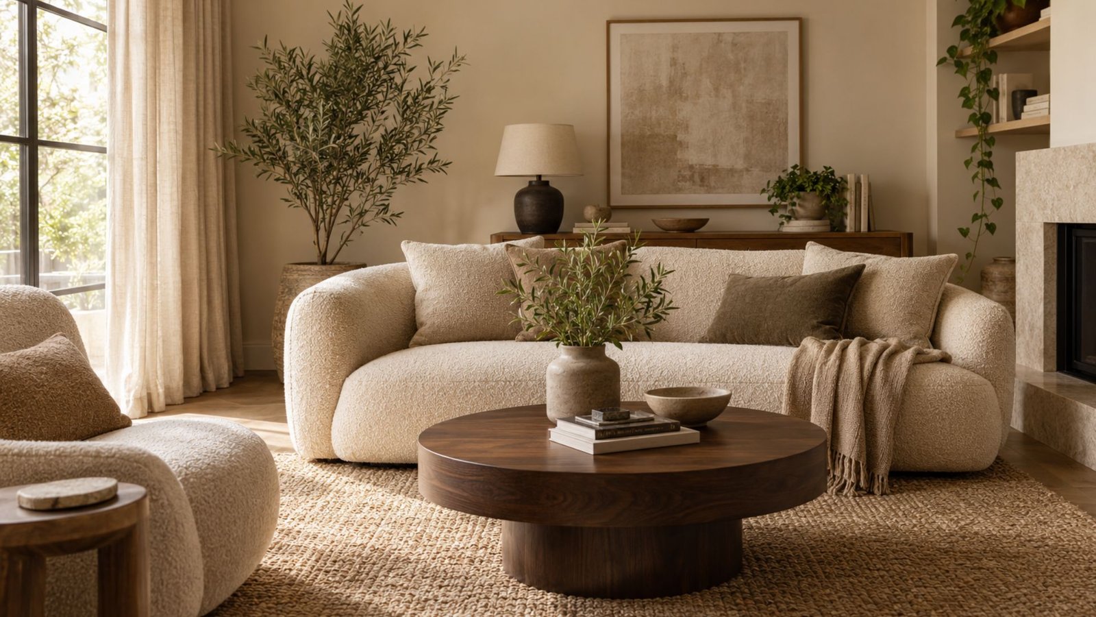

Beige has picked up an unflattering reputation in recent design conversation, with “sad beige” becoming shorthand for interiors that feel overly uniform or stripped of personality. But beige itself isn’t necessarily the problem. A room where the walls, upholstery, rug, and accessories all sit at nearly the same value and texture can feel flat; give those surfaces clearer separation, material variation, and deliberate contrast, and beige becomes a much more flexible foundation.
These beige living room ideas show four directions to consider, followed by a Wallsaide diagnostic for working out what an existing beige room may be missing.
Beige living room ideas: 4 directions to start from
These beige-specific directions build on Wallsaide’s broader living room ideas framework, with the focus here narrowed to color, material, and contrast.
Warm beige with natural wood
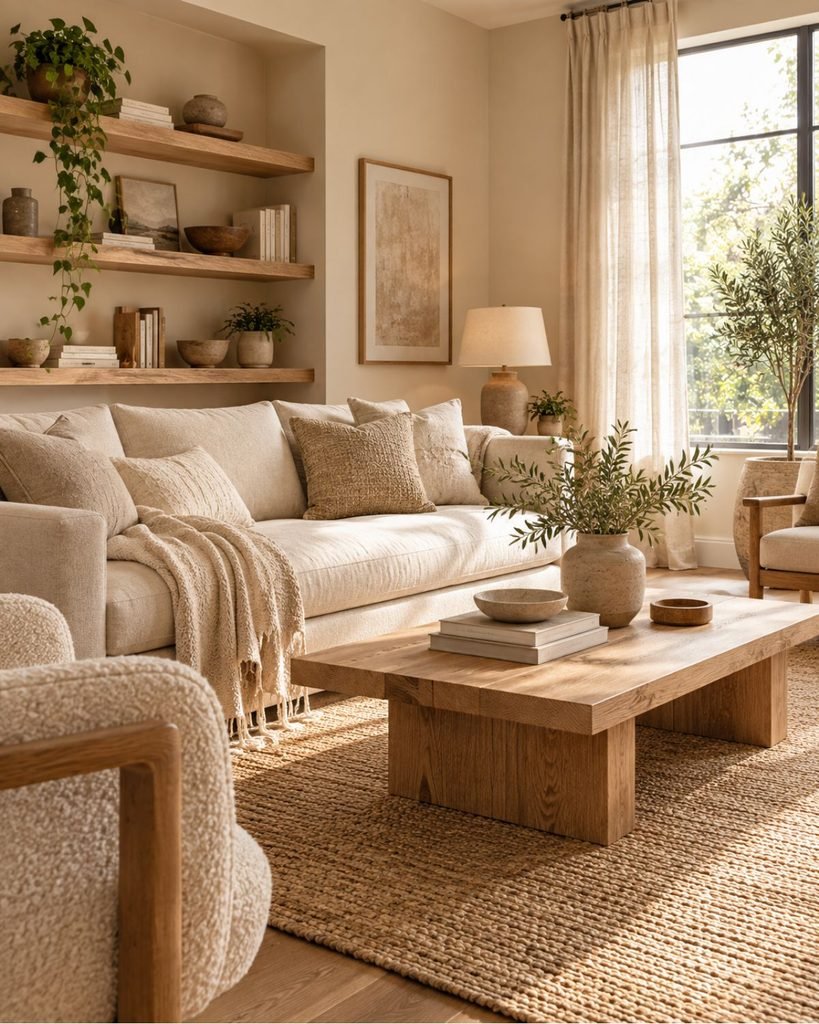
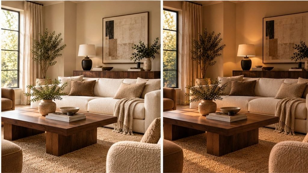
Warm beige and natural wood can be an easy combination to build around. Beige living room ideas that use visible wood grain gain another source of material variation, while shared warm undertones can help the finishes relate naturally.
Tonal, monochromatic beige
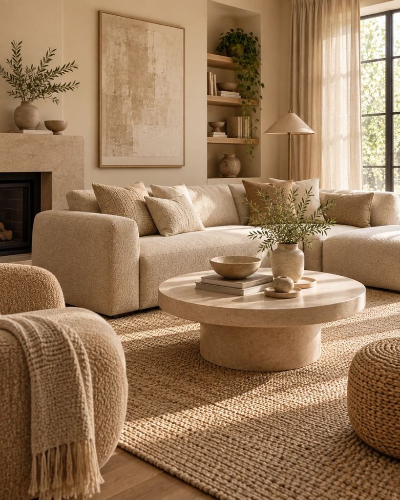
Staying within one beige family but varying value and texture rather than color creates a softer, more tonal look. It depends heavily on genuine material variation to avoid reading as flat; without that variation, the walls, upholstery, textiles, and flooring can begin to merge visually.
Beige with dark wood contrast
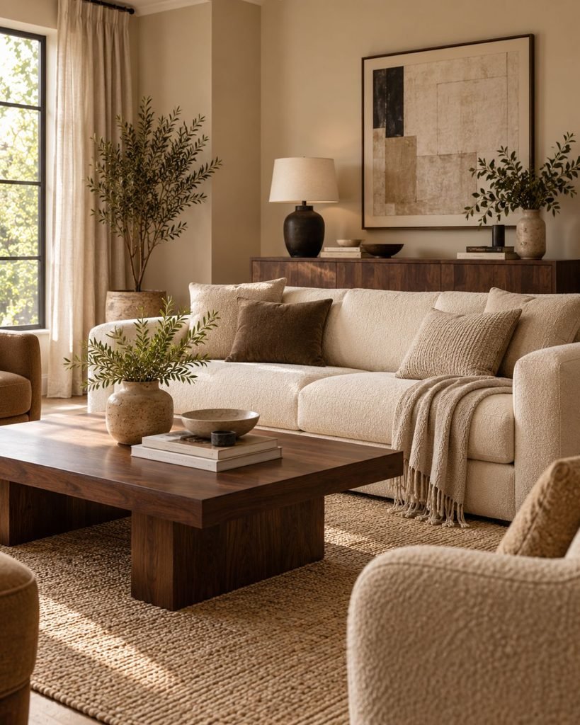
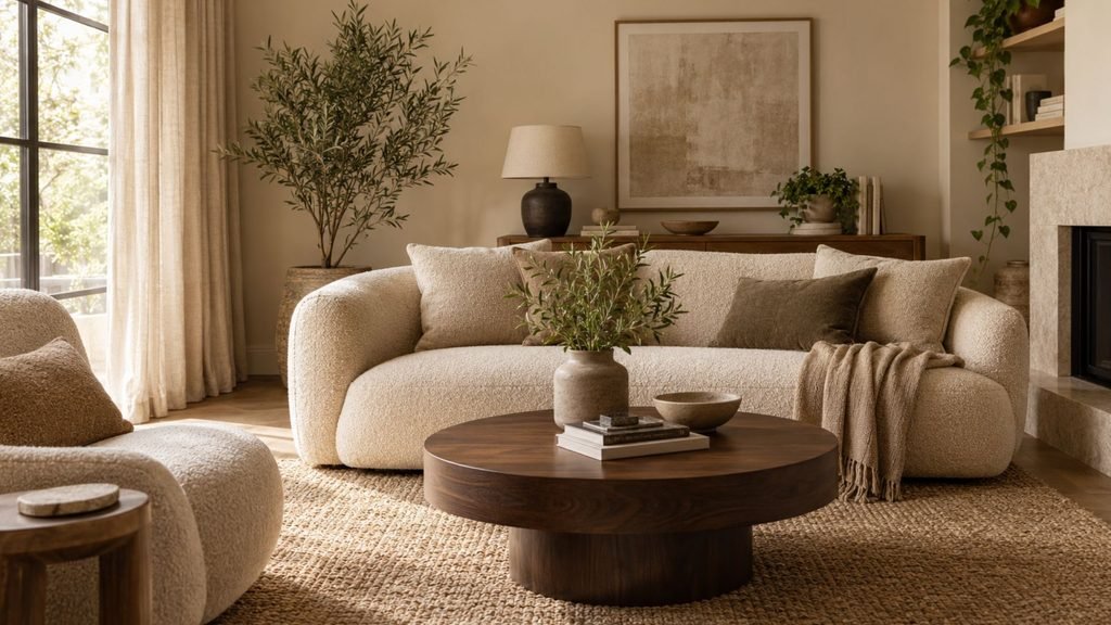
Pairing soft beige upholstery with a substantial dark wood piece, such as a sideboard or coffee table, gives the eye a clear anchor point. It can make an otherwise pale room feel more deliberate without requiring a painted accent color.
Contemporary beige
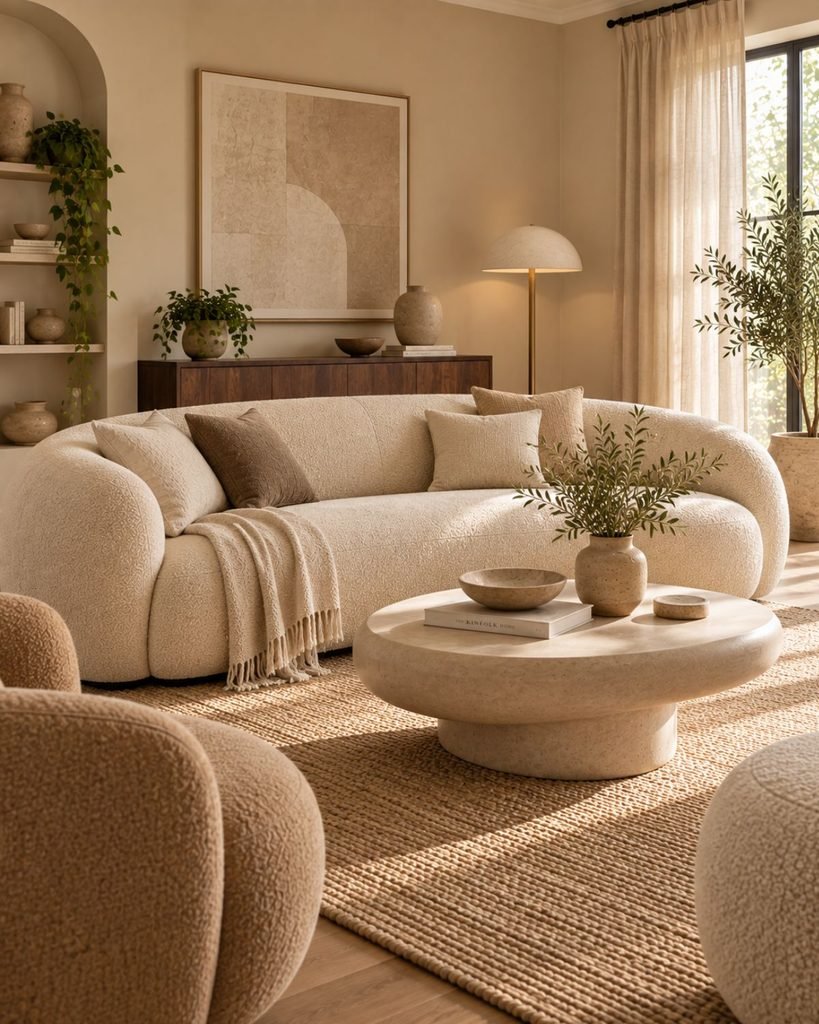
Curved or sculptural furniture can give beige a more contemporary expression because the silhouette adds visual interest without introducing another color. Straighter or more traditional furniture can work just as well when that character is intentional, so the goal isn’t to replace every boxy sofa with a curved one.
The Wallsaide Beige Balance Check
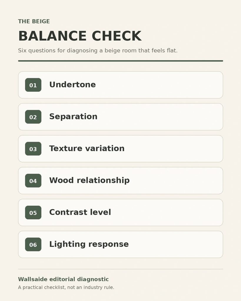
A beige room that already feels flat usually isn’t just a color problem. Before repainting or replacing furniture, it’s worth looking at six parts of the room together. This is Wallsaide’s own editorial diagnostic, not an industry standard:
- Undertone. Is the beige warm or cooler-leaning, and does it work with the room’s light and existing materials, or was it chosen from a small sample without checking either?
- Separation. Do the walls, sofa, and rug sit at genuinely different values, or do they blur into roughly one surface from across the room?
- Texture variation. Do the major surfaces offer visibly different material qualities, such as linen, wool, wood, stone, or bouclé, or does nearly everything have the same visual finish?
- Wood relationship. Does the visible wood in the room echo the beige’s undertone or contrast it intentionally, rather than looking accidentally disconnected?
- Contrast level. Does the room have enough contrast to make its major surfaces and forms distinct, or is the low-contrast effect a deliberate part of the design?
- Lighting response. Has the beige actually been looked at under the room’s evening lighting, not just daylight?
If several of these checks reveal the same problem, start there before assuming the entire palette needs replacing.
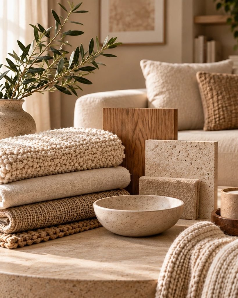
Texture is doing more work than color here
Since the colors in a tonal beige room sit relatively close together, texture can provide much of the visual distinction. A bouclé sofa, smooth linen curtain, nubby wool rug, and stone or ceramic accessory each interact with light differently, even when their colors are closely related.
That material variation helps individual surfaces retain their character instead of merging into one continuous beige field.
Furniture silhouette is one contributing factor, not the whole story
Furniture silhouette contributes to how current or traditional a beige room feels, but it isn’t the only factor. Finishes, proportions, materials, and overall styling all play a part.
A curved or sculptural piece can introduce a more contemporary character, while a straighter or more traditional silhouette can look equally intentional when it works with the rest of the room.
A note on contrast, and choosing not to use it
Not every beige room needs a black accent or dark wood piece. A fully tonal, softly monochromatic room can be a deliberate choice rather than a missed opportunity for contrast.
The distinction is whether that softness looks intentional, supported by tonal separation and material variation, or whether the major surfaces simply disappear into one another.
A black frame, dark wood piece, or muted earthy accent can provide definition, but this article isn’t intended to catalog every color that can be paired with beige. The more important decision here is how much contrast the room actually needs.
Beige under different lighting
Beige can look noticeably different as the light changes through the day. Warm artificial light can strengthen yellow or golden undertones, while a different bulb temperature may make the same beige read cooler or duller than expected.
This is why a beige that looks balanced in daylight should also be checked under the lighting you actually use in the evening. Wallsaide’s complete guide to interior color ideas explains the broader testing method.
Flat beige vs. balanced beige
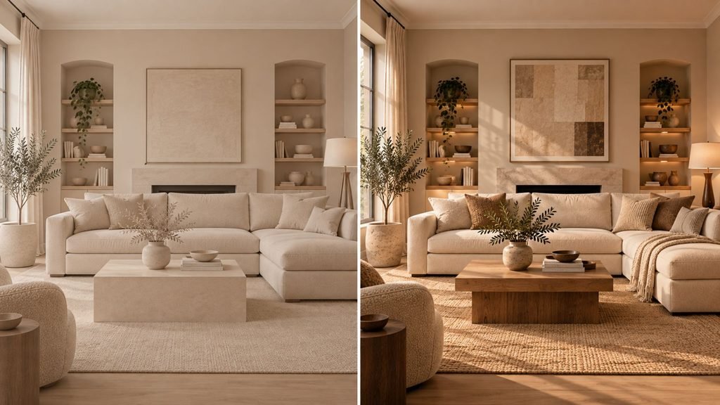
Beige living room ideas become easier to evaluate when the same basic room is compared with and without clear tonal separation, material variation, and deliberate contrast.
The comparison captures the central idea: beige itself doesn’t need to disappear from the room. What changes is the relationship between the surfaces around it.
Clearer tonal separation, visible material differences, natural wood grain, and considered contrast can give individual elements more definition while keeping the overall palette restrained.
Beige living room mistakes
Some beige rooms feel unfinished because several small decisions are working against one another rather than because beige itself is the wrong choice. Common problems include:
- Using one beige tone on walls, sofa, and rug alike, with little value separation between them.
- Choosing a beige from a small paint chip without checking it under the room’s actual evening light.
- Relying on one visual texture across most surfaces, leaving little material variation for the eye to register.
- Mixing undertones without checking the relationship between them, so the beige, wood, and metal finishes look accidentally disconnected rather than intentionally contrasted.
- Choosing furniture, finishes, and styling that all point strongly to one earlier design period without considering how they interact with the room’s palette and materials.
None of these automatically requires starting over. Often, identifying the specific relationship that feels unresolved is more useful than replacing the entire palette.
Where this leaves you
Beige living room ideas become easier to evaluate when the same basic room is compared with and without clear tonal separation, material variation, and deliberate contrast.
If the problem extends beyond beige and into the broader structure of a restrained palette, our guide to neutral living room ideas explains how to layer a neutral room from the ground up.
Beige living room ideas FAQ
Why does my beige living room look dated?
Beige itself may not be the reason. A room can feel dated when its furniture silhouettes, finishes, and styling all point strongly to an earlier design period, especially when the palette also lacks material and tonal variation. Updating one or two shapes, textures, or contrast points may have more impact than replacing beige altogether.
How do you make a beige living room feel warm instead of flat?
Create clear tonal separation between major surfaces, vary the materials and textures, and use enough contrast to keep important forms distinct. A darker wood piece or small dark accent can help, but a deliberately tonal room can work without one. The Wallsaide Beige Balance Check above helps identify which part of the room needs attention.
Does beige work in a room with limited natural light?
Yes, but the specific beige matters. A room with cool or limited daylight can change how its undertones appear, so test the color on a larger sample in the actual space and check it during both daytime and evening. Rather than assuming every low-light room needs the same type of beige, choose the shade that works with the room’s light and fixed finishes.
Is beige still a good choice for a modern living room?
Yes. Beige can work well in a modern living room when the overall design feels intentional. Furniture shape, material variation, wood tones, lighting, and contrast influence the result as much as the beige itself. A restrained beige palette can therefore feel contemporary without relying on trend-driven colors.
How do you keep a beige living room from looking too yellow?
Start by checking the beige’s undertone under the room’s actual daylight and evening lighting. Warm artificial light can emphasize yellow or golden undertones, while surrounding wood, flooring, and textiles can also affect how the color is perceived. Test a larger sample in the room before committing, and compare it directly with the fixed finishes that will remain.
About the author
Emma Carter writes about color, materials, textiles, and styling for Wallsaide. Her work focuses on how texture, tone, and small deliberate details come together to make a room feel finished rather than simply decorated.