


Learn how to use cream with the right whites, lighting, materials, and contrast so your living room feels warm and defined.
Cream living room ideas work best when the cream is judged alongside the colors, materials, and light around it. A cream that looks soft beside warm wood can look noticeably more yellow beside bright white trim. One that looks fresh at midday can feel heavier under warm evening light.
The key is to judge cream in context. A cream living room succeeds largely because of what surrounds the cream: nearby whites, changing light, wood and stone, and the darker elements that give the room definition.
Below are four directions you can recreate with ordinary materials, followed by a simple four-part check for judging cream in your own room. They sit within Wallsaide’s broader living room ideas, with this guide focused specifically on cream.
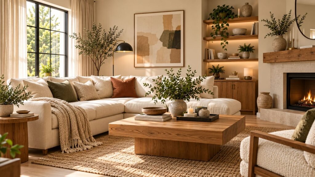
Cream, ivory, off-white, and beige: what actually differs
These names overlap, and manufacturers do not use them as perfectly standardized categories. One brand’s ivory can resemble another’s cream, so the physical color matters more than the name printed on the sample.
As a practical design guide:
| Name | How it usually reads | What to check |
|---|---|---|
| Cream | Clearly warm, often with a noticeable yellow lean | Compare it with your trim and view it under evening lighting |
| Ivory | Usually softer and more muted than a pronounced cream | Place it beside a clearer white to reveal its warmth |
| Off-white | A broad family that can lean warm or cool | Judge the specific paint or fabric rather than relying on the name |
| Beige | Usually carries more gray or brown depth and reads earthier | Check whether it sits too close in value to nearby wood or upholstery |
Beige has its own design decisions, covered in our guide to beige living room ideas. Cream and beige can share a room, but they are easier to distinguish when their values or textures are visibly different.
If you are building a broader palette from several pale neutrals, our neutral living room ideas guide covers that layering in more detail.
Cream living room ideas: 4 directions to recreate
The strongest cream rooms do more than fill every surface with approximately the same pale neutral. They establish relationships between cream and the materials around it.
These four combinations offer different ways to do that. Think of each as a formula rather than a shopping list.
Tonal cream and off-white with aged brass
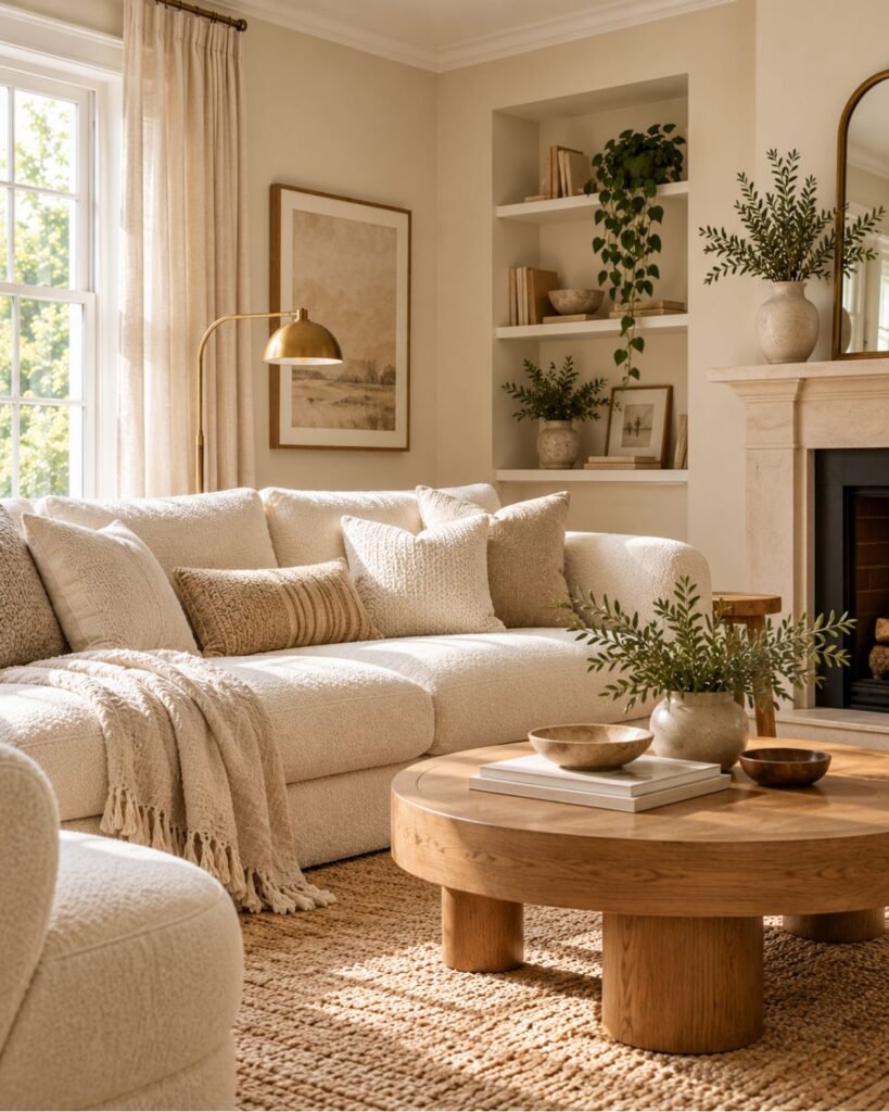
This direction stays within one warm family and lets texture create separation. Think cream walls, an off-white bouclé or linen sofa, a slightly deeper rug, soft curtains, and aged rather than highly polished brass.
The important distinction is subtle variation. If every surface is identical in both color and texture, the room loses definition.
There is also a risk of undertone drift. If the walls lean strongly yellow while the sofa appears distinctly cooler, the scheme can look accidental rather than intentionally tonal. Compare the largest cream and off-white surfaces together before committing.
Recreate it: cream walls + lighter off-white upholstery + deeper cream rug + aged brass + varied natural textures.
Cream, medium oak, and black
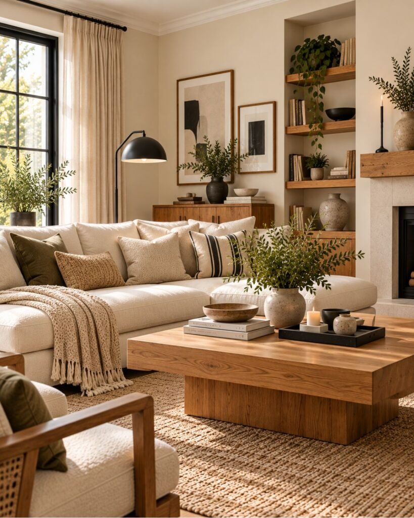
A few black elements give cream clear edges. That sharper contrast is one reason cream, oak, and black can read more contemporary than a completely tonal cream scheme.
Try cream walls and upholstery with a medium-toned oak coffee table or shelving, then repeat black sparingly through a lamp, picture frames, or another small architectural-looking detail.
The black does not need to dominate. Its job is to create definition.
Wood deserves the same scrutiny. A strongly orange oak beside a strongly yellow-leaning cream can amplify the room’s warmth, so compare the wood finish directly against the cream rather than choosing each separately.
Recreate it: cream + medium oak + two or three restrained black accents.
Cream, brown leather, and stone
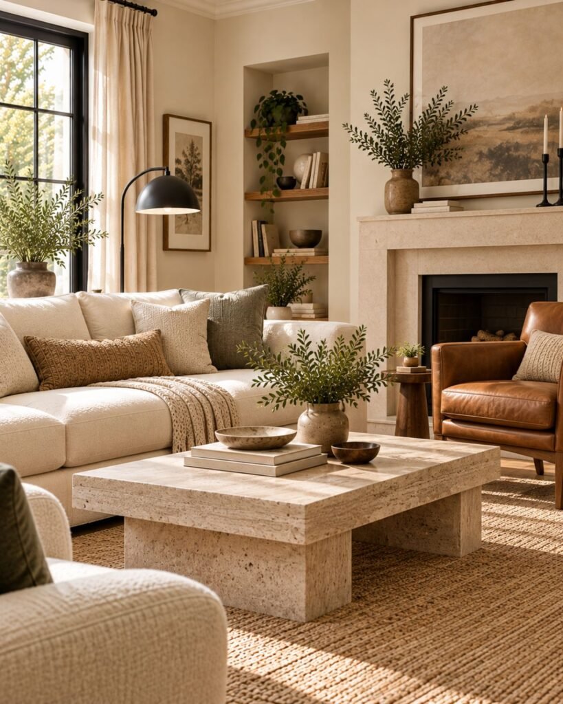
Brown gives cream deeper visual weight without requiring a dramatic change of palette, while stone can introduce a cooler or more mineral surface.
Start with cream walls or upholstery, add one cognac or chocolate leather chair, then introduce a stone or stone-look table. A small amount of dark contrast can sharpen the composition further.
The common mistake is stacking several mid-toned browns at nearly the same depth. If the leather, flooring, and timber furniture all occupy similar visual territory, the room can become muddy.
Make at least one noticeably lighter or darker than the others. Our brown living room ideas guide goes deeper into choosing and balancing brown.
Recreate it: cream + one distinct brown + stone + restrained dark contrast.
Cream with muted green
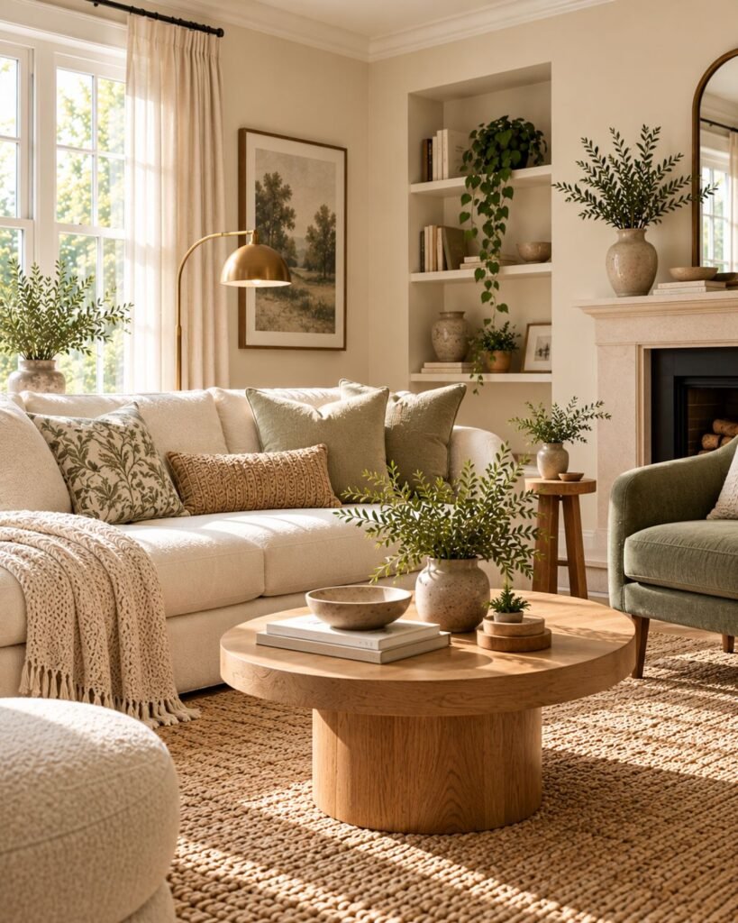
A restrained green introduces a second hue without overwhelming cream. An olive or gray-green armchair, cushions, or other limited accent can provide enough separation to stop the room becoming one continuous warm field.
The green’s undertone still matters. A very pale, yellow-leaning green beside a yellow-leaning cream can merge into the same warm haze. A grayer or somewhat deeper green creates clearer distinction.
Warm wood can then connect the two sides of the palette.
Recreate it: cream + muted gray-green or olive + warm wood + natural texture.
The Wallsaide Cream Neighbor Check
The four directions look different, but they reveal the same principle: cream is judged in relation to what surrounds it.
The Wallsaide Cream Neighbor Check is our editorial framework for evaluating those relationships. It is a practical design tool, not an industry standard.
Before committing to a cream scheme, check four neighbors:
- The white neighbor: trim, ceiling, and bright white furniture. Does cream look intentionally warm beside them, or unexpectedly yellow?
- The light neighbor: daylight and the lamps used after dark. Does the cream still work under both?
- The material neighbor: wood, stone, and metal. Do their undertones create useful separation or simply amplify the cream’s warmth?
- The dark neighbor: is there anything clearly darker that gives the room definition?
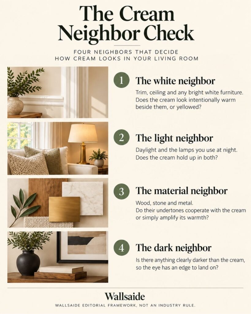
These four checks explain many of the differences between a cream room that feels layered and one that looks yellow, muddy, or flat.
The white neighbor
A cream appears warmer when a whiter surface sits beside it. That difference can make the cream look deliberate, or it can expose more yellow than you expected.
Bright white trim creates the strongest comparison. A softer off-white reduces the gap between wall and trim and can produce a gentler transition.
That does not mean bright white and cream cannot work together. It means you should see the actual colors together before deciding.
Place your cream sample directly beside the existing trim in the room. Judge the relationship in the room itself rather than from two separate swatches.
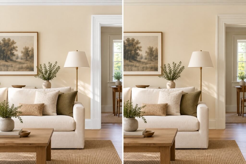
The same cream, beside two different whites.
The light neighbor
Cream can change noticeably as the room’s light changes because lighting affects how undertones appear. Natural light, room orientation, artificial light, and bulb characteristics can all alter how a wall color is perceived. Sherwin-Williams specifically recommends considering both natural and artificial lighting when evaluating undertones.
That makes a midday decision insufficient. A cream that looks balanced during the day deserves another inspection after the lamps come on.
C2 Paint recommends testing samples on multiple walls, observing them through different times and lighting conditions, and comparing them with materials such as flooring, wood, tile, and fabrics.
For cream, add one particularly useful comparison: place the sample beside your existing trim and flooring. Those large neighboring surfaces will remain after the walls are painted.
Our complete guide to interior color ideas covers the broader color-selection process.
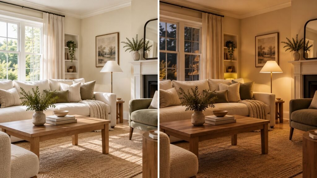
The same cream in daylight and under evening lamps.
The material neighbor
Wood, stone, and metal can change how cream reads because they introduce their own color and temperature relationships.
A honey- or orange-leaning wood beside a yellow-leaning cream can push the entire room warmer. A less orange wood or cooler-looking stone creates more separation instead.
Neither approach is inherently better. The decision depends on whether you want a tonal room or a room with more visible contrast.
Metals provide another lever. Aged brass can continue cream’s warmth, while black or cooler-looking metal creates a stronger break.
The useful question is not simply, “Does brass go with cream?” It is, “Does this room need more warmth or more separation?”
The dark neighbor
An all-cream room can be deliberate and sophisticated, but pale surfaces alone do not automatically create depth.
Without a darker element, the eye may have few clear edges to follow. A black frame, darker lamp, leather chair, dark rug border, or another restrained accent can provide that definition.
You do not need to scatter black throughout the entire room. One or two purposeful dark elements may be enough.
Texture performs a different job. Bouclé, linen, wool, timber, woven fibers, and stone interact with light differently, helping similarly colored surfaces remain distinguishable.
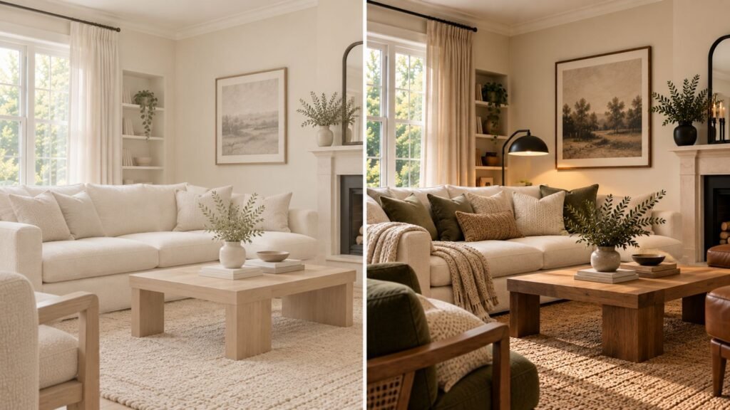
The same cream palette, with contrast and texture used to create clearer definition.
Cream on walls, upholstery, and accents
Where you use cream changes how carefully you need to test it.
On walls, cream occupies a large visual area and sits directly beside trim, flooring, doors, and ceilings. It also changes appearance as light moves across the room. This is where physical sampling matters most.
On upholstery, texture becomes more visible. A cream bouclé chair and a smooth cream cotton sofa can appear different even when their base colors are similar because their surfaces handle light differently.
On accents, cream is relatively low commitment. Cushions, throws, lampshades, and smaller textiles let you test how a warmer pale neutral interacts with the room before investing in a sofa or repainting the walls.
If you are unsure about cream, start small and observe the relationships before increasing its visual weight.
Cream in a small or low-light living room
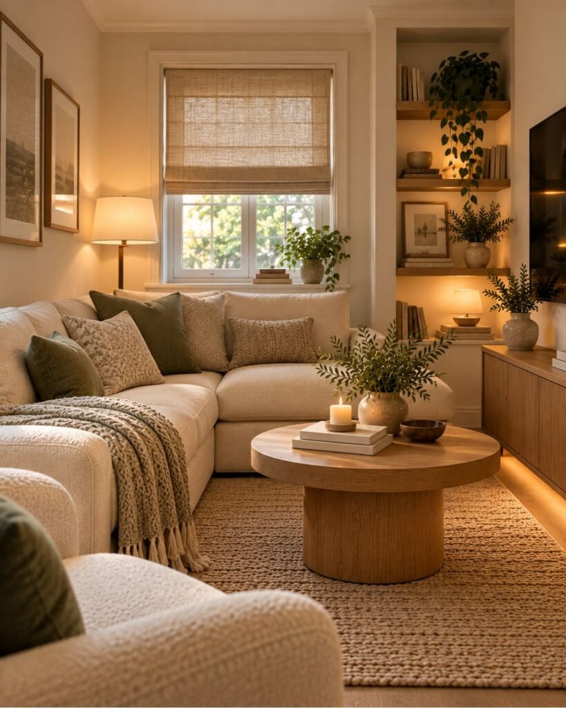
Cream living room ideas for small spaces still depend on good furniture scale, layout, and circulation. Pale color can support the room, but it cannot compensate for oversized furniture or a poor layout.
In a room with modest daylight, test the cream where the light is weakest rather than only beside the brightest window. A shade that looks fresh in the best-lit corner may appear noticeably warmer or flatter elsewhere.
A slightly lighter ceiling can create additional visual separation from cream walls, while a darker accent gives the eye a defined reference point.
For the furniture and layout decisions that matter independently of color, see our small living room ideas guide.
Where this leaves you
The most successful cream living room ideas start by treating cream as part of a relationship, not as an isolated swatch.
Look at its neighbors: the white beside it, the daylight and lamps around it, the wood and stone underneath it, and the darker elements that give the room definition.
Then choose the direction.
For a soft tonal room, separate similar creams through value and texture. For a more contemporary result, introduce oak and restrained black. For greater depth, use brown leather and stone. For a quiet second hue, bring in muted green.
The principle stays the same: test the cream against its neighbors first, and buy or paint the largest surfaces second.
Cream living room ideas FAQs
Is cream warmer than beige?
Cream often reads brighter and more yellow, while beige commonly carries more gray or brown depth. These are not perfectly standardized color categories, however, so actual paint and fabric samples are more useful than names alone.
Does cream always have a yellow undertone?
Cream generally refers to a warm pale neutral with some yellow character, but the amount varies considerably between products. One cream may appear softly warm while another looks distinctly golden, especially beside a clearer white.
Can cream and white work together?
Yes. The important question is whether the difference looks deliberate. Compare the cream directly against your existing white trim or furniture before committing, because a clearer white can make cream’s warmth much more visible.
How do you keep a cream living room from looking bland?
Create definition through contrast and texture. One darker element can give the eye an edge, while materials such as linen, bouclé, wool, timber, stone, and woven fibers help similarly colored surfaces remain visually distinct.
How should cream paint be tested?
Test a substantial sample in the actual room, preferably in more than one position. Observe it during the day and under the artificial lighting you normally use, then compare it directly with trim, flooring, wood, stone, and major furniture.
References
- Sherwin-Williams — What’s in a Color? Understanding Paint Undertones.
- C2 Paint — How to Properly Test Paint Color Samples for Picture-Perfect Results
About the author
Emma Carter writes about interior color, home décor, and practical styling for Wallsaide. She focuses on helping readers combine colors, materials, textiles, and decorative elements into rooms that feel balanced and cohesive.