


This guide helps you decide whether white is your room’s backdrop or its whole palette, and what each choice needs to avoid feeling cold or flat.
White living room ideas can look deceptively simple. In practice, white’s undertone and character become much clearer in relation to the surfaces around it. How the room reads depends heavily on the white’s temperature, the amount of contrast around it, and the materials and textures breaking up pale surfaces.
Start with one decision: is white going to sit behind the room’s other materials, or is white going to become the palette itself? Those are different design problems and need different solutions.

White, off-white, cream, and ivory: enough to tell them apart
These names are not standardized, and two products both marketed as white can look noticeably different beside each other.
As a practical guide, white is the broadest label. Off-white usually describes a white with a more noticeable underlying tint, while cream and ivory are commonly used for warmer, yellow-leaning variations. Because manufacturers use these terms differently, compare actual samples rather than relying on the product name.
Cream’s particular relationship with yellow undertones and neighboring colors is a separate design problem. Our cream living room guide covers that in depth.
WWhite living room ideas have a different challenge: undertones can be subtle until you compare them with nearby surfaces, so the result depends heavily on what’s next to the white.
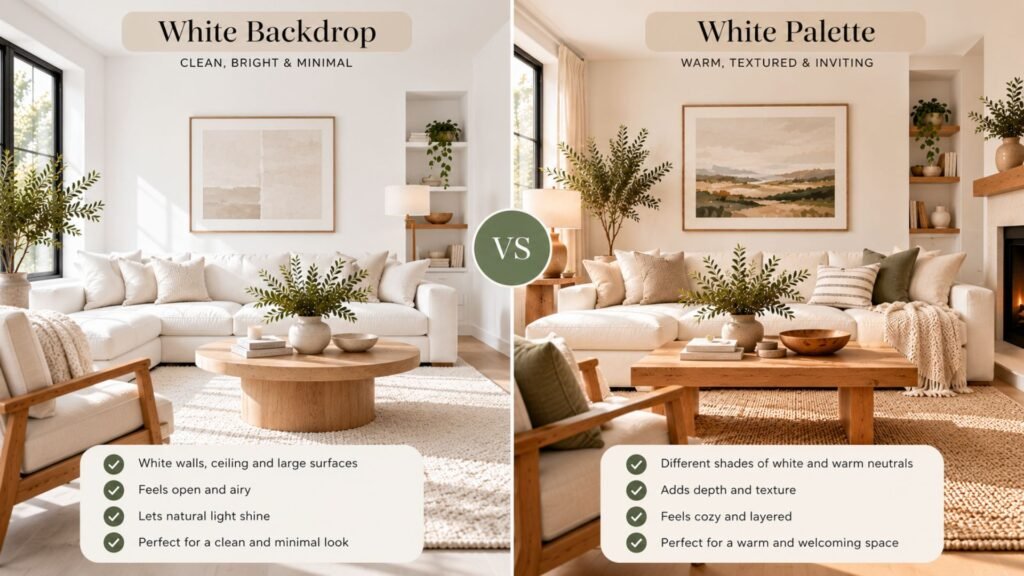
White as backdrop, or white as palette
White as backdrop means the walls and ceiling stay white while wood, color, art, stone, textiles, and darker furniture provide most of the room’s definition. White recedes, allowing those materials to establish the character of the space.
White as palette means the walls, sofa, rug, curtains, and other large surfaces remain white or very pale. Separation then has to come from somewhere other than obvious color differences: texture, sheen, material, shadow, and subtle changes in value become much more important.
Neither approach is inherently better. A backdrop gives wood, furniture, art, and color more responsibility for defining the room. A white-as-palette scheme asks subtle differences in texture, sheen, material, and value to create that separation instead.
Warm white and cool white
A white paint’s undertone can change how it relates to the rest of the room, even when the difference looks minor on a small sample.
Warm whites can carry traces of yellow, orange, or red. Cooler whites can contain blue, green, violet, or gray influences. These differences often become easier to recognize when the white is placed beside another white or a large neighboring material.
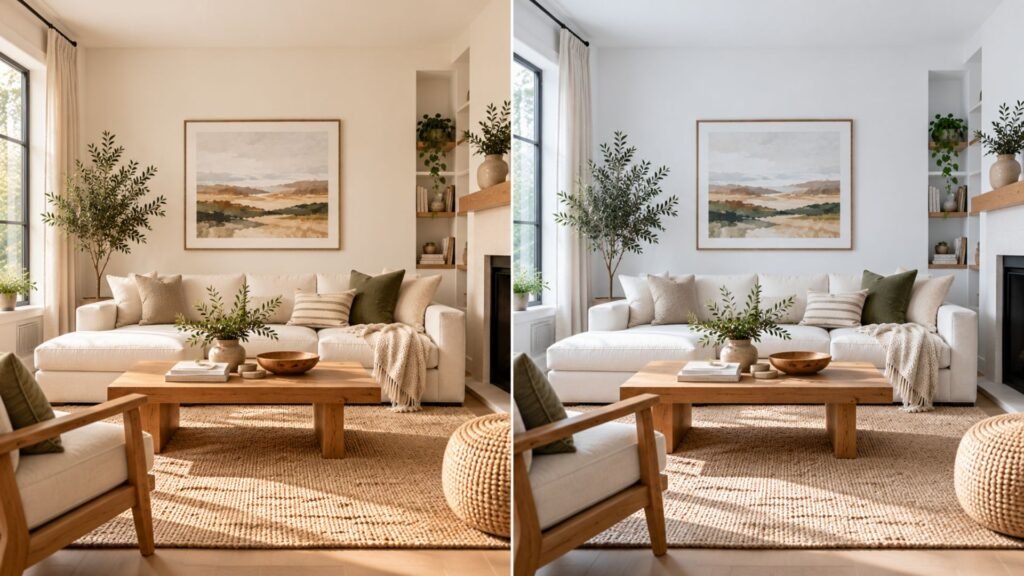
Neither undertone is universally correct. Natural and artificial light can reveal or emphasize different undertones, so test the actual white in the room and view it at several times of day before committing.
Four white living room ideas to build from
These four white living room ideas solve the same design problem differently. The first two treat white as a backdrop, while the second two make white and neighboring pale tones part of the palette itself.

Oak introduces a middle value between white walls and darker elements elsewhere in the room. Oatmeal keeps the sofa pale without making it look like another extension of the wall.
This is a forgiving direction because the materials do different jobs: white provides the background, oatmeal softens the transition, and oak establishes warmth and definition.
What can go wrong: remove the wood or another middle-value material and pale walls, upholstery, curtains, and rugs can begin to merge visually.
Backdrop: white, black, and wood
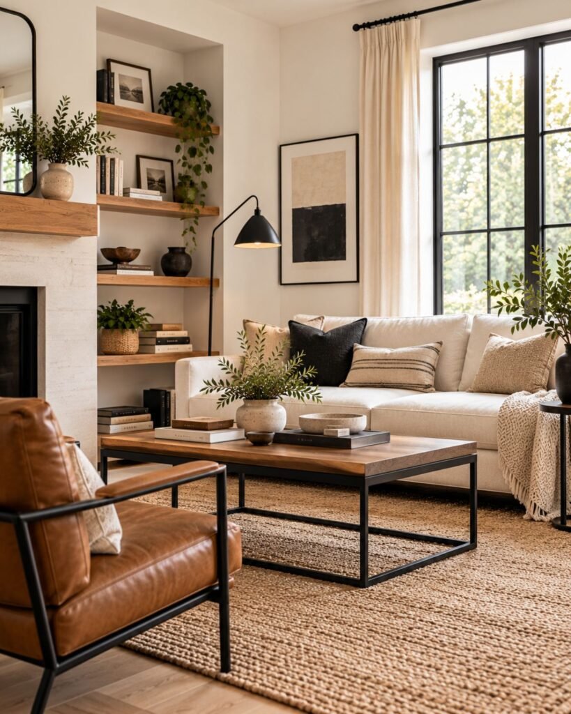
Black establishes clear edges against white, while wood introduces an intermediate value and warmer material between the two extremes.
The black doesn’t need to dominate. A coffee table, picture frames, lamp, or occasional chair can provide enough definition while allowing white to remain the background.
What can go wrong: increasing the amount of black without preserving a middle value can make the contrast feel abrupt. Wood, leather, woven fibers, or another warmer material can bridge that gap.
Palette: layered white and cream with texture

When most of the room remains pale, material differences have to replace some of the separation that stronger color would normally provide.
Bouclé, linen, wool, plaster, and woven fibers interact with light differently. That allows similarly pale surfaces to remain distinguishable instead of merging into one uniform field.
Cream can also create a visible tonal step beside white without abandoning the pale palette.
What can go wrong: if the sofa, walls, curtains, rug, and accessories are all similarly pale and similarly smooth, changing the name of each white won’t create enough separation by itself.
Palette: white-on-white with mixed sheen
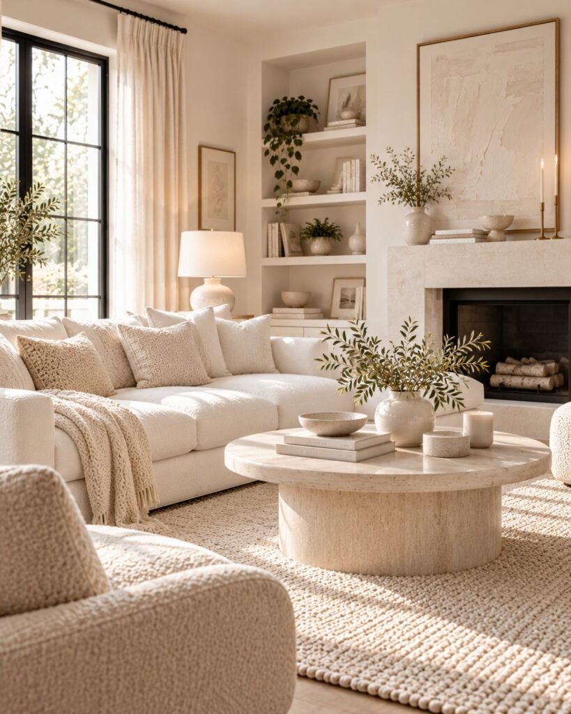
An even tighter white palette can use finish as another source of separation.
A matte wall, linen upholstery, a wool textile, and a glazed ceramic object can all respond differently to the same light despite sitting close together in color. The effect is subtle, which is exactly why material choice matters more here.
What can go wrong: an all-white room made from similarly smooth, matte surfaces gives the eye very little material variation to read.
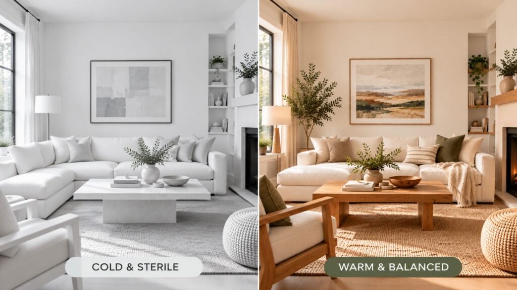
Why white living rooms go cold, sterile, flat, dingy, or stark
A disappointing white room usually doesn’t need more decoration. It needs the specific cause identified first.
- Cold: a cooler-looking white combined with predominantly cool materials and little visual warmth elsewhere.
- Sterile: too many pale, smooth surfaces with little material or textural differentiation.
- Flat: large surfaces sitting at similar values and finishes, leaving weak visual separation.
- Dingy: one white appearing warmer, grayer, or duller when directly compared with a cleaner-looking neighboring white.
- Stark: strong light-dark contrast, often white against black, without an intermediate value or material connecting them.
Watch what happens when two whites meet
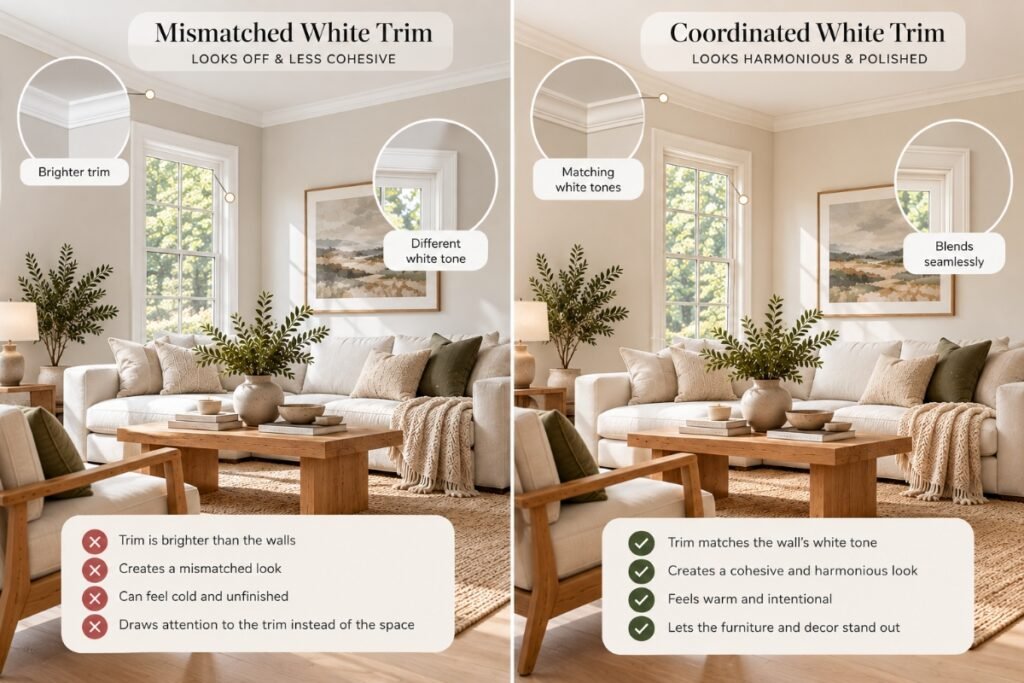
White becomes especially revealing when another white sits directly beside it.
Two paints that appear similar when viewed separately can expose their different undertones once the wall meets the trim. One can suddenly look warmer, cooler, grayer, or brighter simply because there is now a direct comparison.
That doesn’t mean walls and trim must always use the same white. It means that choosing two different whites should be deliberate rather than accidental.
Testing white before you commit
White needs careful testing because subtle undertones can become much easier to see across a large surface or beside another material.
Compare a large sample with your trim, flooring, and largest furniture pieces. Check it on more than one wall and under both daylight and your normal evening lighting before committing to the room.
Sherwin-Williams explains how paint undertones become apparent through comparison and changing light, while C2 Paint recommends testing samples across multiple walls and lighting conditions.
Our guide to interior color ideas covers the broader color-testing process.
White in a small or low-light living room
White doesn’t automatically make a small room look larger. A white surface still changes with the amount and character of light reaching it, while contrast, furniture scale, and the boundaries between surfaces also affect how the room is perceived.
In a low-light room, compare a cleaner white with a softer off-white rather than assuming the brightest-looking sample will work best. Check both under the room’s real daylight and evening lighting.
Small white living room ideas still depend on proportion. White cannot compensate for furniture that overwhelms the available floor area. Our small living room guide covers the layout and furniture-scale decisions separately.

Where this leaves you
The most successful white living room ideas start by giving white a specific job rather than treating it as a default background color. Start by deciding what job white is doing.
If white is the backdrop, let furniture, wood, art, stone, textiles, and darker details establish the room’s character.
If white is the palette, plan where separation will come from. Use changes in texture, material, sheen, shadow, and subtle value rather than expecting several nearly identical pale surfaces to distinguish themselves.
Then check the actual white against the room’s largest neighbors: trim, flooring, upholstery, and fixed materials. View those relationships in daylight and under the lighting you use at night.
Choose the white that works in the room, not the one that looks best by itself.
White living room ideas FAQs
How do you make a white living room feel warm?
Start with the white itself, then look at the materials surrounding it. A warmer-looking white combined with oak, woven fibers, warm-toned textiles, or other natural materials can shift the room away from a cooler appearance. Lighting also affects how those relationships look after daylight disappears.
What colors go with white in a living room?
There isn’t one required pairing. Warm wood and oatmeal create a softer backdrop, while black and wood provide stronger definition. Cream and off-white can create a tonal palette. Muted greens, blues, browns, and other colors can also work depending on the effect you want.
Should living room walls and trim be the same white?
They can be. Using the same white can reduce the visible color transition between wall and trim. Different whites can also work, but compare them directly first because their undertone differences often become clearer once the two surfaces meet.
Why does my white paint look gray or dingy?
Lighting and neighboring surfaces can change how a white is perceived. A white that looks balanced on its own may appear grayer, warmer, or duller when placed beside a cleaner-looking white or viewed under different light.
Does white make a small living room look bigger?
Not automatically. Wall color is only one part of how a room’s boundaries are perceived. Furniture scale, contrast, available light, sightlines, and how much visible floor remains also affect whether a compact room feels open or crowded.
Is an all-white living room practical?
It can be, but an all-white palette puts more responsibility on materials and finishes. Texture, durability, cleanability, subtle value changes, and mixed finishes become more important when strong color differences aren’t providing the room’s visual separation.
References
- Sherwin-Williams. Understanding Paint Undertones.https://blog.sherwin-williams.com/color/color-guidance/understanding-paint-undertones/
- C2 Paint. How to Properly Test Paint Color Samples for Picture-Perfect Results.
https://c2paint.com/blogs/color-confidential/how-to-properly-test-paint-color-samples-for-picture-perfect-results/
About the author
Emma Carter writes about interior color, home décor, and practical styling for Wallsaide. She focuses on helping readers combine colors, materials, textiles, and decorative elements into rooms that feel balanced and cohesive.