
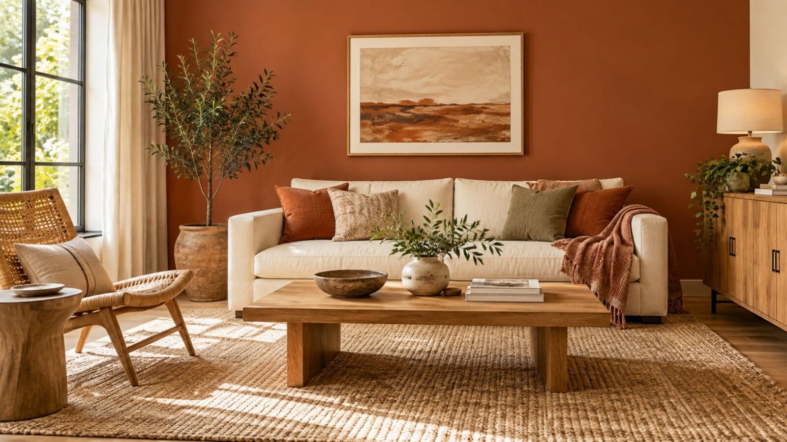

How to choose the right terracotta, decide where to use it, and build a palette that feels warm without becoming overly orange or muddy.
Terracotta living room ideas work best when you make one decision early: should the colors around the terracotta reinforce its warmth or interrupt it? Cream, warm wood, and natural materials can continue its warm character, while muted green, blue, charcoal, and black can create clearer contrast. Before choosing either direction, look at the specific terracotta in front of you. The name covers a surprisingly broad range of muted orange-browns, so the actual sample matters more than the label.
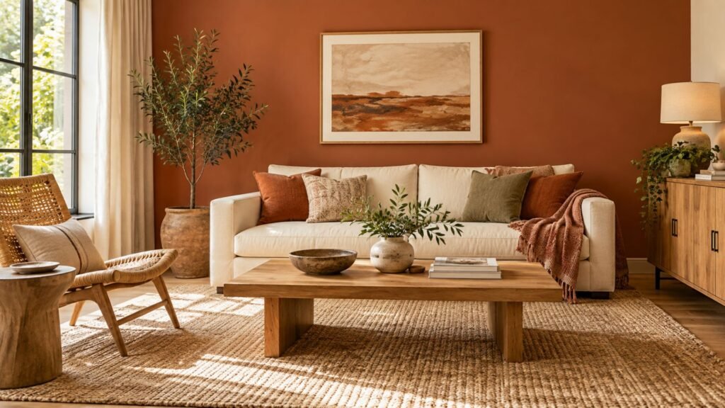
The simplest approach is to identify the specific version of terracotta first, then decide what the surrounding palette needs to do. A muted, clay-like terracotta and a stronger orange-red terracotta may carry the same retail label but need very different amounts of contrast.
Terracotta, rust, burnt orange, and clay: what actually differs
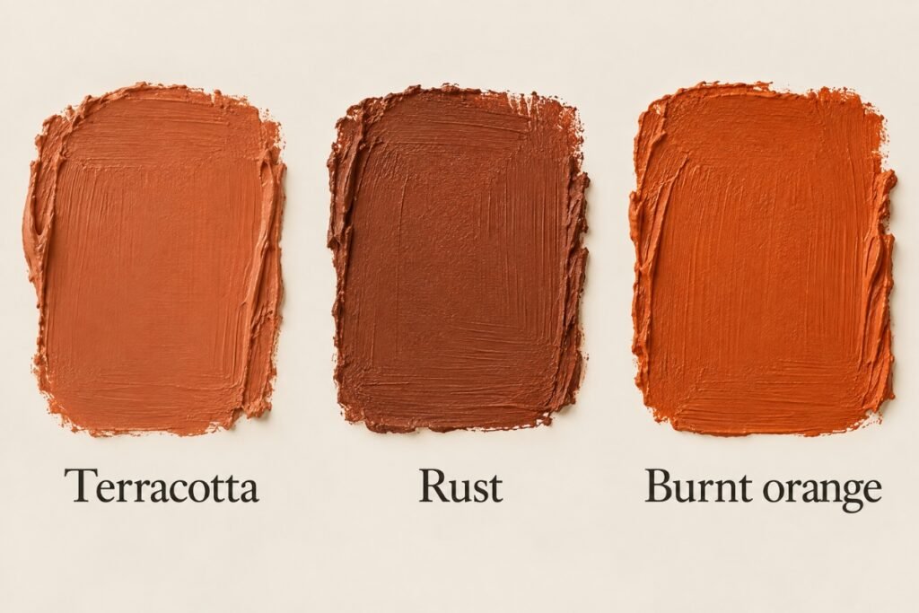
Terracotta, rust, burnt orange, and clay overlap enough that their names can be misleading. They are descriptive color terms rather than universally standardized categories, so one manufacturer’s terracotta may resemble another retailer’s rust or clay.
As a practical distinction:
- Terracotta usually describes a muted orange-brown associated with fired clay.
- Rust often reads browner or redder and less distinctly orange.
- Burnt orange generally describes a stronger, more visibly orange color.
- Clay is used broadly and can describe an earthy color, a material, or a matte, mineral-looking quality.
Brick is another nearby reference, but it commonly suggests a redder material color. Copper is different: it is a metal finish rather than another name for terracotta.
These boundaries are not fixed. Two products marketed as terracotta can look noticeably different beside each other, which is why comparing physical samples is more useful than relying on the product name alone.
The Wallsaide Reinforce/Interrupt Model
Once you’ve identified the terracotta you’re actually working with, the next decision is what the surrounding palette should do.
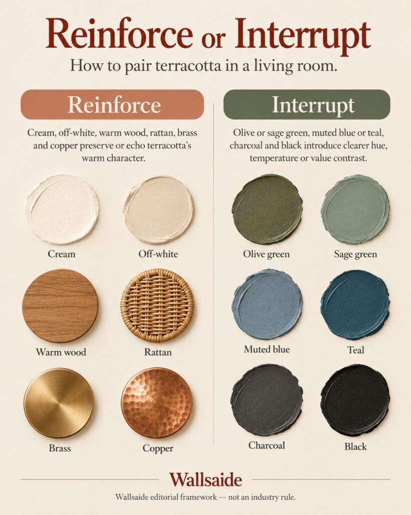
Wallsaide’s Reinforce/Interrupt Model is a practical editorial framework for making that choice. It isn’t an industry rule.
Reinforce: cream, off-white, warm wood, rattan, brass, and copper preserve or echo terracotta’s warm character rather than creating strong temperature or value contrast.
Interrupt: olive or sage green, muted blue or teal, charcoal, and black introduce clearer hue, temperature, or value contrast. They give the eye a break from an otherwise warm palette.
Neither approach is inherently better.
A reinforced palette can feel cohesive and enveloping. An interrupted palette creates more obvious separation. Problems usually begin when a room keeps adding similarly warm surfaces without enough difference in value, texture, or hue to distinguish them.
Terracotta living room ideas: four directions to build from
The following combinations demonstrate both sides of the model. You don’t need the exact furniture shown to recreate them. Focus on the relationship between the terracotta, lighter surfaces, contrasting colors, and natural materials.
Reinforced: terracotta, cream, and oak
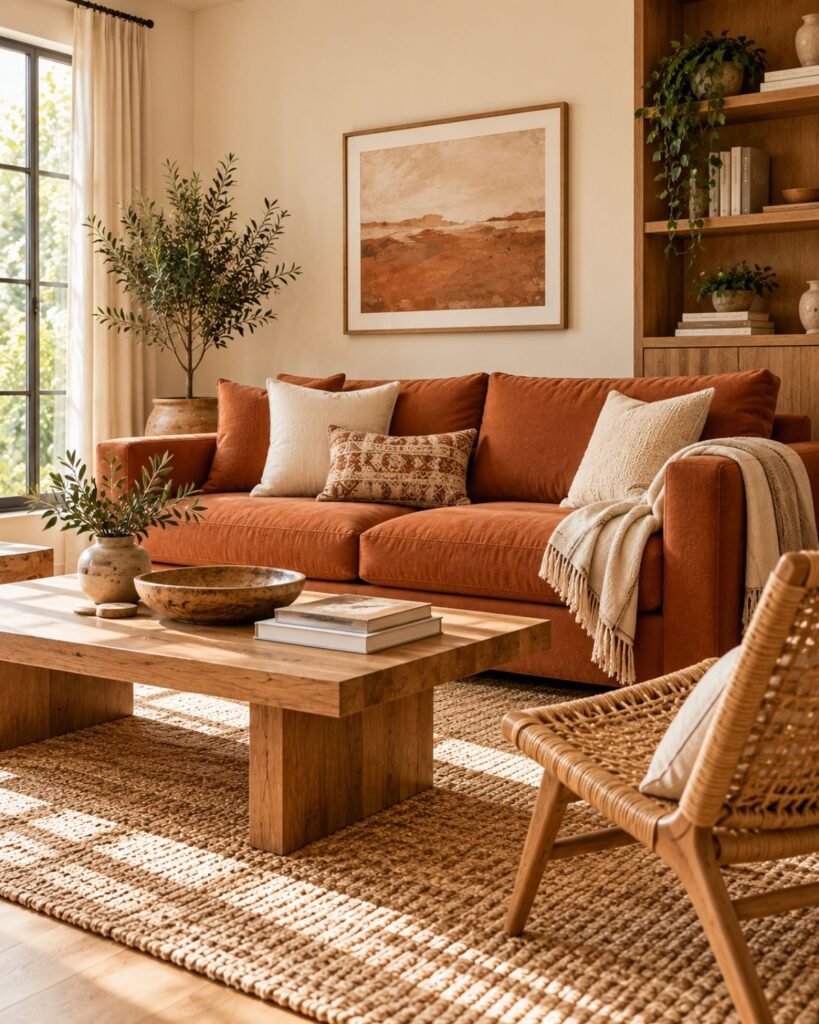
Cream provides clear value relief without introducing a strongly cool color, while oak continues the warmer character of the palette. The result can stay predominantly warm without every surface collapsing into the same visual depth.
A simple recreation formula is a terracotta sofa or wall, cream upholstery or surrounding walls, medium warm oak, and a lighter natural-fiber rug.
This is one of the more forgiving directions because cream creates visible separation while oak keeps the palette warm.
What can go wrong: remove the lighter neutral and several orange-brown surfaces can begin to merge. If the terracotta, flooring, wood furniture, and textiles are all similar in value and temperature, introduce a lighter cream or off-white surface rather than adding another warm brown.
For a deeper treatment of cream itself, see our cream living room ideas.
Interrupted: terracotta and olive green
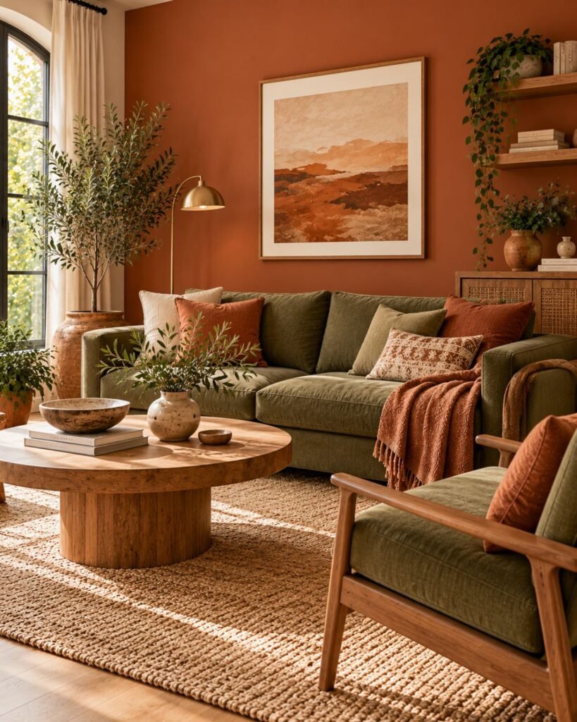
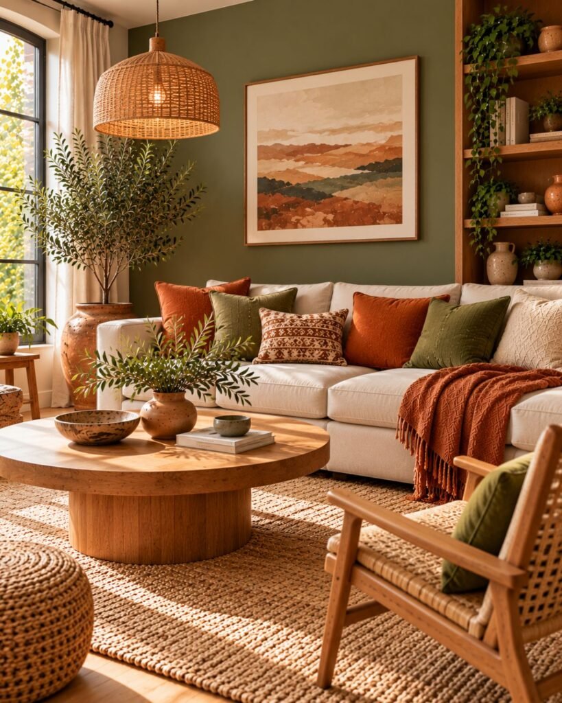
Muted green changes the relationship completely. Instead of continuing terracotta’s orange-brown warmth, it introduces a distinct hue that gives the palette separation.
A simple formula is one substantial terracotta element, one muted olive or gray-green element, a light neutral, and natural wood connecting them.
The exact green matters. A strongly yellow-green can make the whole palette feel warmer, while a grayer or slightly cooler green creates clearer distinction from the terracotta.
What can go wrong: increasing the saturation of both colors simultaneously can turn a restrained earthy palette into two competing focal points. If the terracotta is strong, keep the green quieter, or reverse that relationship.
Wallsaide’s green living room ideas guide covers green as the primary room color rather than as a terracotta counterpoint.
Interrupted: terracotta and charcoal
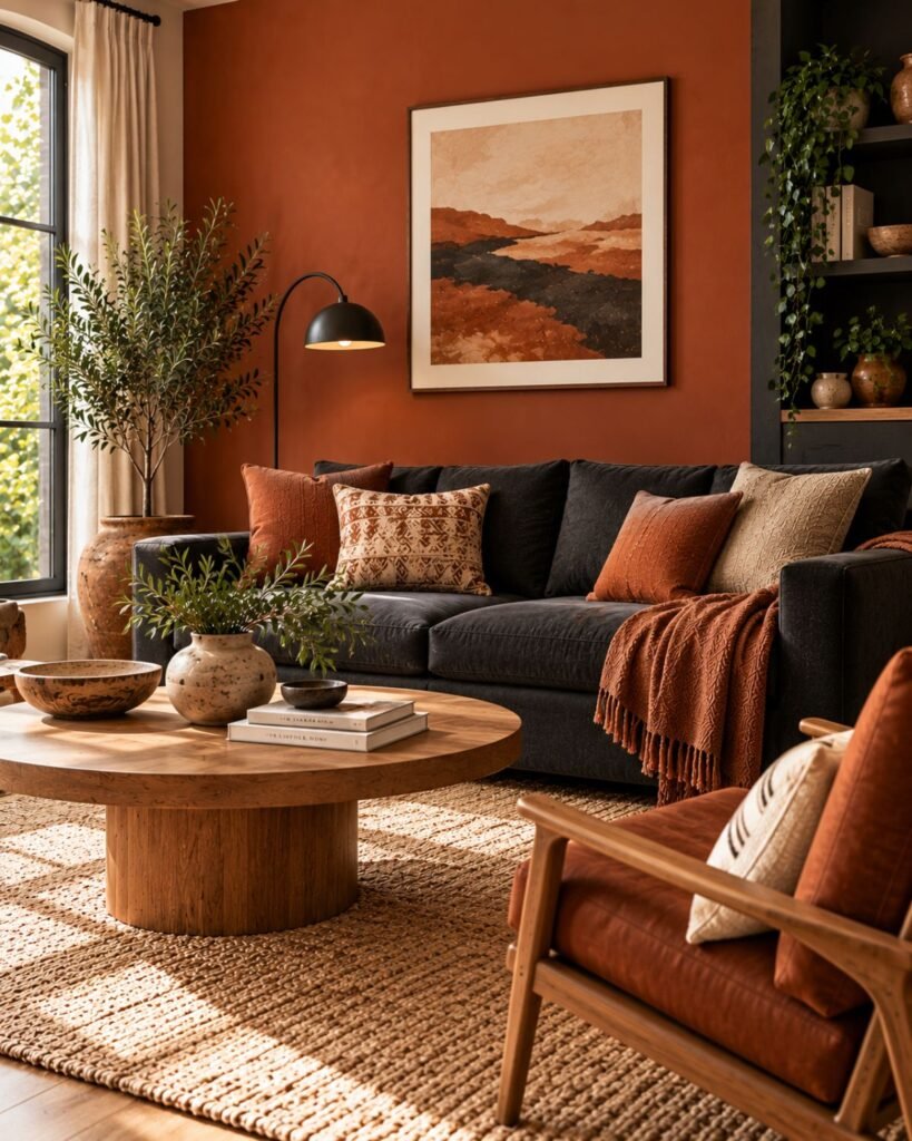
Charcoal gives terracotta much sharper value definition. Because it doesn’t repeat terracotta’s orange-brown character, it can make the warmer color appear more deliberate and graphic.
Try terracotta walls with a charcoal sofa, a lighter rug, and a small amount of black metal. The lighter element matters because terracotta and charcoal can both carry substantial visual weight.
What can go wrong: too much charcoal or black can reverse the hierarchy. Instead of a terracotta room with dark definition, you end up with a dark room where terracotta becomes the accent.
If you’re considering a larger black element rather than charcoal accents, our black living room ideas guide explains the difference between using dark color on movable objects and architectural surfaces.
Interrupted: terracotta and muted blue
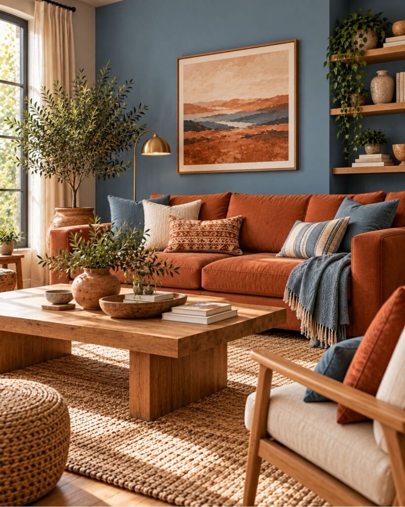
Muted blue creates a stronger temperature contrast with terracotta than the previous combinations. That makes it useful when an otherwise warm room needs a clearly cooler-looking element rather than another earthy material.
Keep one color visually dominant. A terracotta wall with one muted blue or teal chair is easier to control than covering large surfaces in equally strong versions of both colors.
What can go wrong: highly saturated blue beside highly saturated terracotta can make both compete for attention. Muting one or both gives the eye a clearer hierarchy.
How much terracotta should you use?
When comparing terracotta living room ideas, where the color appears matters almost as much as the specific shade.
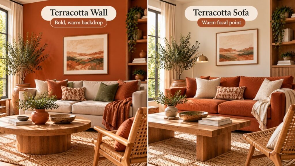
A terracotta cushion is a small, reversible accent. A sofa creates a substantial block of color but remains a contained object. Painting one or several walls makes terracotta part of the architecture and exposes it to changing daylight and artificial light across a much larger area.
There isn’t a universal percentage that makes terracotta work. Instead, look at how much lighter or contrasting surface remains around it.
A mid-depth terracotta can be easier to distribute across a larger surface because it may leave more visible separation from darker furniture and flooring. A deeper terracotta carries more visual weight, so test it across a large sample before extending it around the room.
Why terracotta living rooms can look too orange or muddy
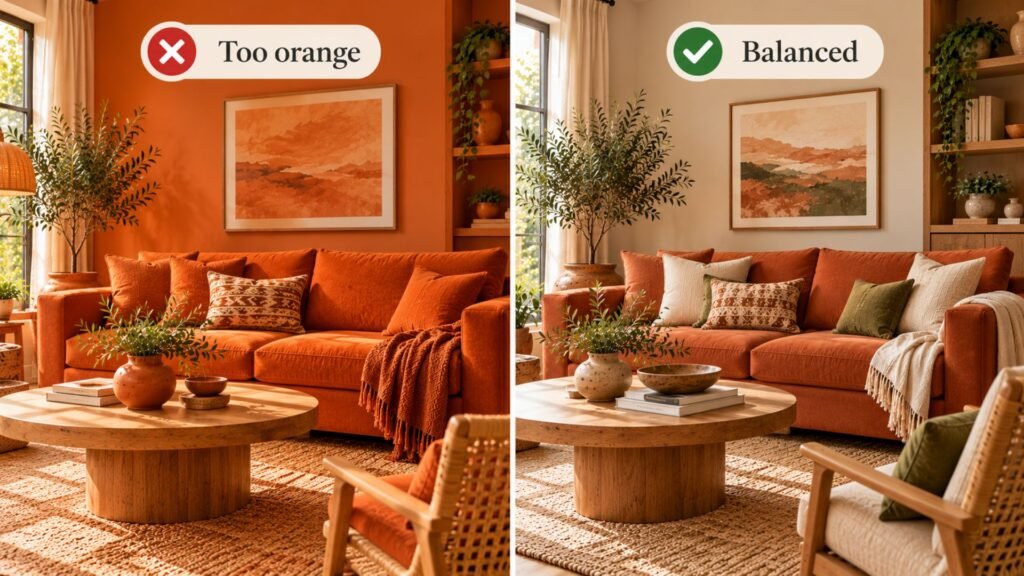
A disappointing terracotta room usually isn’t evidence that the color itself was wrong. More often, several decisions are amplifying the same characteristic at once.
- Too orange: a stronger orange-leaning terracotta dominates a large area while nearby materials continue rather than relieve that warmth.
- Too muddy: terracotta, warm brown, and orange-leaning wood sit too close in value and temperature, so their boundaries become weak.
- Too visually heavy: several large, mid-to-dark surfaces compete without enough lighter area between them.
- Too themed: terracotta is repeated through walls, pottery, textiles, rattan, and similar earthy elements without enough contrast or restraint to establish hierarchy.
The fix doesn’t always require replacing the terracotta. Sometimes one lighter neutral, cooler-looking color, darker edge, or different material is enough to create the missing separation.
Test terracotta before committing
Screens are unreliable judges of paint and upholstery color. Photography, editing, display settings, daylight direction, and artificial lighting can all change how a terracotta reference appears.
For paint, test a sufficiently large sample in the room rather than choosing from a small digital swatch. Paint manufacturers such as Benjamin Moore also recommend viewing color samples in the actual space and checking them as lighting changes throughout the day.
Look at it beside the actual floor, trim, sofa, and wood furniture during the lighting conditions in which you normally use the room.
The important question isn’t simply whether you like the terracotta sample in isolation. Ask what happens when it sits beside its largest neighbors.
If the sample becomes more orange than expected beside your flooring, you may need more neutral or contrasting relief. If it becomes dull beside a dark sofa, increasing the value difference may matter more than changing hue.
Our interior color ideas guide covers the broader color-testing principles that apply beyond terracotta.
Can terracotta work with beige and brown?
Yes, but both combinations require enough separation to prevent several warm surfaces from merging.
With beige, look for a visible difference in value or undertone rather than trying to match the two closely. A pale beige can provide relief around terracotta; a deeper, orange-leaning beige may simply extend the same temperature.
Our beige living room ideas guide covers beige-specific decisions in more detail.
Brown can ground terracotta, particularly through leather and wood, but the combination becomes less readable when the brown, terracotta, and flooring all occupy similar depths.
If brown is becoming a substantial part of the room rather than one supporting material, see our brown living room ideas guide.
Terracotta in a small living room
Small terracotta living room ideas don’t have to be limited to cushions and accessories.
If you’re considering it on the walls, look at how much contrast remains between the terracotta, ceiling, flooring, and largest furniture. One terracotta wall with lighter surrounding surfaces is a lower-commitment starting point, but room size alone doesn’t determine whether a darker or more extensive application will work.
A terracotta sofa is another way to introduce a substantial area of color while leaving the surrounding architecture lighter.
Furniture scale, circulation, and lighting still matter independently of color. Our small living room ideas guide covers those decisions in more detail.
Where this leaves you
The most useful terracotta living room ideas start with the terracotta itself, not a Pinterest palette built around someone else’s version of it.
Place the actual sample beside the room’s largest fixed surfaces. Then decide what the room needs next.
If you want to continue its warmth, use cream, warm wood, rattan, or warm metals while preserving enough value difference to keep the surfaces distinct.
If the room already feels overwhelmingly warm, interrupt it with muted green, blue, charcoal, black, or another clearly contrasting element.
The useful question isn’t simply “What goes with terracotta?”
It’s “Does this room need more of terracotta’s warmth, or somewhere for that warmth to stop?”
Terracotta living room ideas FAQs
What colors go with terracotta in a living room?
Cream, off-white, warm wood, and natural materials can reinforce terracotta’s warm character. Muted green, blue or teal, charcoal, and black create clearer contrast. Choose according to whether the room needs more warmth or more separation.
Is terracotta orange or brown?
Terracotta generally sits in the orange-brown family and is associated with fired clay. The term isn’t a standardized paint category, so individual products can lean more orange, red, brown, pale, or muted.
What’s the difference between terracotta and rust?
The terms overlap and are used inconsistently. Rust often describes a browner or redder, less distinctly orange color, while terracotta commonly suggests muted fired-clay orange-brown. Compare actual samples rather than relying on the names.
Does terracotta work with green?
Yes. Muted olive, sage, and gray-green can provide hue contrast against terracotta’s orange-brown warmth. The result changes with the particular green, however, so compare the two samples together rather than assuming every green will behave identically.
How do you stop a terracotta living room from looking too orange?
Reduce the number of nearby materials that repeat the same orange warmth. Introduce a lighter neutral, a muted contrasting color such as green or blue, or a darker defining element such as charcoal. Also check whether the terracotta itself is more saturated than you expected.
Can terracotta work in a small living room?
Yes. Room size doesn’t prohibit terracotta. Pay more attention to the relationship between the terracotta, lighter surrounding surfaces, furniture scale, and lighting. One wall or one substantial furniture piece provides a lower-commitment starting point than applying the color throughout the architecture.
About the author
Emma Carter writes about interior color, home décor, and practical styling for Wallsaide. She focuses on helping readers combine colors, materials, textiles, and decorative elements into rooms that feel balanced and cohesive.