
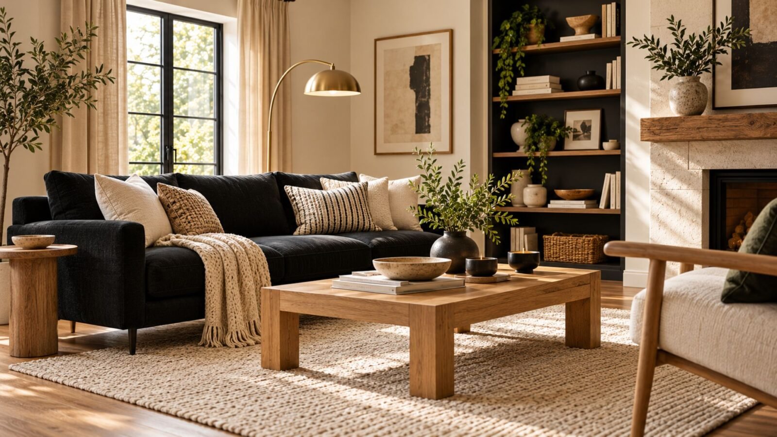

This guide helps you decide whether black belongs on an object or a surface in your living room, and what each choice needs to work.
Black living room ideas are often treated as one decision, but a black lamp and a black wall have very little in common. One is a low-risk accent you can swap in an afternoon. The other becomes part of the architecture and needs more thought before you commit.
The useful question, then, isn’t simply how much black to use. It’s where the black will go, how difficult that choice will be to reverse, and what the rest of the room needs around it.
For broader planning beyond color, start with Wallsaide’s living room ideas guide.
Where should black go: the object versus the surface
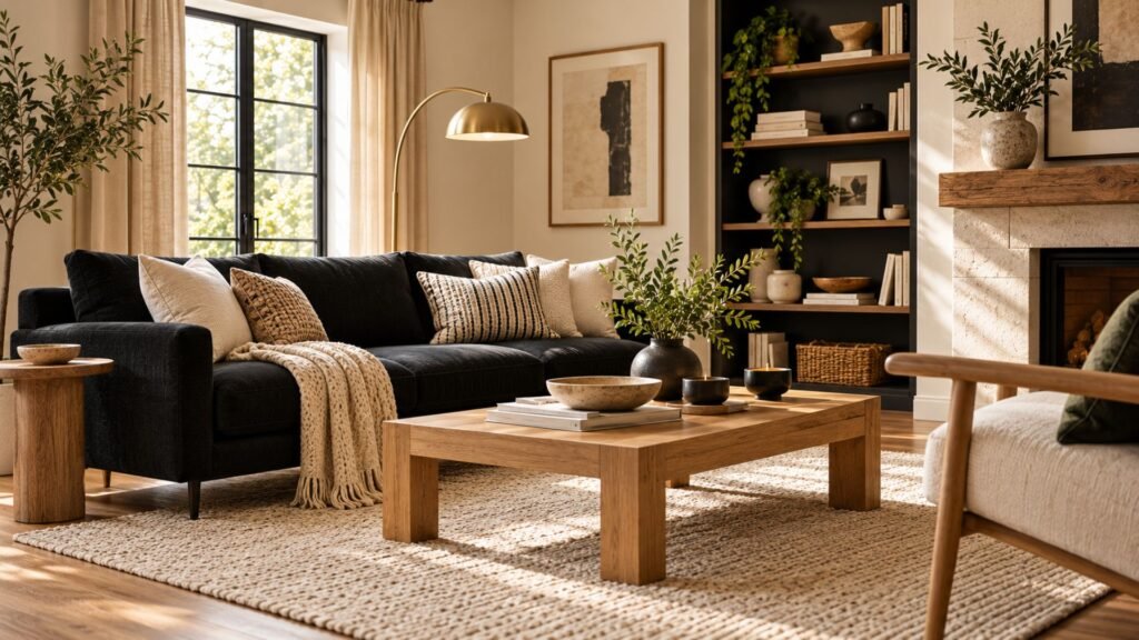
A black object, such as a sofa, lamp, or frame, sits inside the room and can be changed without altering the architecture. A black surface, such as a wall, built-in, or paneling, becomes part of the room itself.
That distinction affects how carefully you should test the choice and how much attention the surrounding surfaces deserve.
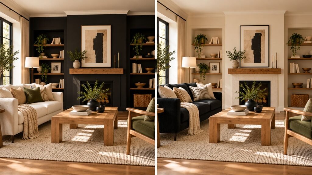
A black sofa can be balanced with a different rug, coffee table, cushions, or wall color. Paint an entire wall black, however, and the relationship with the ceiling, trim, flooring, daylight, and evening lighting becomes much more important.
The Wallsaide Black Commitment Scale
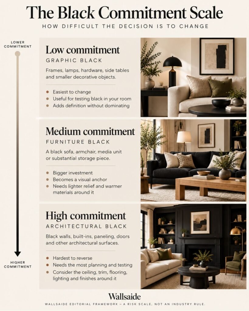
The Wallsaide Black Commitment Scale is our editorial framework for separating these decisions. It isn’t an industry standard, and it isn’t a rule for how much black a room should contain.
Instead, it asks one practical question: how difficult will this black element be to change if it doesn’t work?
Low commitment: graphic black
Frames, lamps, hardware, side tables, and smaller decorative objects sit at the lowest level.
These are useful when you want stronger definition without making black the dominant feature. They’re also a practical way to see how black interacts with your existing cream, beige, wood, stone, or other finishes before committing further.
Medium commitment: furniture black
A black sofa, armchair, media unit, or substantial storage piece carries more visual weight and usually costs more to replace.
Once a large black object enters the room, look at what sits immediately around it. A lighter rug can separate a black sofa from a dark floor, while a warm wood table can introduce a mid-value material between very dark furniture and pale walls.
High commitment: architectural black
Black walls, built-ins, paneling, doors, and other architectural surfaces are harder to reverse.
This is where testing matters most. Look at the black beside the actual ceiling, trim, floor, furniture, and materials that will remain in the room. Then check it again after daylight disappears.
The scale doesn’t tell you that architectural black is wrong. It simply tells you that the harder a decision is to reverse, the more carefully its relationships should be tested first.
Important: This is the only article image that should intentionally contain text. Typography and the spelling Wallsaide must be checked manually before publishing.
Warm black, cool black, and charcoal
Black paint isn’t necessarily visually neutral. Benjamin Moore notes that black paints can lean blue or carry warmer brown undertones, while warm blacks may contain brown, red, or purple undertones. Benjamin Moore explains black paint colors and their undertones here.
A warm-leaning black can reinforce the warmth of wood, leather, or brass, while a cooler black can create a sharper relationship with cooler grays and metals. These are tendencies rather than pairing rules, so judge the specific black beside the materials already in the room.
Charcoal is also worth testing alongside black when you want a very dark surface without choosing the deepest black available. Compare both in the room itself rather than assuming charcoal will automatically feel softer.
If you’re making a broader color decision rather than choosing black specifically, Wallsaide’s interior color ideas guide covers the wider relationship between color and the room around it.
Black living room ideas: 4 directions to recreate
You don’t need a specific sofa, paint brand, or designer piece to recreate these rooms. Focus on the relationship between the dark element, lighter relief, warmer materials, and surrounding surfaces.
Black, cream, and warm oak
Black provides definition, while cream creates clear value contrast. Oak introduces a warmer mid-value material between those two extremes.
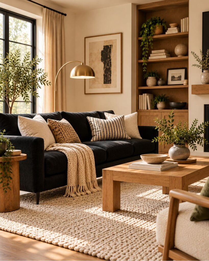
A simple formula is:
black sofa or smaller black furniture + cream walls or upholstery + warm oak + a lighter rug
This combination can also work with black architecture. If the wall is black rather than the sofa, move more cream or another light neutral into the furniture and floor area.
What can go wrong: using only black and cream can produce a very sharp contrast. Wood, woven fibers, stone, and other textured materials can create more variation between the two.
For a closer look at the lighter side of this pairing, see our cream living room ideas guide.
Black, brown leather, and stone
Black and brown don’t need to compete.
A cognac or medium-brown leather surface introduces warmth, while stone can provide a quieter transition between dark furniture and lighter architecture.
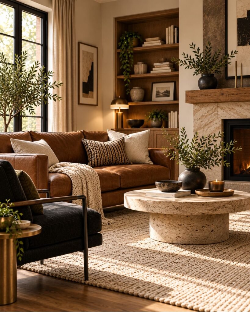
This works particularly well when black appears in a chair, table, fireplace, frame, or another clearly defined element rather than across every surface.
Leather and woven fabric handle light differently, so their texture and finish can change how dark furniture reads in the room. Judge the actual materials together rather than treating every black or brown upholstery surface as equivalent.
A useful formula is:
black anchor + distinct brown leather + lighter or mid-value stone + restrained light neutral
What can go wrong: if the leather, stone, flooring, and black element are all similarly deep in value, their outlines can become less distinct.
Our brown living room ideas guide goes further into choosing and combining different browns.
Black, warm white, and brass
This direction creates stronger contrast.
Warm white keeps large surfaces light, black provides clear definition, and brass introduces a warmer metallic note.
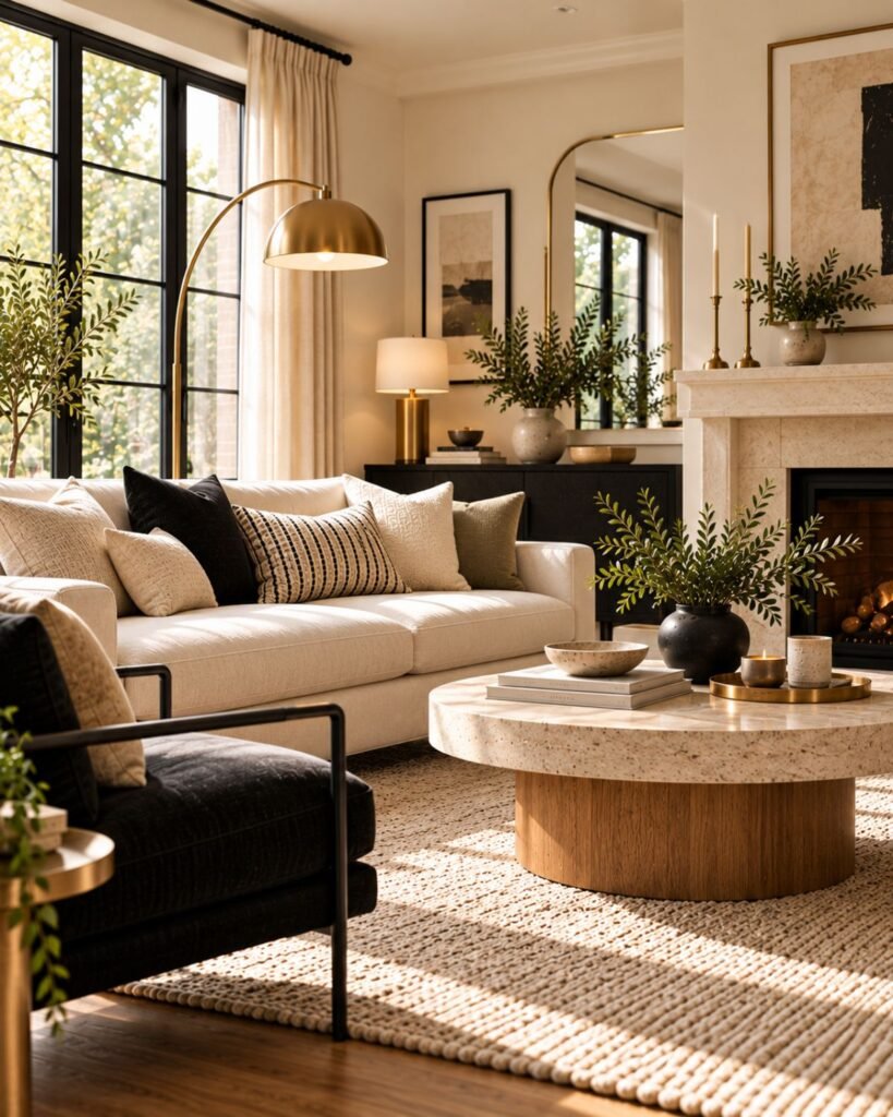
The combination can work especially well through black window frames, lighting, furniture, or a smaller architectural feature.
A simple formula is:
warm white base + controlled black elements + restrained brass + one natural texture
Don’t rely on the metal alone to make the room feel warmer. Wood, woven fabric, stone, or another tactile material can help bridge the large difference between black and a very pale wall.
What can go wrong: without any mid-value or textured material, the room can become visually binary: very dark elements against very light ones.
Black, muted green, and natural wood
Muted green provides another route when you want more color without losing black as the defining dark element.
Try black on the coffee table, frames, lighting, or a single larger piece. Use muted olive or gray-green on upholstery or a smaller surface, then introduce natural wood to separate the two darker colors.
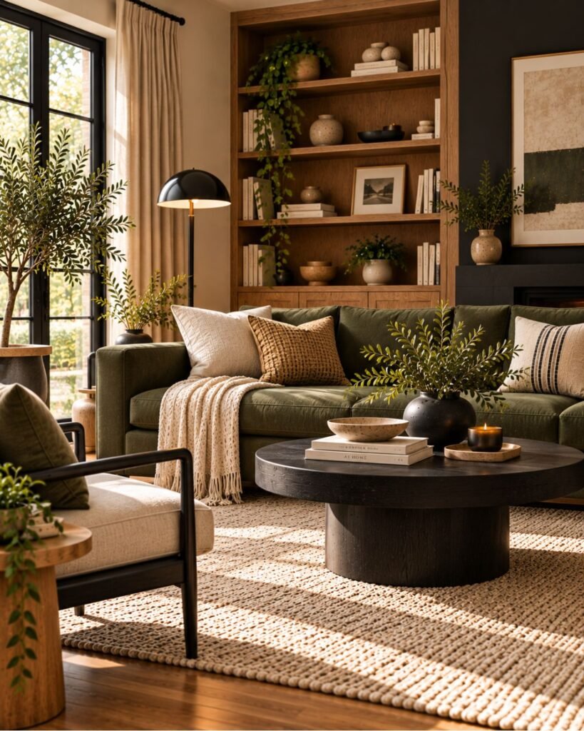
A useful formula is:
controlled black + muted green + natural wood + restrained cream or off-white
A brighter or more saturated green will create a stronger color statement. That isn’t inherently a problem, but it changes the hierarchy of the room: green may start competing with black rather than supporting it.
Matte versus reflective black
Finish changes how a black surface interacts with light.
Sherwin-Williams explains that gloss and sheen describe how much light a painted surface reflects independently of its color. Flat and matte finishes have very low reflection, while higher-gloss finishes reflect considerably more. Sherwin-Williams explains gloss and sheen here.
That means the same underlying black can appear different depending on finish, viewing angle, and illumination. Contrasting finishes can also introduce additional depth and definition.

In a predominantly matte scheme, varied sheen or texture can create more visible surface variation. That doesn’t mean every black room needs glossy paint.
A glass table, metal lamp, stone surface, textured textile, or subtly reflective object may be enough to prevent every surface from responding to light in exactly the same way.
Why black rooms can feel too heavy, stark, or dark
When a black living room isn’t working, diagnosing the specific problem is more useful than assuming black itself is the problem.
Too heavy: check whether large dark surfaces are dominating without enough lighter contrast, varied texture, or reflective detail elsewhere in the room.
Too stark: look at the jump between the darkest and lightest elements. Black beside bright white can create a much sharper relationship than black beside cream, oak, leather, or another mid-value material.
Too dark to use comfortably: check whether the room has enough functional and ambient light after dark. A dark scheme may need additional light sources rather than relying on one fixture.
Too visually uniform: look at the finishes. Several large matte surfaces of similar value can produce less visible variation than a room combining different textures and levels of reflectivity.
Sherwin-Williams similarly recommends using lighter elements, reflective surfaces, varied textures, and additional lighting when developing dark interiors. See its guidance on dark and moody interiors.
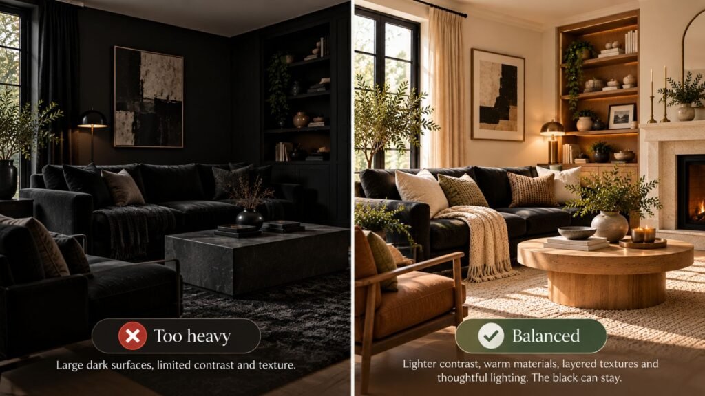
Black also does not automatically make a living room feel smaller. Dark surfaces can create depth, while contrast, furniture scale, lighting, and the distribution of lighter and darker elements also affect how spacious a room feels.
Black wall or black sofa: how to choose
This is where the Commitment Scale becomes useful.
Choose a black sofa when you want one substantial dark anchor but would prefer to keep the architecture flexible. You can change the rug, walls, tables, curtains, and accessories around it without repainting a major architectural surface.
Choose a black wall when you want the architecture itself to establish the dark background. That places more responsibility on the ceiling, trim, flooring, furniture, lighting, and finishes in front of it.
Neither is inherently the stronger design choice.
The practical difference is reversibility: furniture black lets you redesign around the object; architectural black asks you to design around the surface.
If you’re uncertain, graphic black is the lowest-commitment place to begin. Frames, lamps, small tables, or hardware can show whether stronger dark definition improves the room before you move further up the scale.
Testing black before you commit
Testing matters more as you move up the Commitment Scale.
For graphic black, there is little risk. A lamp or frame can simply be moved or replaced.
For furniture, bring the upholstery, leather, wood, or finish sample into the actual room where possible. Look at it beside the rug, floor, walls, and nearby furniture rather than evaluating it in isolation.
For architectural black, test a substantial paint sample on the actual wall or on a movable sample board. Observe it in daylight and again under the lighting you actually use in the evening.
Benjamin Moore recommends brush-on samples for evaluating color as the light changes and notes that samples can be tested on a wall or foam board. See Benjamin Moore’s paint sampling guidance.
The point isn’t to find a black that looks identical all day. It’s to make sure you like the different versions of it that your room produces.
Black in a small living room
Black living room ideas for small spaces can include either a black wall or a black sofa. The color itself shouldn’t be separated from furniture scale, circulation, contrast, and lighting.
Keep furniture appropriately scaled for the available floor area and preserve comfortable movement through the room. Then judge whether the black element has enough light, material variation, and lighter contrast for the effect you want.
If the sofa is the largest dark mass, a lighter rug can help separate it from the floor. If the wall is black, lighter upholstery or another substantial lighter surface can provide contrast without requiring the whole room to become pale.
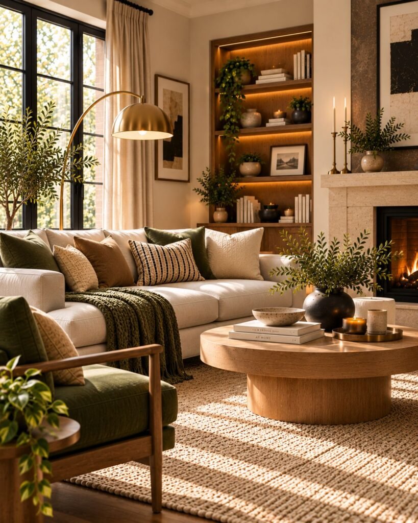
For the layout decisions themselves, use our small living room ideas guide rather than treating color as a substitute for good space planning.
Where this leaves you
The most successful black living room ideas start with one decision: where is the black going?
A frame or lamp needs little planning because it is easy to change. A black sofa creates a substantial anchor, so judge the rug, tables, walls, and materials around it. A black wall or built-in deserves the most testing because the architecture itself becomes the dark element.
Then look at what the black needs around it: lighter relief, a warmer or mid-value material, varied texture, appropriate lighting, or some combination of them.
Test the level you’re actually committing to, not the one that’s easiest to imagine.
Black living room ideas FAQ
Does black make a living room look smaller?
Not automatically. Dark surfaces can create depth rather than simply closing a room in. Furniture scale, contrast, lighting, and the balance between lighter and darker surfaces also affect how spacious the room feels.
What colors go with black in a living room?
Cream and warm oak provide a versatile combination with strong light-dark contrast and a warmer mid-value material between them. Brown leather and stone can produce a more material-led scheme, while warm white and brass create stronger contrast. Muted green works when you want a second noticeable color without removing black as the dark anchor.
How do you make a black living room feel warm instead of stark?
Look beyond black itself. Warm wood, brown leather, brass, woven textiles, cream, and warmer off-whites can introduce warmer or intermediate elements between very dark and very light surfaces.
Lighting and material finish also affect how those relationships appear after dark.
Can you use black in a small living room?
Yes. Black can work in a compact living room, but judge it as part of the whole room rather than by color alone. Furniture scale, circulation, lighting, and lighter contrasting surfaces all affect the result.
Is charcoal easier to work with than true black?
It can be worth testing when you want a very dark surface but aren’t sure about the deepest black available. Don’t assume it will automatically work better, though.
Compare black and charcoal beside the room’s actual flooring, trim, furniture, daylight, and evening lighting.
Should I choose a black wall or a black sofa?
Choose according to where you want the dark visual anchor and how much commitment you’re comfortable making. A sofa is substantial but movable; a painted wall becomes part of the architecture.
If you’re uncertain, test lower-commitment black elements before making the architectural decision.
References
- Benjamin Moore — Black Paint Colors
- Sherwin-Williams — Shine On, Shine Off: Gloss & Sheen
- Sherwin-Williams — Mastering Dark and Moody Interior Design
- Benjamin Moore — Paint Color Samples
About the author
Emma Carter writes about interior color, home décor, and practical styling for Wallsaide. She focuses on helping readers combine colors, materials, textiles, and decorative elements into rooms that feel balanced and cohesive.