
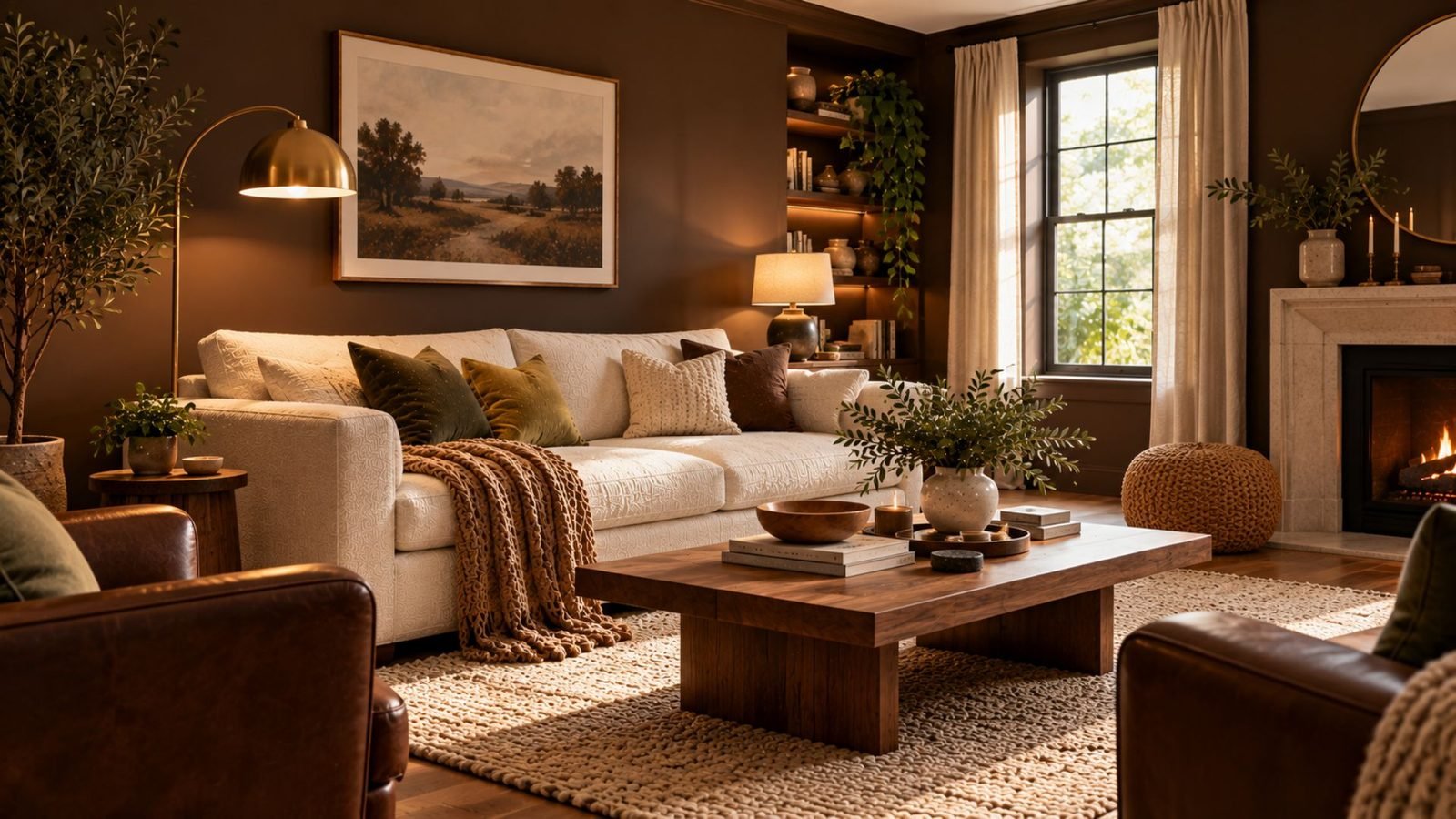

Brown living room ideas work best when undertone, depth, and contrast are considered together rather than treating every shade of brown the same way.
Brown works in a living room when two things are handled deliberately: its undertone, whether it leans warm-red, warm-yellow, or cooler and gray, and its depth, from light caramel to near-black espresso.
Get either one wrong relative to what surrounds it, and the same color that could look rich and grounded can start to look muddy, heavy, or flat. This guide sits within Wallsaide’s broader living room ideas, focused specifically on getting brown right.
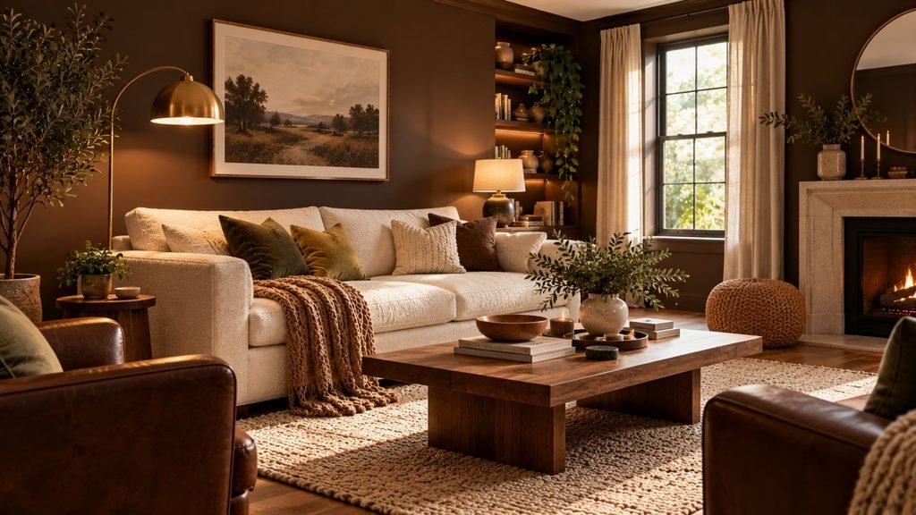
Brown isn’t one color
A light, cool-leaning mushroom brown and a deep, warm-red chestnut are barely the same design decision, even though both get called “brown.”
Three broad undertone families are useful when deciding what should surround them:
- Cool or gray-leaning: Mushroom and taupe-brown sit closest to warm neutrals. They tend to feel softer and more muted than red or yellow browns.
- Warm-red: Chestnut, reddish-brown, and mahogany-adjacent shades can feel rich and substantial, but too many similarly warm tones can make them lose definition.
- Warm-yellow: Caramel, cognac, and camel have more golden warmth. Without enough contrast, they can start to read more orange than intended.
This isn’t meant to turn every brown into a technical color classification. The distinction matters because undertone changes which surrounding colors and materials help the brown look intentional.
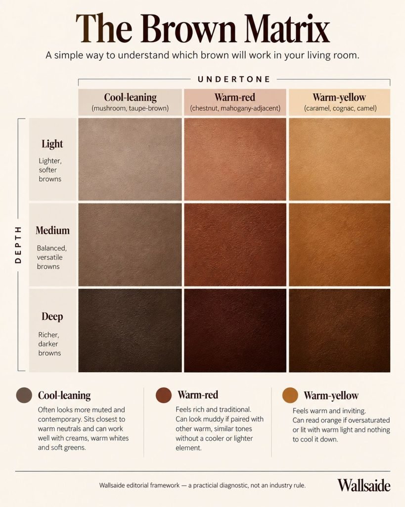
The Wallsaide Brown Matrix
Most brown living room advice treats brown as one color and then attaches a list of colors that supposedly “go with it.” A more useful approach is to consider two variables together: undertone and depth.
The Wallsaide Brown Matrix is our editorial framework for doing that. It is a practical diagnostic, not an industry rule.
Undertone describes whether the brown leans cooler and grayer, warmer and redder, or warmer and yellower.
Depth describes how light or dark that brown appears, from pale mushroom and caramel through medium walnut and chestnut to deep espresso.
Those two variables can help diagnose why a brown palette isn’t working.
If several warm-red or warm-yellow colors have similar saturation and little separation between them, the room can begin to feel muddy or overly orange. If most of the large surfaces sit at approximately the same depth, the room can instead feel flat or visually heavy.
The solution usually isn’t to abandon brown. It is to identify which kind of contrast is missing.
Brown living room ideas: 5 directions to start from
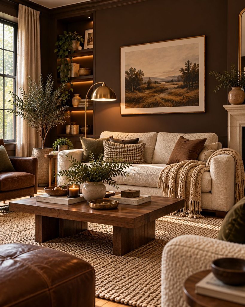
The Brown Matrix becomes more useful when you apply it to actual rooms. These five directions occupy different positions on the matrix, so each needs a slightly different kind of contrast.
Espresso and cream
Deep brown · strong value contrast
Deep espresso needs a clear light-value partner. Cream and warm white can provide that separation without creating the harder contrast that a brilliant cool white sometimes produces.
The important part isn’t simply that “cream goes with brown.” A genuinely light sofa, rug, curtain, or wall gives the eye somewhere to rest against the much deeper espresso.
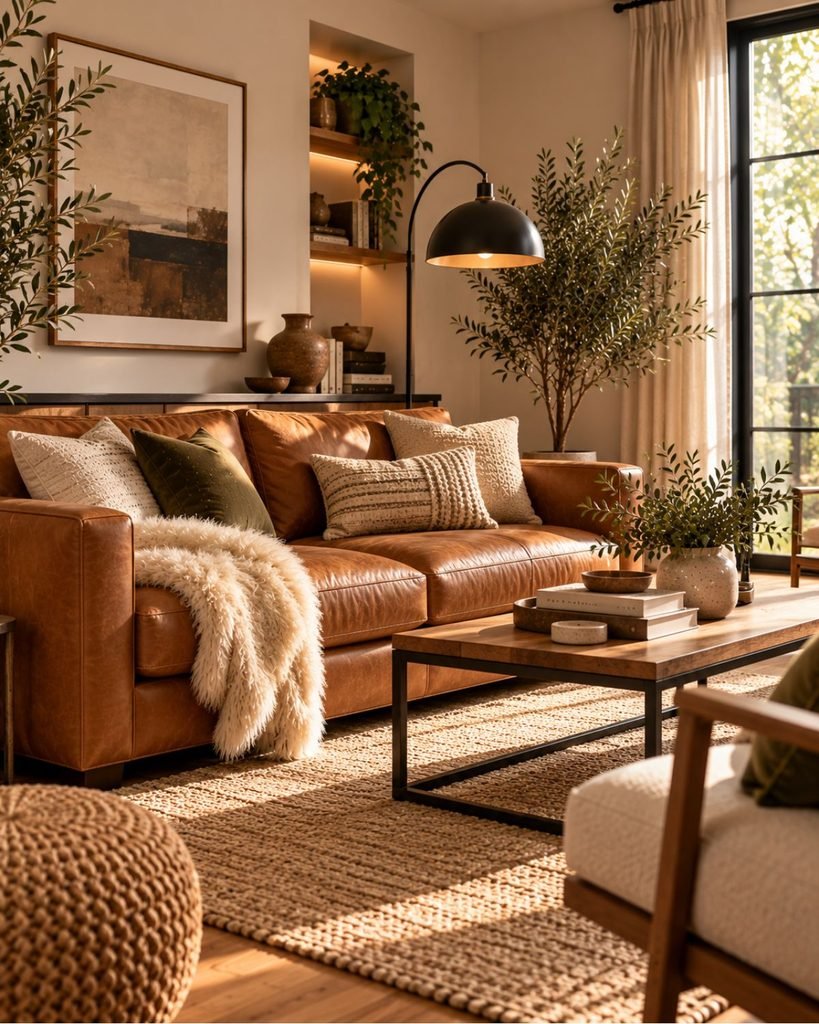
Caramel and black metal
Warm-yellow brown · cooling contrast
Caramel and cognac bring a golden undertone into the room. That warmth can be attractive, particularly through leather, but surrounding it entirely with other orange-brown materials can make the palette feel oversaturated.
Black metal gives the eye a cleaner, cooler break. In a room with a caramel leather sofa, a black floor lamp or coffee-table frame can therefore do more than introduce another material; it helps define the warmer brown.
Chestnut and olive
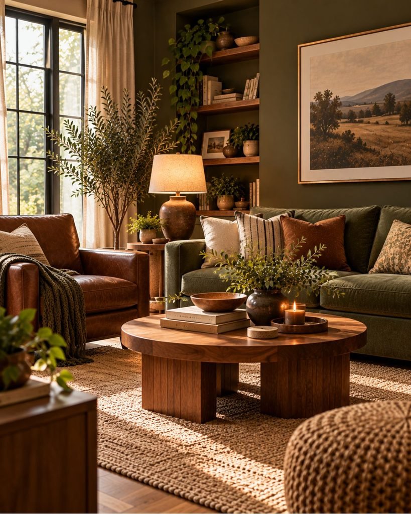
Warm-red brown · muted color contrast
Chestnut has more red in it than caramel or mushroom brown. Pairing it with muted olive introduces another earthy color without simply adding a second version of brown.
The two colors still feel related because both are relatively subdued, but the green creates enough hue separation to keep the palette from becoming one continuous warm-brown field.
Chocolate and navy
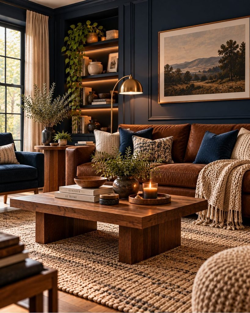
Medium-deep brown · cool color contrast
Chocolate and navy create a stronger temperature contrast. Navy brings a distinctly cooler hue beside the warmth of brown, while cream or another lighter neutral can prevent the combination from becoming too dark overall.
This works particularly well when brown enters through a sofa or wood furniture rather than covering every large surface.
Mushroom and warm white
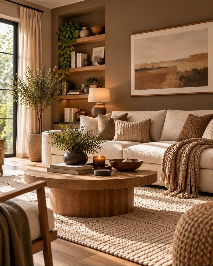
Cool-leaning light brown · soft value contrast
Mushroom sits near the boundary between brown, taupe, and the broader warm-neutral family. Because it contains more gray than caramel or chestnut, it generally needs less dramatic color contrast.
Warm white, pale oak, and restrained natural materials can preserve that softness while still preventing the room from becoming visually flat.
If this lighter direction is closer to what you want, our beige living room ideas and neutral living room ideas explore that adjacent territory in more depth.
How brown enters the room matters
Brown creates a different design problem depending on where it appears. A chocolate-painted wall, cognac leather sofa, walnut floor, and small brown vase may technically belong to the same color family, but they have completely different visual weight.
Brown walls occupy a large proportion of the visual field. The deeper the wall color, the more important lighter furniture, textiles, art, or architectural details can become.
Brown upholstery and leather concentrate the color into a large object rather than the room itself. Leather also reflects light differently from matte upholstery, so two sofas in a similar brown can read quite differently.
Wood furniture introduces brown through natural variation. Grain, knots, finish, and differences between light and dark areas break up what would otherwise be one solid color.
Brown flooring and rugs form the visual base of the room. When the floor, rug, sofa, and coffee table all occupy similar medium-brown values, their outlines can begin to merge rather than read as distinct layers.
Smaller brown accents require much less commitment. Frames, cushions, ceramics, lamps, and occasional furniture can introduce a brown family before you use it across a larger surface.
Light, material, and texture change how brown reads
Brown should never be chosen from a swatch in isolation.
Daylight, artificial lighting, neighboring colors, and surface finish can all change how strongly its undertone appears. A brown that looks muted in one setting may show considerably more red or gold somewhere else.
That is why a brown intended for walls or another large surface should be viewed under the actual lighting conditions of the room before the final decision. Our interior color ideas guide goes further into evaluating color under real room conditions.
Material changes the effect again.
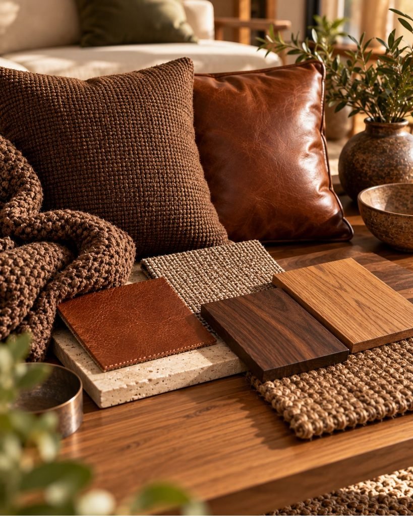
Matte wool absorbs and diffuses light. Leather introduces sheen. Wood breaks the color into visible grain and tonal variation. Stone can add a cooler, harder surface beside softer brown textiles.
A room using several brown materials can therefore have more visual depth than one built from several flat surfaces that happen to be different shades of brown.
Why brown living rooms can look muddy or dated
When a brown room feels wrong, adding another cushion or changing a decorative object rarely addresses the underlying problem. The Brown Matrix gives you a more useful place to start.
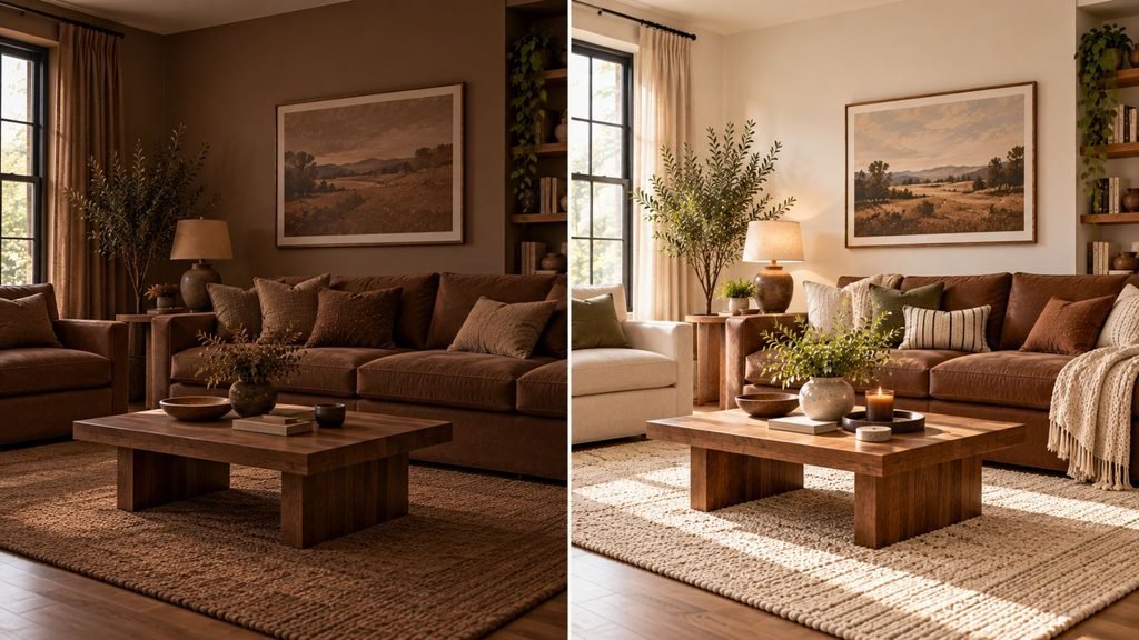
Muddy: Several warm browns and similarly warm surrounding colors may be too close in undertone, saturation, and depth. Introduce clearer separation rather than another similar shade.
Too orange: Caramel and cognac can become more visibly golden or orange when surrounded by other warm materials and warm artificial light. A cooler or lower-saturation element can help rebalance them.
Flat: The wall, sofa, rug, and furniture may all sit at approximately the same value. Changing one large element to something substantially lighter or darker creates more definition.
Heavy: Deep brown across several large surfaces can absorb a lot of visual attention. A cream rug, light upholstery, pale curtains, or another substantial light-value element can interrupt that weight.
What sometimes gets described as a “dated brown room” is therefore not necessarily a problem with brown itself. It can be a problem of insufficient contrast between the things that are brown and everything around them.
Brown in a small living room
Brown can work in a compact living room, but the amount and depth of the color become more noticeable because fewer surfaces share the visual field.
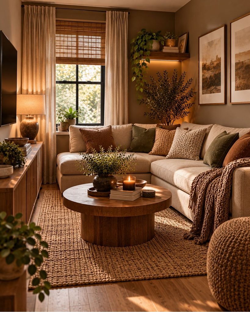
You don’t have to restrict a small room to pale brown. A deep brown wall, chestnut loveseat, or darker wood can still work when another substantial surface is genuinely lighter.
The more useful question is not “Is brown too dark for a small room?” It is where the dark value will sit and what will separate it from the other large objects.
In a compact room, that separation might come from a cream rug beneath a brown sofa, a lighter wall behind dark furniture, or pale curtains beside deeper brown paint.
Our small living room ideas guide covers the furniture scale, layout, and circulation decisions that need to work alongside the color palette.
Where this leaves you
A successful brown living room doesn’t depend on finding one universally “correct” shade.
Start by identifying whether the brown leans cooler and grayer, warmer and redder, or warmer and yellower. Then consider its depth and how much visual space it will occupy.
From there, look for the contrast the room actually needs. That might be a substantially lighter surface, a cooler color, a different material finish, or simply more separation between several similar browns.
Brown feels deliberate when its undertone and depth are part of the decision, rather than an afterthought.
Brown living room ideas FAQ
Can a brown living room look current rather than dated?
Yes. Brown can feel deliberate and contemporary when there is enough contrast between major surfaces and variation between materials. Rooms are more likely to feel heavy when walls, flooring, upholstery, and furniture all occupy similar medium or dark brown values with little separation.
What colors go well with a brown living room?
Cream and warm white are useful value-contrast partners for many browns. Muted olive can work with chestnut, navy provides cooler contrast beside chocolate brown, and black metal can sharpen warmer caramel and cognac tones. The best pairing depends on the brown’s undertone and depth rather than the color name alone.
How do you keep a brown living room from looking dated?
Look first at value contrast rather than replacing every brown element. A lighter rug, upholstery, wall, or curtain can separate darker brown surfaces, while mixing matte textiles, wood grain, leather, stone, and metal prevents the palette from reading as one continuous block.
Why does my brown living room look muddy?
Several surfaces may be too similar in undertone, saturation, and depth. Instead of adding another brown, introduce clearer separation with a lighter value, a cooler or more muted color, or a materially different surface.
Can a brown living room work in a small space?
Yes. Deep brown can work even in a compact room when it is balanced by a substantial lighter element and the furniture remains appropriately scaled. The key is maintaining enough visual separation that the brown surfaces don’t merge into one heavy field.
About the author
Lauren Johnson writes about interior design, home décor, color, and practical room styling for Wallsaide. She focuses on helping readers understand why design choices work and how to recreate beautiful, functional spaces at home.