
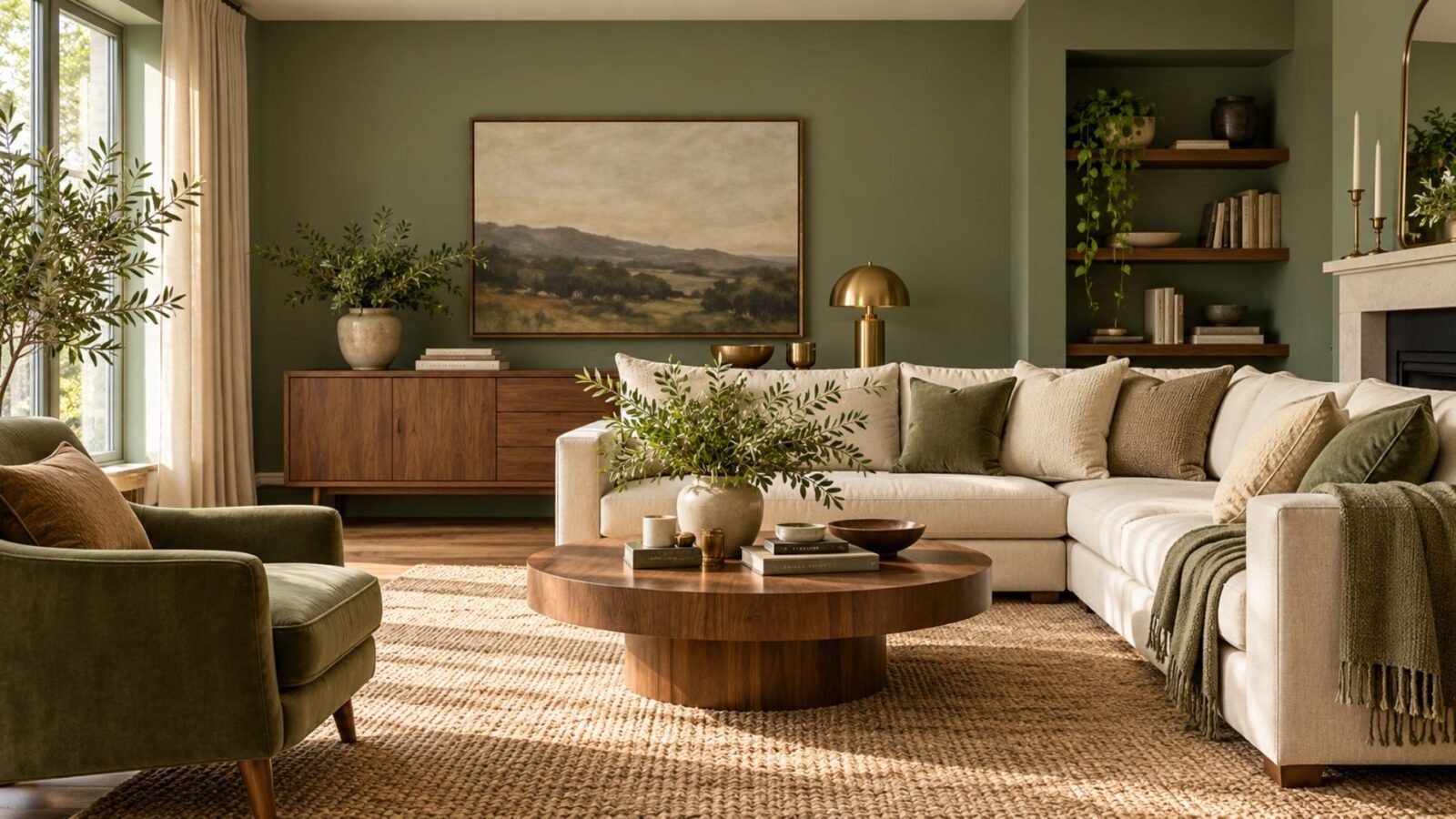

Learn why sage can read warm, cool, green or almost gray, and how to choose a version that works with your living room’s light and materials.
Sage green living room ideas work best when you stop treating sage as one fixed color. One sage can look cool and almost gray, while another reads warmer and distinctly green. The difference comes from the particular color’s undertone and depth, then becomes more noticeable as lighting and surrounding materials influence how you perceive it.
That is why copying a sage room from a photograph can produce an unexpectedly different result at home.
Our green living room ideas guide looks at green as a broader color family. Here, the question is more specific: which kind of sage are you actually working with, and what does that change?
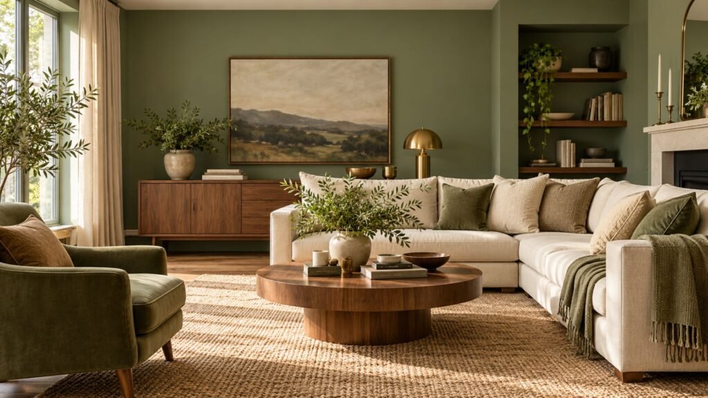
Why two sage greens can look completely different
Sage is generally understood as a muted green with a noticeable gray influence, but the name covers considerable variation. Some versions lean cooler and more silvery, while others contain more yellow-green warmth and read much more clearly as green. HGTV, for example, describes sage as a gently muted green with silvery-gray undertones, while designers interviewed by Houzz distinguish between blue-based and yellow-based interpretations.
Depth changes the result again. A sage can be pale or relatively deep regardless of whether it leans cooler or warmer.
That gives you two separate questions to answer:
- Which way does this sage lean? Cooler and grayer, or warmer and greener?
- How much depth does it have? Pale and quiet, or deeper and more visually substantial?
Those questions are more useful than relying on the word sage alone.
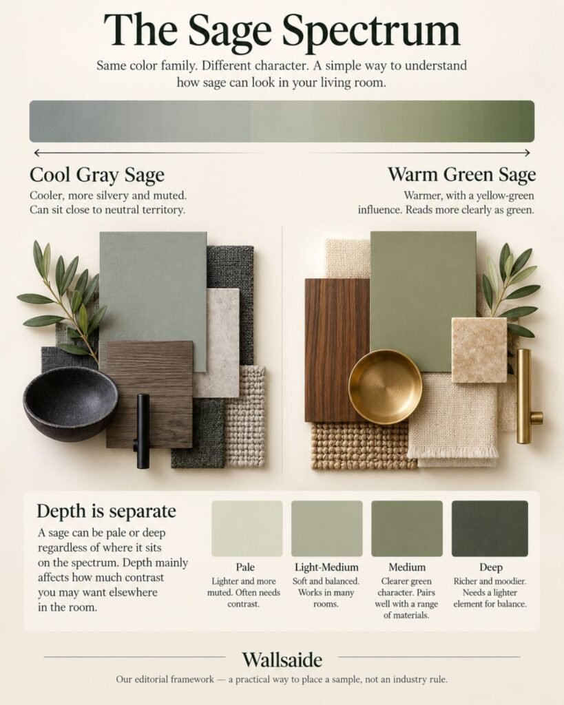
The Wallsaide Sage Spectrum
To make that distinction easier, we use the Wallsaide Sage Spectrum. This is our editorial framework for evaluating sage in a room, not an established industry classification.
At one end sits Cool Gray Sage. It has a quieter, more silvery character and can move close to neutral territory.
At the other sits Warm Green Sage. It retains more obvious yellow-green warmth and reads more immediately as green.
Cool Gray Sage ←────────→ Warm Green Sage
Where a color appears along that spectrum can help you think about the materials surrounding it. A cooler gray sage can work particularly well with charcoal, black and quieter finishes, although warm wood can also create useful contrast. A warmer green sage often sits comfortably beside walnut, oak, cream, brass and other warm materials.
These are starting points, not pairing rules. Houzz’s discussion with designers similarly shows that different interpretations of sage can work with varied woods, metals and colors rather than belonging to one fixed material formula.
Depth is separate from the spectrum. A cool sage can be pale or deep, just as a warm sage can. Depth mainly changes how much light-dark contrast you may want elsewhere in the room.
Don’t choose sage from a photograph alone
A sage you see on Pinterest, Instagram, a retailer’s website or even this page is a visual reference, not a paint specification.
Screens reproduce color differently. Photography and editing can change its appearance. Most importantly, the light and permanent finishes in your own room affect how the finished color is perceived.
That is particularly relevant to muted colors such as sage because changes in lighting and neighboring materials can noticeably affect whether the color appears greener, grayer, warmer or cooler.
If you’re choosing paint, test the actual candidate in the room before committing to a full wall. Look at it beside your flooring, trim and major furniture under the lighting conditions the room experiences throughout the day. Our interior color ideas guide goes deeper into how surrounding colors and room conditions affect a palette.
Sage green living room ideas: 5 directions across the spectrum
The following rooms aren’t formulas to copy exactly. Instead, they show how the character and depth of sage can influence the materials and colors that make sense around it.
Use them as starting points, then adjust the combination for the daylight, flooring, furniture and permanent finishes already in your living room.
Warm sage with walnut and brass
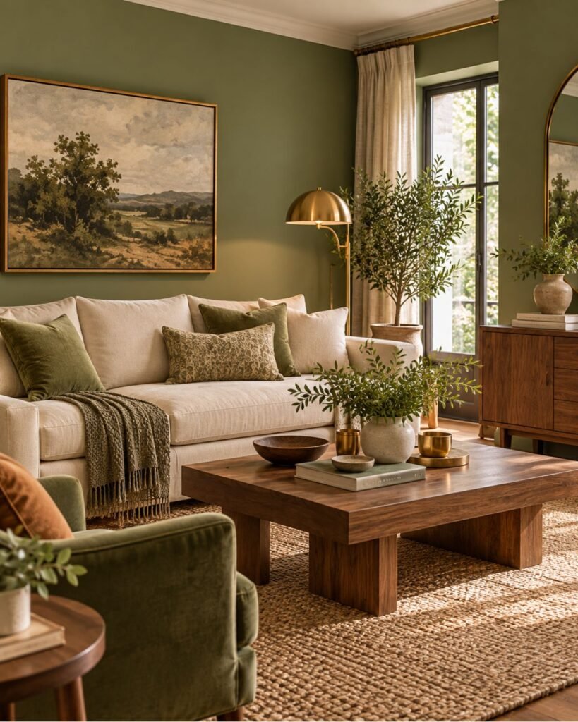
A warmer sage and walnut share an earthy quality without needing to match. The green supplies a muted background while visible wood grain introduces variation that prevents the palette from becoming too flat.
Brass can reinforce that warmth, but it doesn’t need to appear everywhere. One lamp, hardware detail or small decorative object is usually enough to establish the relationship.
Cream upholstery or curtains can then provide lighter relief without creating the sharper contrast of bright white.
Cool sage with charcoal and black
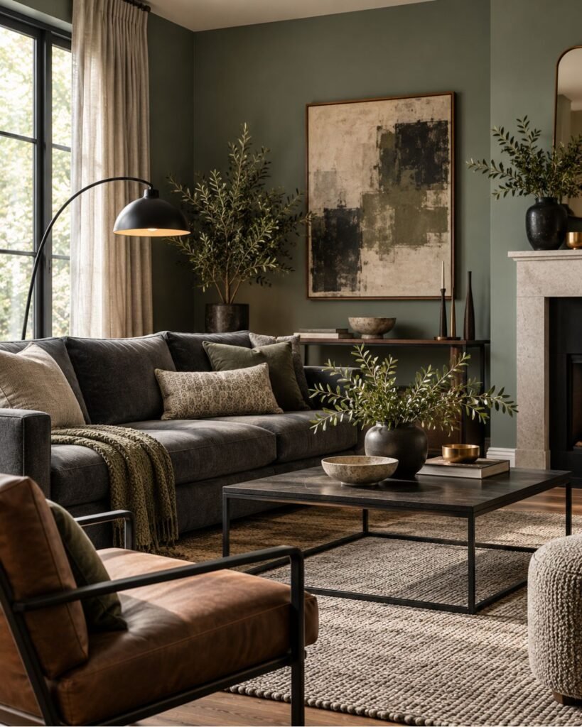
Move toward the Cool Gray Sage end of the spectrum and the room can support a different character.
Charcoal upholstery, a black metal lamp or a slim dark frame gives the muted wall a clearer edge. The important distinction is that these aren’t mandatory partners for cool sage; they simply provide enough visual definition to stop several quiet colors from dissolving into one another.
If the result starts feeling cold, wood, leather or another warm natural material can shift the balance without requiring a different wall color.
Soft pale sage with cream
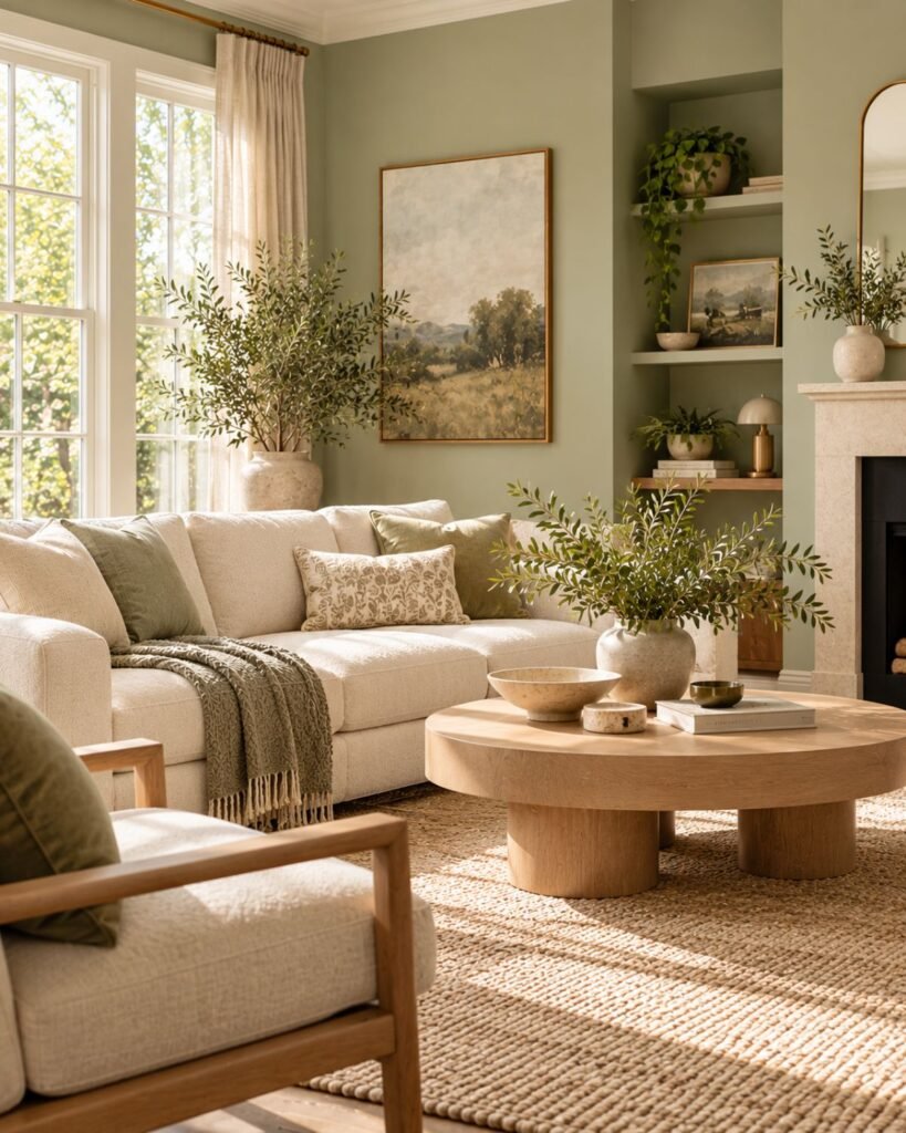
Pale sage and cream can create an exceptionally quiet room, but quiet shouldn’t mean indistinct.
When both colors have similar visual weight, introduce at least one stronger point of contrast. That might be a darker picture frame, deeper cushion, patterned rug, walnut table or a more substantial piece of artwork.
A pale gray-leaning sage can move surprisingly close to neutral territory. At that point, texture and contrast become more important than adding more colors.
Deep sage with brass and velvet
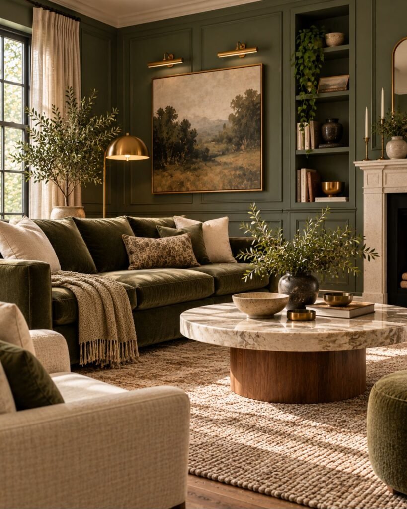
Sage doesn’t have to be pale.
A deeper version can create a more enveloping background while retaining the muted quality that separates sage from brighter greens. The practical challenge changes: rather than trying to stop the color from disappearing, you need enough lighter material around it to preserve definition.
A cream or warm-neutral sofa, pale stone table or lighter rug can provide that relief. Velvet and restrained brass introduce differences in surface and reflectivity without requiring a complicated palette.
Sage with terracotta
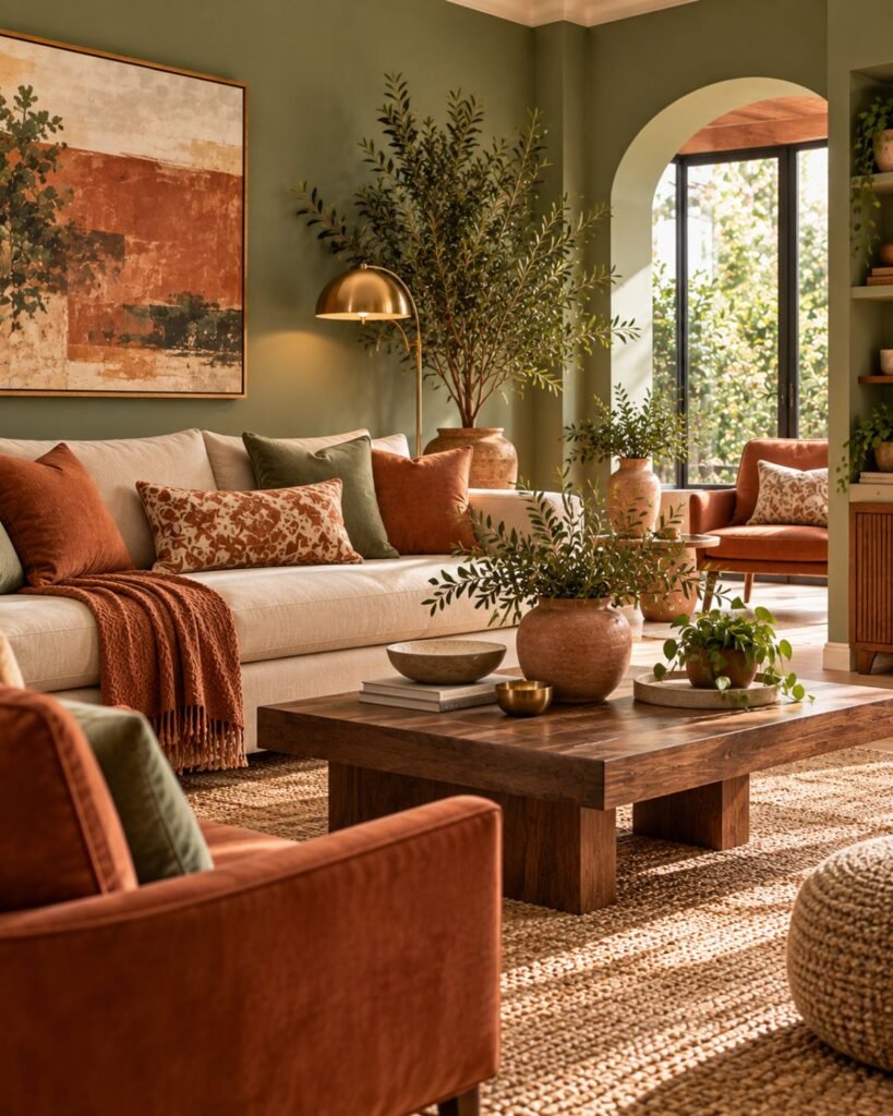
Terracotta introduces earthy red-orange warmth against muted green, creating a clearer color relationship than sage and cream alone. Design publications also regularly pair sage with earthy colors including terracotta and beige.
The combination becomes easier to control when one color remains dominant. A sage wall with one substantial terracotta chair, for example, usually reads more deliberately than scattering numerous small terracotta accessories around the room.
Natural wood, linen and woven fibers can bridge the two colors without introducing another strong hue.
How surrounding materials change sage
A paint chip never exists by itself once it reaches a living room.
Put a cooler sage beside charcoal and black and its gray character may become more apparent. Place a warmer sage beside walnut, cream and brass and its earthy green quality may become more prominent. That doesn’t mean every cool sage needs black or every warm sage needs walnut; it demonstrates that color is perceived in context.
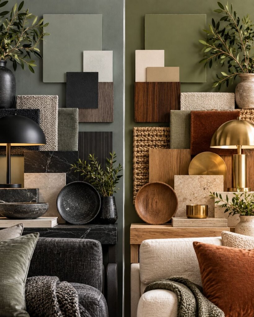
This is also why replacing furniture can sometimes change how an existing wall color feels without repainting it. The sage itself hasn’t changed, but the visual relationships around it have.
Before rejecting a sage because it seems too cold, dull or muddy, look at the largest neighboring surfaces first: flooring, sofa, curtains, rug and major wood finishes.
When sage starts behaving like a neutral
A sufficiently muted, gray-leaning sage can function much like a neutral background even though it remains visibly green.
That is one reason sage deserved its own guide rather than a short subsection of our broader green article. The closer it moves toward gray, the less useful it becomes to treat it like forest, emerald or other more obviously chromatic greens.
If your sage is pale and subdued, the layering principles in our neutral living room ideas guide become increasingly relevant. Warm beige can also work beside sage, but the exact undertones matter; our beige living room ideas guide explains why beige itself isn’t one interchangeable color.
The goal isn’t to decide whether sage is officially a “color” or a “neutral.” It is to recognize how the particular sage in front of you is behaving in the room.
Why sage green living rooms go wrong
Sage rarely fails simply because sage was the wrong color. More often, the room hasn’t given that particular version of sage enough contrast, warmth or material variation.
The room looks washed out
A very pale gray sage surrounded by similarly pale furniture can lose definition, particularly when the room doesn’t have much light-dark contrast.
Don’t immediately add more green. First try introducing one clearly darker element and more visible texture.
The palette looks muddy
This often happens when several muted mid-tone colors occupy almost the same visual depth.
A sage wall, taupe sofa, muted brown rug and subdued wood can all be individually attractive while collectively lacking separation. Lighten one major surface or deepen another.
The sage feels too cold
Before repainting, look at what surrounds it.
A cool gray sage combined with cool artificial light, charcoal furniture and cool hard finishes may reinforce the same temperature repeatedly. A warm wood table, warmer lamp light or natural textile can alter the balance.
Everything looks generically farmhouse
Sage isn’t inherently farmhouse.
The association usually comes from the supporting materials: distressed wood, shiplap, baskets, rustic signs and predictable cream accessories can push the room strongly in that direction.
If that isn’t the look you want, change the material vocabulary. Clean-lined walnut, contemporary upholstery, stone, black metal or restrained brass can give the same sage a different architectural context.
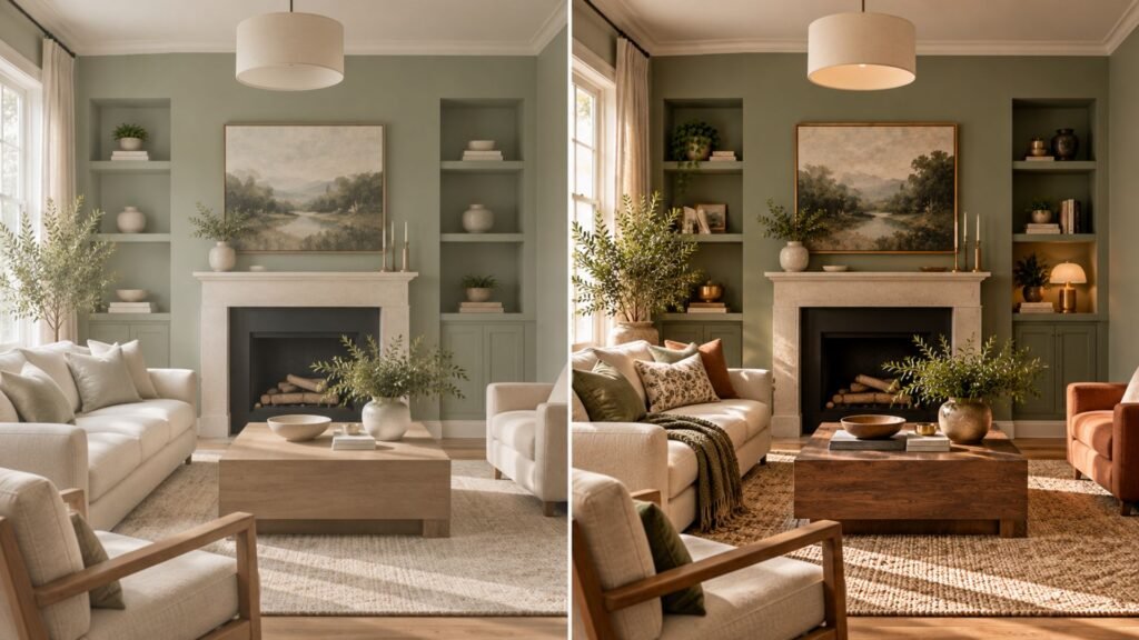
The useful diagnostic is to ask what is missing, rather than deciding the green itself is wrong.
Is there enough value contrast? Is every finish similarly muted? Are all the materials pulling warm or cool in the same direction? Answering those questions is usually more productive than searching for yet another sage swatch.
Sage in a small or low-light living room
A small room doesn’t automatically require the palest sage available.
In fact, an extremely pale gray-green can become so subdued under limited light that the intended green character becomes difficult to perceive. A slightly deeper sage may retain more visible identity, although the exact result depends on the specific paint, orientation, artificial lighting and surrounding finishes.
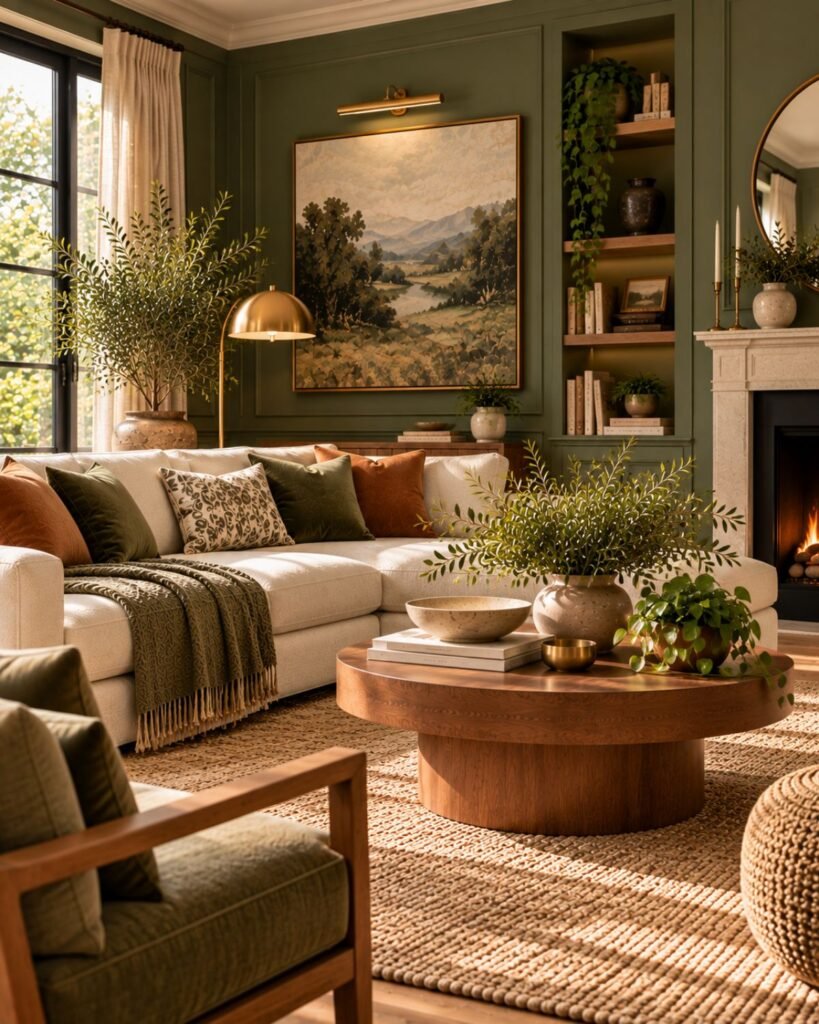
Rather than selecting by room size alone, sample several depths in the actual space. Compare them during the periods when you normally use the room.
Then consider the rest of the room. Lighter upholstery, a less visually heavy coffee table and controlled furniture scale can provide openness without forcing the walls to be almost white.
Our small living room ideas guide covers those layout and scale decisions separately.
Where this leaves you
Don’t start by asking whether sage green works in a living room. Start by identifying which sage you’re looking at.
Place it roughly between Cool Gray Sage and Warm Green Sage. Then consider its depth separately.
From there, evaluate it beside the room’s actual wood, flooring, upholstery, metals and light. If the palette feels wrong, diagnose whether the problem is undertone, insufficient contrast or too many materials with similar visual weight before replacing the color itself.
That is the advantage of treating sage as a family of muted greens rather than one fixed shade: you can make decisions based on what the color is actually doing in your room.
Sage green living room ideas FAQs
Is sage green warm or cool?
It can lean either way. Sage is a muted green, but individual versions can appear cooler and grayer or warmer and more yellow-green. Houzz’s interviews with designers similarly identify blue-based and yellow-based interpretations of sage.
Why does my sage green paint look different from the photograph?
The photograph, screen and room aren’t reproducing the color under identical conditions. Your room’s natural and artificial light, flooring, trim and furniture can all affect how the sage is perceived, which is why an actual sample is more useful than trying to reproduce a photographed color exactly.
How do I stop a sage living room from looking washed out?
Check contrast before adding more color. If the walls, sofa, rug and other large surfaces are all pale and muted, introduce at least one clearly deeper element plus some material variation, such as visible wood grain or a more textured textile.
What is the difference between sage, olive and forest green?
Sage generally describes a softer, more muted gray-influenced green. Olive typically has a stronger yellow or brown influence, while forest green is usually substantially deeper and more saturated. For the broader family and how different greens can control a room, see our green living room ideas guide.
Can sage green work in a small living room?
Yes. Don’t assume that the smallest room requires the palest sage. Test different depths in the actual space, then use furniture scale, lighter surfaces and deliberate contrast to manage how open or visually heavy the room feels.
References
- HGTV — The Best Sage Green Paint Shades for Every Space.
- Houzz — What to Know About Decorating With Sage Green.
- Homes & Gardens — What Colors Go With Sage Green?.
About the author
Emma Carter writes about interior color, home décor, and practical styling for Wallsaide. She focuses on helping readers combine colors, materials, textiles, and decorative elements into rooms that feel balanced and cohesive.