
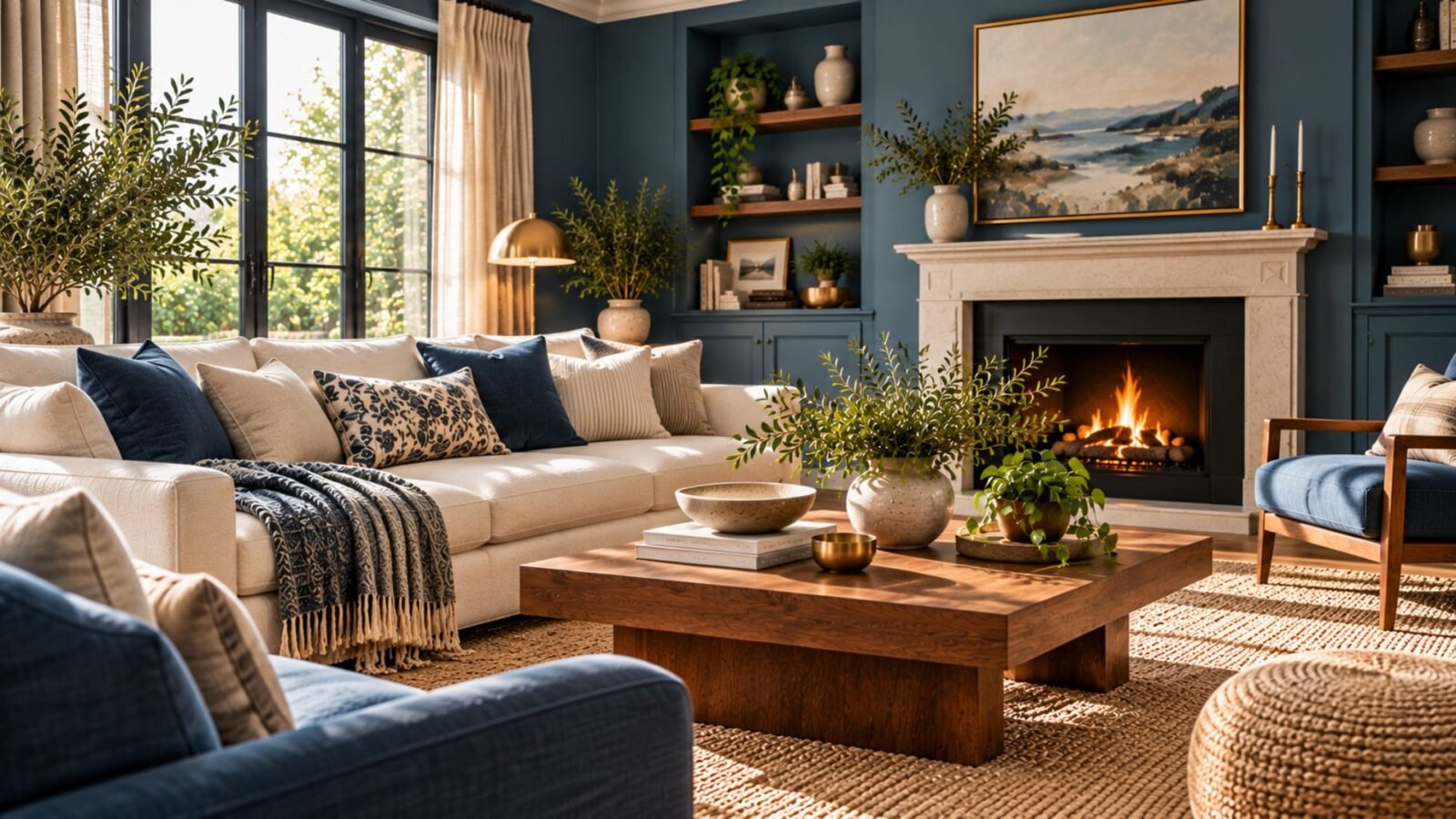

Learn how to choose a blue that suits your room, then balance it with the right contrast, materials and warmer elements.
Blue living room ideas work best when the blue and the rest of the room are designed together. A pale blue surrounded by cream and light wood behaves very differently from a smoky mid-blue beside walnut, or a deep blue relieved by pale upholstery.
The useful question isn’t simply which blue looks best? It is what does this particular blue need around it to feel balanced?
That becomes especially important as blue gets deeper or cooler. The stronger the blue becomes visually, the more deliberately you need to manage contrast, material warmth and visual relief.
Our broader Living Room Ideas guide covers the complete room. Here, we’ll concentrate specifically on making blue work.
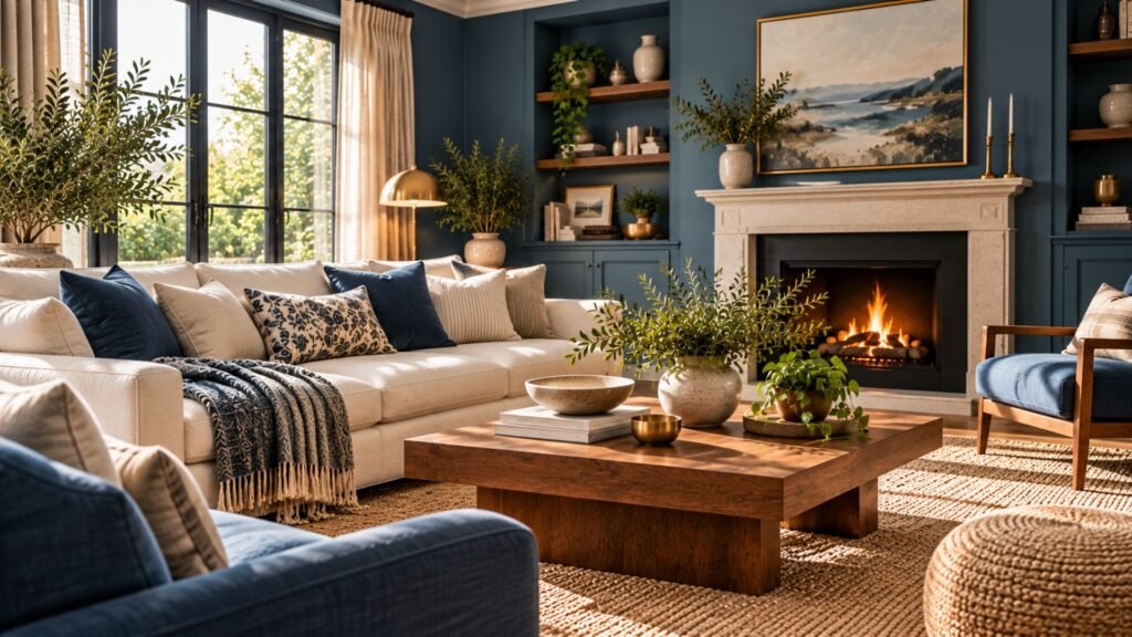
Blue isn’t one design decision
Blue covers an unusually broad visual range in interiors. A barely-there powder blue can sit close to a cool neutral, while stronger mid-blues become unmistakable color statements. Deep blues can change the atmosphere of an entire room.
Current design guidance reflects that range. Livingetc distinguishes airy light blues, smoky gray-blues and deeper blues, while Homes & Gardens similarly shows light and dark blue producing very different living-room schemes.
Before choosing cushions, metals or a second color, identify three things about the blue itself:
- Depth: how light or dark is it?
- Intensity: how quiet or vivid does it appear?
- Temperature: does it feel relatively cooler, or does it contain enough warmth or green influence to soften that effect?
You don’t need specialist color terminology to do this. You need to compare actual samples in the room rather than treating every blue as interchangeable.
The Wallsaide Blue Balance Principle
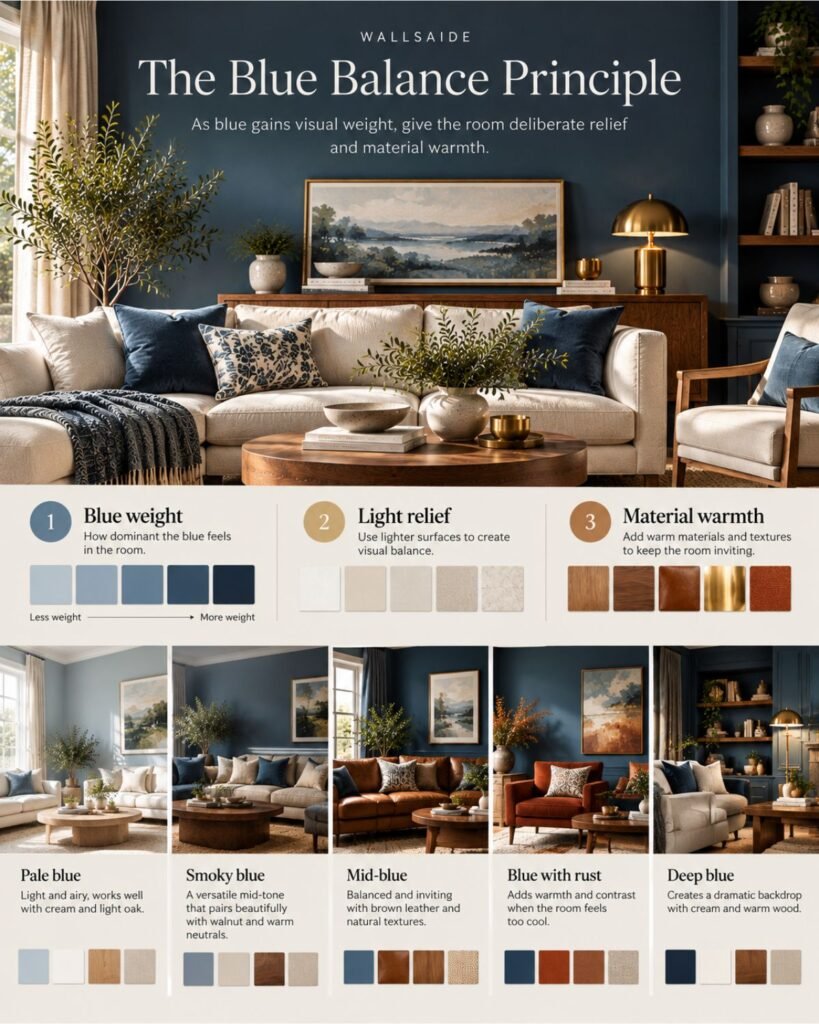
Wallsaide uses a simple editorial framework for blue rooms: as blue gains visual weight, give the room deliberate relief and material warmth.
We call this the Wallsaide Blue Balance Principle. It is our design framework, not an established industry rule.
Think of a blue room as balancing three controls:
Blue weight is how visually dominant the blue feels. A pale wall has relatively little weight; deep walls, blue built-ins and a large blue sofa together have considerably more.
Light relief comes from visibly lighter surfaces such as cream upholstery, pale curtains, a light rug, ceiling or stone.
Material warmth comes from elements such as walnut, oak, leather, brass, rust, terracotta and warm-textured natural fibers.
The principle is not that every dark blue room requires beige and wood. It is that when blue begins to dominate, something else should prevent the room from becoming visually one-note.
Livingetc similarly recommends warm wood, rust, terracotta and related warm tones when a blue scheme feels too cool, while Homes & Gardens highlights cream and texture as ways of softening blue schemes.
Start with the blue, then diagnose what it needs
The most useful blue living rooms don’t necessarily use more colors. They make the surrounding colors perform specific jobs.
A pale blue may need definition. A smoky blue may need warmth. A deeper blue may need light relief. A brighter blue may need quieter materials around it.
This is why copying a finished palette without understanding the blue at its center can produce a completely different room.
Blue living room ideas: 5 directions that solve different problems
These five directions aren’t a list of the “best” blue palettes. Each solves a different balance problem and shows how the same color family can produce substantially different rooms.
Pale blue with cream and light oak
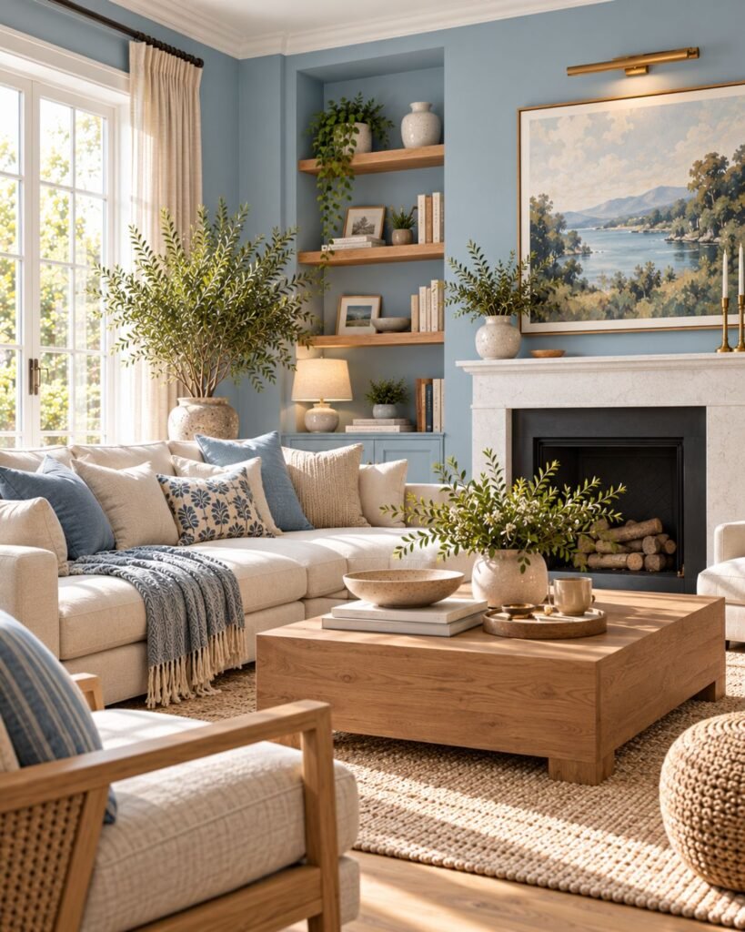
A pale blue living room can feel open and restrained, but too many similarly light surfaces can make the room lose definition.
Cream is useful because it maintains the light palette without necessarily creating the harder separation of brilliant white. Light oak then introduces visible grain and enough natural warmth to keep the combination from becoming sterile.
Livingetc identifies pale blues as capable of functioning almost like cool neutrals, while Homes & Gardens specifically recommends cream as a softer alternative to crisp white with blue.
If the room still feels faint, don’t automatically choose a stronger wall color. A darker frame, patterned textile or one medium-depth furniture piece may provide all the definition it needs.
Smoky blue with walnut and warm neutrals
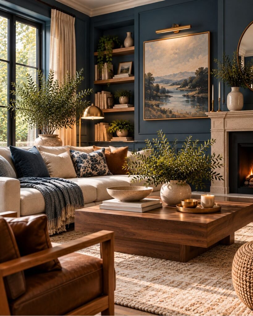
A muted smoky blue can sit comfortably between obvious color and neutral territory. Its restraint makes it particularly useful when you want blue walls without making the entire room feel strongly themed around blue.
Walnut gives this kind of blue a warmer counterweight. Cream, oatmeal or another warm neutral can then separate the wall from the furniture without making the palette busy.
The important variable is material temperature. If the blue, upholstery, metalwork and lighting all lean cool, even an individually attractive smoky blue can begin to feel flat.
Mid-blue with brown and leather
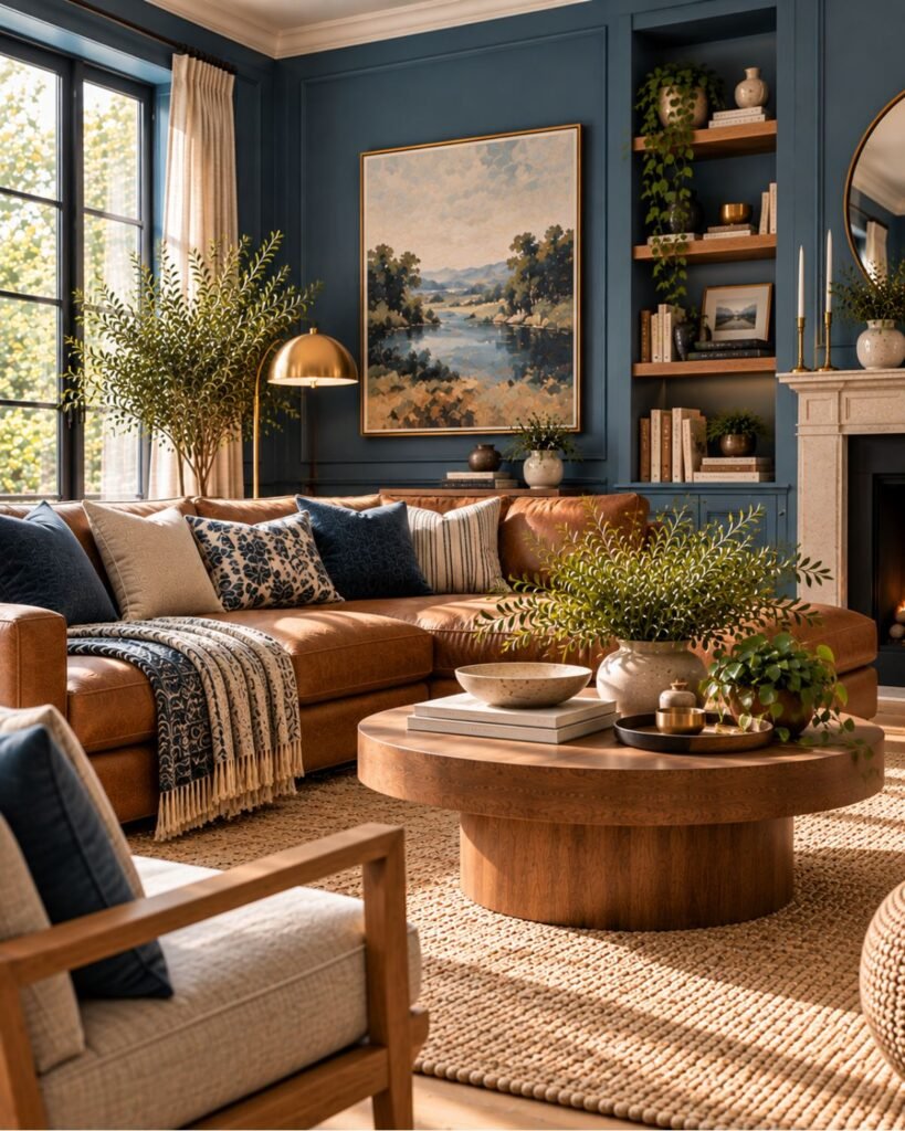
Blue and brown work because they create a clear relationship between color and earthier material tones rather than asking one color to do everything.
A mid-blue wall beside cognac or brown leather gains warmth and texture at the same time. Walnut, aged wood or a woven rug can continue that relationship without requiring numerous accent colors.
The combination also creates a useful bridge to our Brown Living Room Ideas guide, where undertone and depth become the primary questions from the brown side of the palette.
Keep the hierarchy clear. If the walls are strongly blue and the sofa is substantial brown leather, smaller accessories usually don’t need to compete with both.
Blue with rust or terracotta
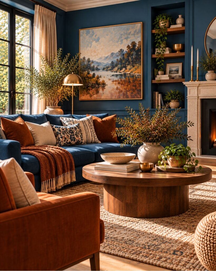
If a blue room feels visually cool, an earthy orange-red can provide stronger contrast than cream or wood alone.
Livingetc recommends rust, orange and terracotta among the warm elements that can counterbalance blue, and its separate coverage of blue-and-orange interiors demonstrates how deliberately contrasting warm and cool colors can coexist in living rooms.
You don’t need equal quantities of both colors. A blue wall with one rust chair or a substantial terracotta textile usually creates a clearer hierarchy than scattering orange accessories around every surface.
Deep blue with cream and warm wood
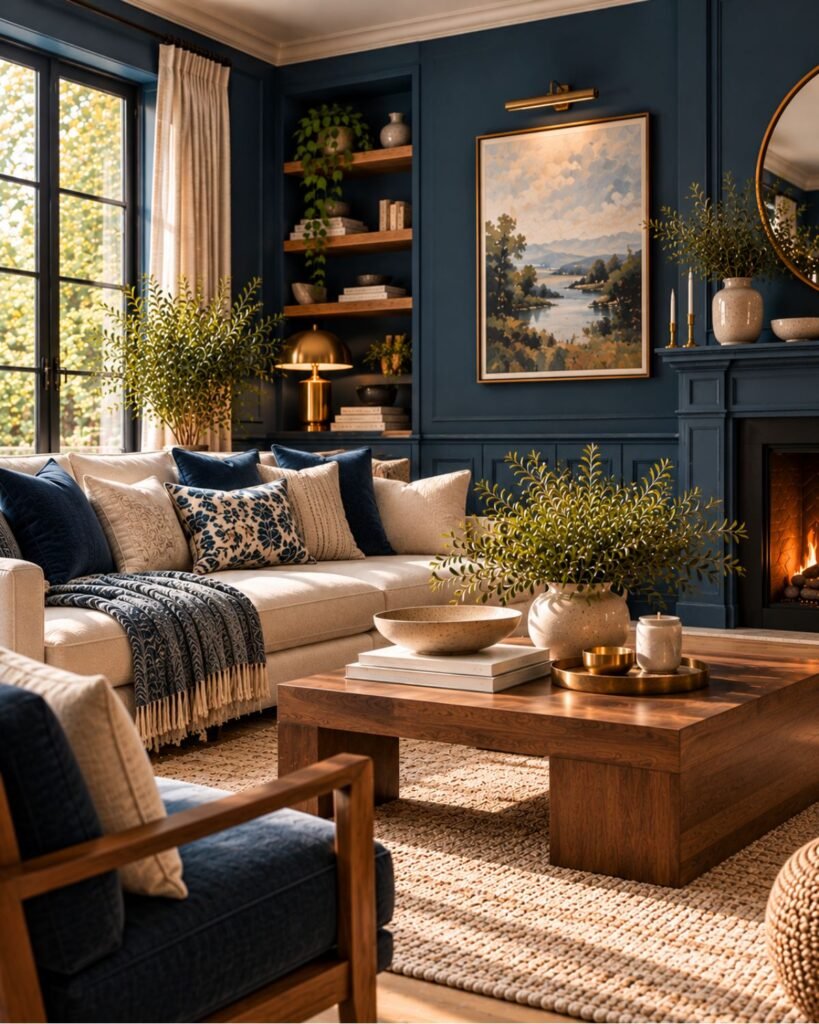
Deep blue changes the balance problem again.
The wall now carries enough visual weight that lighter elements become more important. Cream upholstery, pale curtains or a light rug can create clear relief, while warm wood stops the palette from becoming exclusively cool.
Homes & Gardens specifically demonstrates deep blue moderated by pale neutrals and light wood, while Livingetc likewise recommends neutral relief around darker blue walls.
This article deliberately stops there. Navy is substantial enough as a decorating problem to deserve separate treatment, particularly around walls, upholstery, architectural details and navy-specific pairings.
What colors work with blue in a living room?
There is no single supporting palette for blue because pale, smoky, vivid and deep blues don’t create the same problem.
Instead of asking whether a color “goes with blue,” ask what the second color needs to do.
Cream and warm white provide relief
Cream can separate blue surfaces while retaining some warmth. This becomes particularly useful as the blue becomes deeper.
If your blue is already pale, cream may create a much subtler distinction. In that case, texture or a darker material may be more useful than adding another pale neutral.
Brown and wood introduce warmth
Natural wood changes more than the color palette. Grain and texture also interrupt large areas of smooth painted blue.
Walnut creates a stronger visual relationship with mid or deep blue, while pale oak can suit softer schemes. These are design directions rather than fixed pairing rules; the existing floor and furniture should remain part of the decision.
Gray needs more care
Blue and gray can create a sophisticated restrained room, but both can contribute to an overwhelmingly cool palette.
That doesn’t make the combination wrong. It means texture, wood, warmer lighting or another contrasting material may become more important.
Livingetc’s blue-and-gray coverage similarly shows the combination across contemporary interiors while emphasizing texture and variation rather than relying on two flat colors alone.
Green can create a neighboring-color palette
Blue and green don’t inherently clash.
Livingetc documents contemporary interiors using the two together, including teal and forest-green combinations.
The practical issue is hierarchy. If both colors are deep and saturated across large surfaces, the room can become visually dense. Let one lead and use the other more selectively, or separate them with neutral material.
For the green side of that decision, see our Green Living Room Ideas guide.
Warm materials can change a blue room without changing the blue
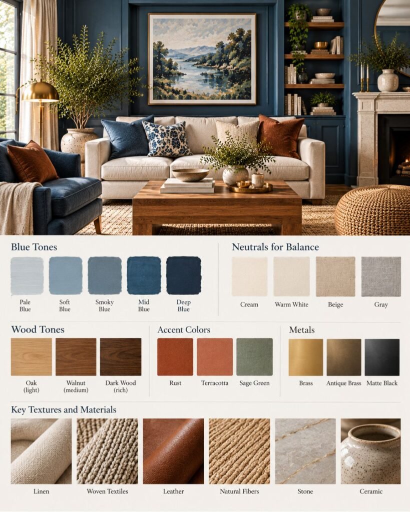
When a blue room feels cold, repainting isn’t necessarily the first solution.
Look at the largest non-blue surfaces. A cool-gray sofa, chrome table, gray rug and cool artificial light can all reinforce the same direction. Replacing even one major relationship with walnut, warm leather, cream linen or another warmer material can change how the room reads.
This is an important distinction in the Wallsaide Blue Balance Principle: balance doesn’t require disguising the blue.
The blue can remain the strongest color. The surrounding room simply needs enough variation to support it.
Why blue living rooms go wrong
Blue living room ideas often fail when every design choice reinforces the same characteristic of the blue. A cool room becomes cooler, a dark room becomes heavier, or a themed room repeats blue so consistently that nothing has enough independence.
The fix depends on the diagnosis.
The room feels cold
Check more than the wall.
Blue walls combined with gray upholstery, cool metal, a gray rug and cool artificial light can collectively push the room in one direction. Introduce warmth through one substantial material rather than adding several tiny beige accessories.
The room feels too dark
The problem isn’t automatically that the blue is too deep.
First inspect where the visual relief occurs. Deep walls beside a dark sofa, dark curtains and dark flooring give the eye very few lighter surfaces.
Change one large relationship before abandoning the wall color.
The room looks nautical when you didn’t intend it to
Blue doesn’t automatically create a coastal interior, but blue-and-white stripes, rope textures, weathered wood and maritime accessories can make the association explicit.
If you want blue without the coastal vocabulary, change the supporting materials rather than the blue itself. Walnut, contemporary upholstery, stone, abstract art and restrained metalwork can move the same wall color in a different direction.
Everything is blue
Repeating a color isn’t inherently wrong. The problem begins when the wall, sofa, rug, curtains and accessories have similar blue intensity and nothing establishes hierarchy.
Varying depth can help, but introducing a non-blue material is often more effective than searching for a fifth shade of blue.
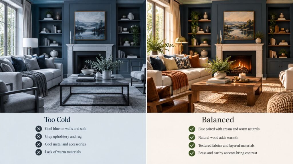
The image above demonstrates the principle with essentially the same room. The blue does not need to change; the supporting materials do.
Blue in a small living room
A small living room doesn’t automatically need pale blue.
A deeper blue can work in a compact room when the furniture scale, circulation and visual relief are controlled. Conversely, pale blue won’t rescue a cramped layout if oversized furniture and poor circulation remain the underlying problem.
That distinction matters because color and room size are often treated as if one can solve the other.
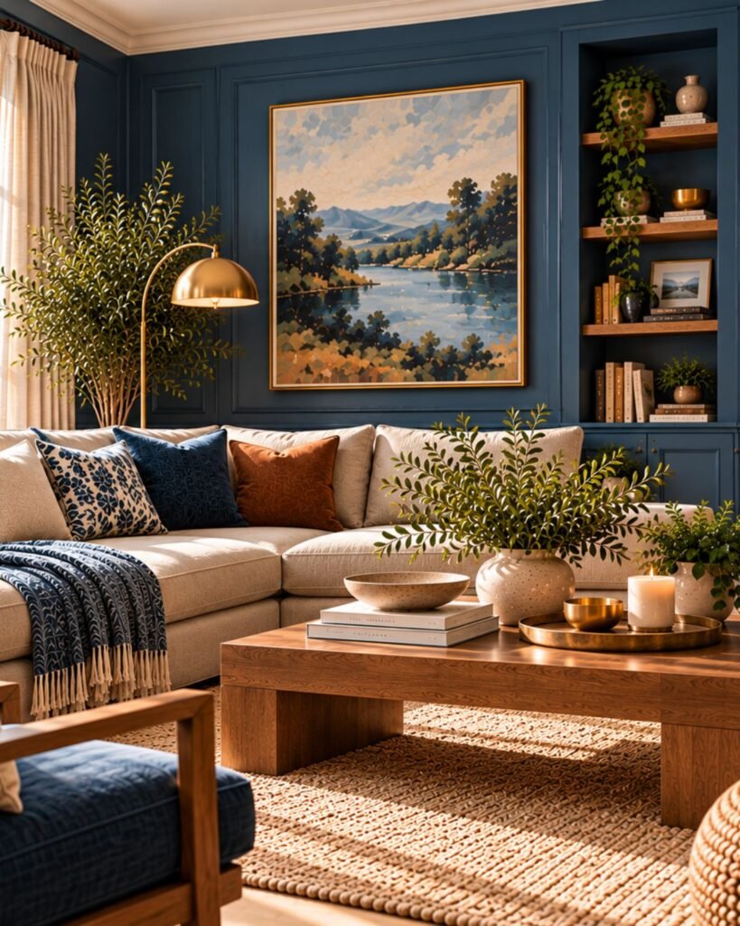
If you want a lighter impression, use pale upholstery, visually lighter furniture and controlled contrast rather than assuming the walls must be nearly white.
Our Small Living Room Ideas guide covers the layout and furniture-scale decisions separately.
Test the blue in your actual room
A photograph is useful inspiration, but it is not a reliable paint specification.
Daylight changes over the course of the day, artificial lighting introduces another variable, and floors, trim, furniture and textiles affect the way surrounding color is perceived. Even professionally photographed interiors can look different on different screens.
For paint, compare actual samples in the intended room and look at them beside permanent finishes before committing to a large surface.
Our Interior Color Ideas guide covers that broader color-planning process.
Where this leaves you
Don’t choose blue in isolation.
First decide whether your candidate is pale, mid-depth or deep, and whether it feels quiet or visually strong. Then look at what the rest of the room needs to contribute.
If the blue is already dominant, create light relief. If the palette feels cold, introduce meaningful material warmth. If the room feels flat, add contrast or texture rather than simply adding another blue.
That is the central idea behind the Wallsaide Blue Balance Principle: let blue have a clear role, then use the rest of the room to balance what that particular blue brings with it.
Blue living room ideas FAQs
What colors go best with blue in a living room?
Cream, warm white, natural wood, brown, rust, terracotta, gray and green can all work with blue, but they perform different jobs. Choose the supporting color according to whether your particular blue needs warmth, light relief, contrast or a quieter background rather than relying on a universal pairing list.
How do I make a blue living room feel warmer?
Start with materials rather than adding numerous warm-colored accessories. Walnut, oak, brown leather, cream textiles, brass, rust and terracotta can introduce warmth, depending on the blue and the style of the room. Livingetc likewise recommends warm wood and earthy warm tones when balancing cooler blue schemes.
Does blue work with brown in a living room?
Yes. Brown wood and leather can provide warmth and material contrast against blue. The exact result depends on the depth and undertones of both colors, so compare them together rather than treating either “blue” or “brown” as one fixed shade.
Can I use dark blue in a small living room?
Yes. Room size alone doesn’t require pale walls. A deeper blue can work when lighter surfaces, furniture scale and circulation prevent the room from becoming visually overloaded. The future Wallsaide navy guide will address the darkest blue family in greater depth.
Should I use blue on the walls or on the sofa?
Either can work. Walls make blue part of the room’s background architecture, while a blue sofa creates a large focal element without committing every wall to the color. Choose according to how dominant you want blue to be and what permanent elements are already in the room.
How do I stop blue and gray from looking cold?
Avoid relying exclusively on smooth cool surfaces. Visible wood grain, warmer textiles, leather, warmer lighting or another material with greater warmth can interrupt an otherwise cool blue-gray palette.
References
- Livingetc — Blue living room ideas: 10 ways with blue in living rooms
- Homes & Gardens — Blue living room ideas: ways to decorate with light and dark blues
- Livingetc — Blue and green living room ideas
- Livingetc — Blue and grey living room ideas
- Livingetc — Blue and orange color schemes for living rooms
About the author
Emma Carter writes about interior color, home décor, and practical styling for Wallsaide. She focuses on helping readers combine colors, materials, textiles, and decorative elements into rooms that feel balanced and cohesive.