
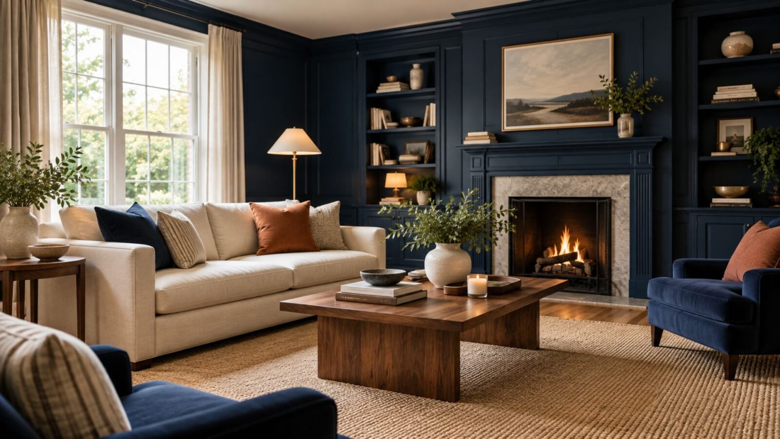

Navy works differently depending on how much visual territory it occupies. This guide shows how to use it on walls, furniture and architectural features while controlling contrast, materials and light.
Navy living room ideas become easier to plan when you stop asking whether navy is “too dark” and start asking where its visual weight will sit. Navy across four walls changes a room very differently from a navy sofa, painted bookcase or single architectural feature.
The goal is not necessarily to make navy look lighter. It is to decide whether you want it to form the room’s background, provide one substantial point of weight, or define a particular architectural area—then give the rest of the room enough separation to make that decision readable.
Why navy changes a living room so quickly
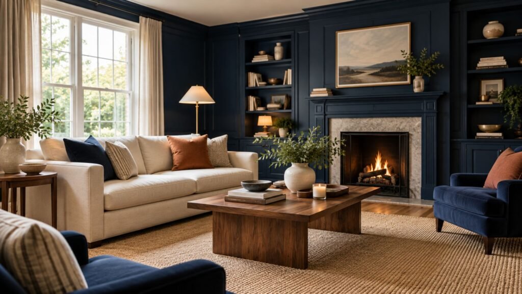
The most useful navy living room ideas start with one question: where should the darkest visual weight sit? Navy occupies enough visual depth that changing its location can change the entire hierarchy of the room.
This is what separates this guide from our broader blue living room ideas guide. Blue as a family ranges from pale, airy shades to deep tones. With navy, the central decision is already constrained by depth: where will you put that depth, and how much of the room should it control?
The particular navy matters too. “Navy” is a category rather than one standardized interior paint color. Different paints can appear cleaner, grayer, greener, more violet or closer to black, and their appearance can shift with surrounding materials and changing light. Benjamin Moore similarly recommends examining undertones and sampling navy candidates in the home’s actual lighting rather than choosing from a screen alone.
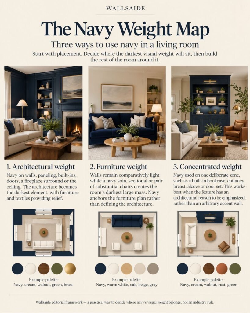
The Wallsaide Navy Weight Map
Wallsaide’s editorial framework for navy starts with placement before pairing.
Instead of beginning with “What goes with navy?”, identify where the darkest visual weight in the room will live.
Architectural weight
Navy occupies walls, paneling, built-ins, doors, a fireplace surround or possibly the ceiling.
The architecture itself becomes the dark element. Furniture and textiles then determine how much relief or continuity the room gets.
Furniture weight
Walls remain comparatively light while a navy sofa, sectional or pair of substantial chairs creates the room’s darkest large mass.
Here, navy anchors the furniture plan rather than defining the architecture.
Concentrated weight
Navy is restricted to one deliberate zone: perhaps a built-in bookcase, chimney breast, alcove, door set or another architectural feature.
This can be useful when the feature has a reason to be emphasized. It is less convincing when navy is placed on an arbitrary wall simply because the room “needs an accent wall.”
This Navy Weight Map is a Wallsaide editorial framework, not an interior-design industry classification. Its purpose is straightforward: decide where navy’s depth belongs before choosing everything that surrounds it.
Navy walls need relief, not necessarily more white
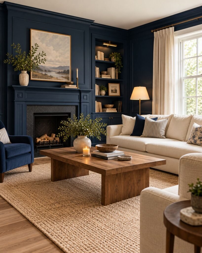
Painting a room navy creates a very different starting point from adding navy through furniture. The walls become the darkest continuous surface, so every sofa, curtain, rug and table is read against them.
The obvious response is white. It works because the light-dark separation is strong, but it isn’t the only answer—and using brilliant white everywhere can push navy toward a crisp blue-and-white vocabulary that may feel more nautical than intended.
Cream, warm white, oatmeal, pale stone and light natural fibers can create similarly strong value separation while changing the temperature and character of the room.
If you want the architecture itself to feel enveloping, navy can also continue across more surfaces rather than being repeatedly interrupted. Current design guidance includes examples of navy applied to walls and ceilings or through color-drenching, particularly when the intention is explicitly immersive rather than bright and airy.
The decision is therefore not simply dark versus light. It is whether you want navy to read as an architectural envelope or as one surface surrounded by obvious contrast.
A navy sofa creates a different problem
If you already own a navy sofa, you don’t need to design the room as though it has navy walls.
The sofa is already a large dark shape, so repeating equally deep navy on every surrounding surface can make the furniture lose definition. A lighter wall gives its silhouette room to register.
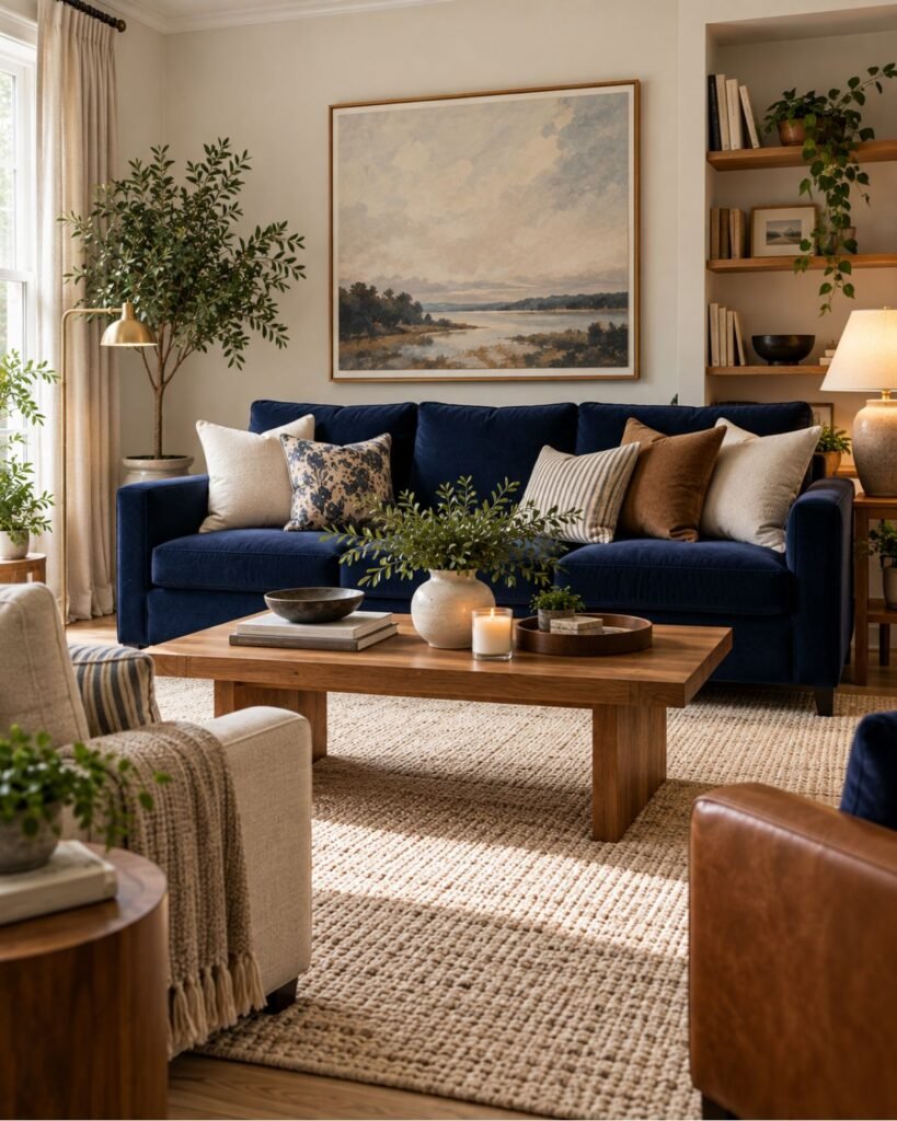
Start with the sofa and work outward.
For the walls, warm white, pale stone, soft beige and other restrained neutrals can provide separation without making the room stark.
For the rug, decide whether you want contrast or continuity. A lighter textured rug clearly separates the navy furniture from the floor; a darker rug creates a more compressed, tonal effect.
For wood, both lighter and darker finishes can work, but they produce different results. Pale oak increases visual separation. Walnut or other medium-dark woods create a richer, lower-contrast relationship.
For curtains, don’t assume they need to repeat the sofa color. Light linen or warm neutral curtains can distribute brightness vertically while leaving the sofa as the principal navy element.
This is a good example of why placement comes before pairing.
Navy and cream: control the proportion
Navy and cream work because their value difference is substantial: one creates depth while the other provides a clearly lighter surface.
But the proportions matter more than simply having both colors present.
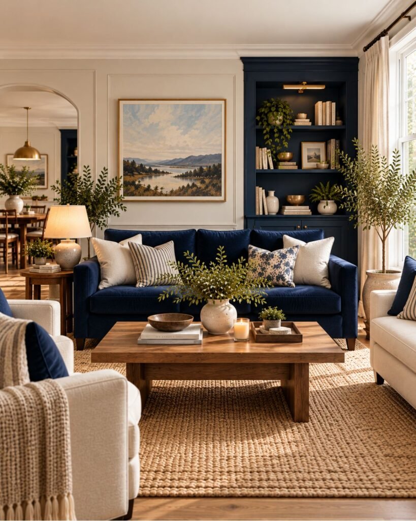
If navy covers the walls, cream can occupy a substantial sofa, curtains or rug. If navy is already confined to a sofa, cream might instead form the architectural background.
That distinction prevents the palette from becoming a collection of alternating navy and cream accessories.
A useful question is:
Which color owns the large surfaces, and which one provides relief?
Once you can answer that, smaller decorative choices become much easier.
Navy and wood: use material as well as color
Wood does something that another painted color cannot: it introduces visible grain, tonal variation and material texture.
That is particularly useful beside a large flat navy surface.
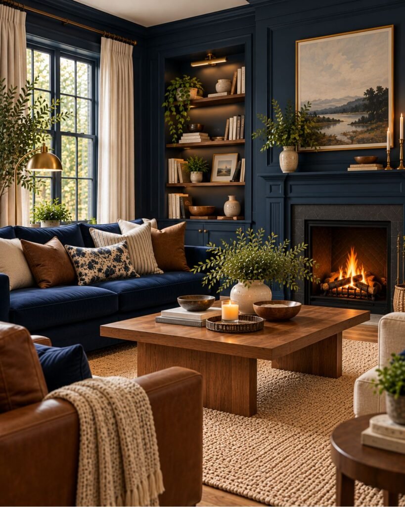
Light oak can create greater contrast against navy. Walnut gives the combination more depth. Brown or cognac leather introduces both color and a different surface quality.
There isn’t one universally correct wood tone for navy. The better question is how much separation you want between the blue and the furniture.
If brown itself is becoming a major part of the palette rather than simply a material note, our brown living room ideas guide goes deeper into brown’s own undertone and depth decisions.
Navy and brass can become formal very quickly
Brass works visibly against navy because the metal is brighter, warmer and reflective against a dark blue field. Current navy guidance frequently uses metallic accents for exactly this kind of contrast.
But more brass isn’t automatically better.
A navy room containing polished brass lighting, brass tables, brass hardware, formal symmetry, dark polished wood and heavy drapery can move toward a much more traditional or formal expression.
That may be precisely what you want.
If it isn’t, retain one or two metal moments and relax the other materials. Matte wood, linen, wool, woven fibers and less symmetrical furniture arrangements can change the room’s character without removing navy.
The same principle applies to black metal. Against navy it produces less temperature contrast and can create a quieter, more graphic result, but too many similarly dark surfaces may reduce separation.
Navy with rust, camel and earthy orange
Warm earthy accents create a more obvious color contrast against navy than cream or brown alone.
The trick is scale.
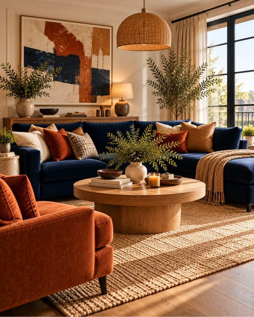
A rust chair, camel leather seat or controlled terracotta textile can be enough to change the temperature of a navy scheme. You don’t need to repeat the accent across every cushion, vase and artwork.
Current navy-pairing guidance also identifies rust and related earthy oranges as useful contrasting accents against navy.
This is an accent relationship here, not a complete terracotta-room strategy. Terracotta deserves its own treatment elsewhere in Wallsaide’s color system.
Navy and gray need separation somewhere
Navy and gray can produce a restrained room, but they are easy to flatten when everything occupies similar depth and temperature.
Imagine dark navy walls, a charcoal sofa, medium-gray rug and black furniture. Nothing is inherently wrong with those choices individually. The problem is that there may be too little value or material separation between them.
You can change that without abandoning the palette.
Introduce a genuinely light surface. Add visible wood grain. Use a warmer textile. Choose a paler rug. Allow one material to reflect more light.
The diagnosis is more useful than the rule:
If navy and gray feel flat together, check value and material contrast before assuming the colors themselves are incompatible.
Navy and green can work when one leads
Navy and green don’t need a neutral wall separating them, but two substantial dark colors require hierarchy.
For example, navy walls with one olive chair allow navy to remain architectural while green becomes secondary. A large green sofa against navy walls is a much stronger two-color statement and requires more deliberate control elsewhere.
Our green living room ideas guide explains the broader role green can play across a room. Here, the important navy-specific question is whether adding another deep color creates useful layering or simply adds another large visual weight.
How to stop navy and white looking nautical
Navy and white do not automatically create a nautical room.
The association usually strengthens when the colors appear alongside other familiar maritime cues: strong stripes, rope details, coastal motifs, weathered finishes and repeated crisp blue-and-white pattern.
If you like navy and white but don’t want that direction, change the supporting vocabulary.
Use walnut rather than weathered timber. Choose abstract artwork rather than coastal imagery. Replace striped textiles with solids or irregular patterns. Introduce stone, wool, linen, leather or contemporary black metal.
You can keep the color combination while changing what the room communicates.
A navy accent wall needs a reason to exist
A navy accent wall works best when the architecture tells you why that particular surface deserves emphasis.
A fireplace wall, built-in media unit, bookcase, paneled section or defined alcove already has a visual role. Navy can reinforce it.
An arbitrary rectangular wall painted navy in an otherwise unrelated room can feel detached because the color creates emphasis without an architectural reason for that emphasis.
Before painting one wall, ask:
What am I trying to make important?
If there is no clear answer, either use navy more substantially or move it into furniture instead.
How surrounding materials change the same navy
This is where navy becomes much easier to understand visually.
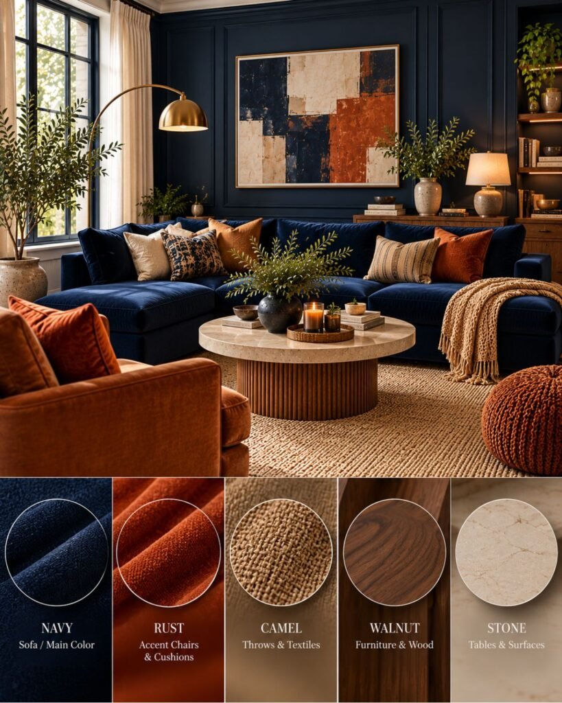
Keep the navy constant and change what sits beside it:
Cream linen increases light-dark separation and adds textile softness.
Pale oak introduces a lighter natural surface.
Walnut creates a deeper, richer material relationship.
Cognac leather introduces an earthy warm accent and surface variation.
Brass adds a small reflective warm highlight.
Black metal keeps the relationship darker and more graphic.
None is inherently the “correct” partner. Each changes what the same navy is being asked to do.
That is why copying a navy room one object at a time often fails. The result depends on the relationships between surfaces, not simply the presence of individually compatible colors.
Why navy living rooms go wrong
Most disappointing navy rooms can be diagnosed more precisely than “navy is too dark.”
Everything has the same visual weight
Dark walls, dark sofa, dark rug and dark furniture can merge into one low-contrast field.
You don’t necessarily need to remove navy. Introduce a meaningful difference in value or material.
The contrast is too stark
Navy surrounded exclusively by brilliant white can look sharper and more graphic than expected.
If that isn’t the intended effect, introduce warmer off-whites, wood, textured natural fibers or another intermediate value.
Navy exists on one unrelated wall
The color attracts attention, but the architecture gives the eye no reason for that wall to be important.
Move navy to an architectural feature or give it a more deliberate role.
Every accent is trying to warm the room
Brass, orange, cognac, rust and warm wood can all work with navy. Using all of them at equal strength can make the room busier rather than more balanced.
Choose a material direction instead of collecting “colors that go with navy.”
The room accidentally becomes themed
Navy plus white plus stripes plus maritime accessories creates a much stronger coastal signal than navy alone.
Change the supporting cues rather than abandoning the blue.
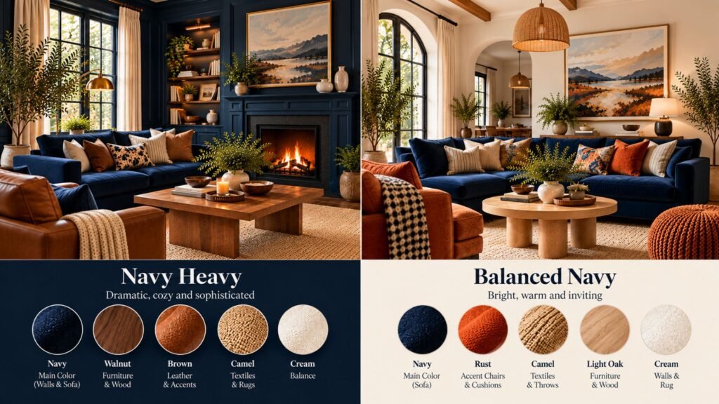
Caption: Same navy, same architecture. The difference is how the surrounding values and materials distribute visual weight.
Can navy work in a small living room?
Yes. Some of the most effective navy living room ideas for small spaces work precisely because they embrace depth rather than trying to make every surface appear lighter.
What changes is the consequence of the decision.
If you paint a compact room navy, you can deliberately accept an enveloping result rather than repeatedly trying to make the dark color behave like white. Some contemporary design guidance similarly recommends leaning into deep color in compact or lower-light rooms when an immersive effect is the goal, rather than assuming dark blue is universally prohibited.
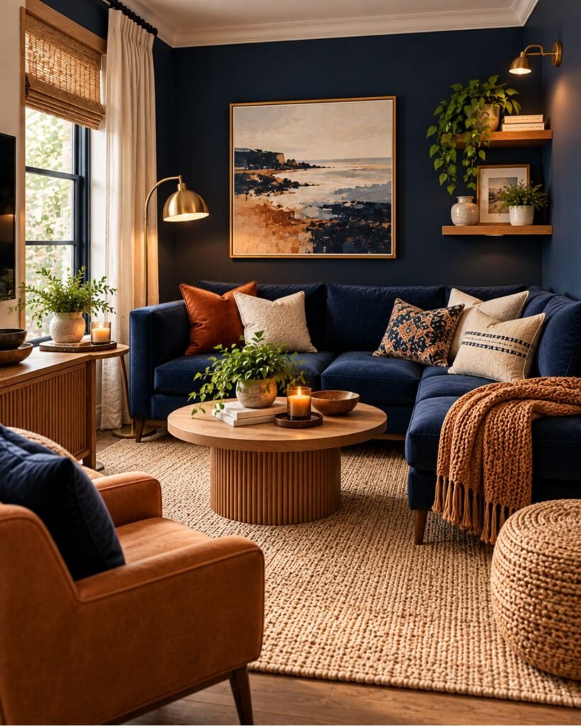
The room still needs functional decisions. Keep furniture appropriately scaled. Preserve usable circulation. Decide whether curtains should disappear into the walls or provide vertical relief. Use lighting at more than one height rather than expecting one ceiling fixture to compensate for dark surfaces.
For the broader layout problem, see our small living room ideas guide.
Test the actual navy before committing
Do not select a navy solely from a Wallsaide image, Pinterest photograph, retailer photograph or phone screen.
Photography, editing, screen calibration and the photographed room’s lighting all affect what you see. Your flooring, upholstery, trim and daylight then introduce another set of variables.
Benjamin Moore recommends evaluating undertones and sampling candidate navy paints in the home’s lighting throughout the day.
Put a real sample in the room and evaluate it beside the materials that are staying.
Ask:
Does it still read clearly blue?
What happens beside the floor?
What happens beside the sofa?
How does it change from daylight to evening lighting?
Does the amount of navy I’m planning still feel appropriate at room scale?
Our broader interior color ideas guide covers the larger color-selection process.
Recreate the look: start with where your navy already is
Rather than copying navy living room ideas image by image, start with the largest navy element you already own or plan to introduce.
If you have navy walls: choose the principal relief surface next. That might be the sofa, rug, curtains or flooring.
If you have a navy sofa: keep the architecture comparatively quiet until you’ve decided how dominant you want the sofa to remain.
If you have navy built-ins: treat them as an architectural focal point rather than automatically repeating navy around the room.
If you have dark flooring: be particularly deliberate about where lighter values will occur so navy doesn’t become one more dark layer without separation.
If the room has limited daylight: decide whether you’re trying to brighten the appearance or deliberately create an immersive room. Those are different design goals.
If the room is small: solve furniture scale and circulation alongside color. Navy cannot compensate for oversized furniture or a congested layout.
That is the practical purpose of the Navy Weight Map: place the visual weight first, then build the palette around it.
Wallsaide Room Recipe: navy + cream + walnut
This is one reproducible direction rather than a rule for every navy room.
| Element | Direction |
|---|---|
| Primary color | Deep navy |
| Relief color | Warm cream |
| Main wood | Medium walnut |
| Accent | Small cognac or rust note |
| Metal | Restrained aged/brushed brass or black |
| Textiles | Linen, wool and other visibly textured neutrals |
| Contrast | High navy/cream value contrast, moderated by walnut |
| Works especially well when | You want navy to feel substantial without relying on stark white |
| Watch for | Too many dark furniture pieces or too many competing warm accents |
The logic is more important than the shopping list.
Navy supplies depth. Cream provides clear relief. Walnut introduces material warmth and a middle value between the two. A small earthy accent can add another temperature shift without becoming a second dominant palette.
This is the direction Wallsaide’s future Room Recipes system can eventually make interactive.
Where this leaves you
The first decision in a navy living room isn’t which cushion goes with navy. It is where the room’s darkest visual weight should live.
Put navy across the architecture and lighter elements become relief. Put it on a sofa and the furniture becomes the anchor. Concentrate it on a genuine architectural feature and navy becomes emphasis.
After that, cream, wood, leather, metal, green or earthy accents aren’t isolated “matching colors.” They are tools for controlling contrast, temperature, texture and hierarchy around the navy you’ve already placed.
That is how a navy room becomes intentional rather than simply dark.
Navy living room ideas FAQs
Is navy too dark for a living room?
Not inherently. The result depends on how much navy is used, where it appears, the room’s light, and the values and materials surrounding it. A navy room can deliberately feel enveloping, while navy furniture can provide concentrated depth within a much lighter room.
What colors go with navy in a living room?
Cream, warm white, beige, brown, natural wood, some greens, earthy oranges and several metallic finishes can all work with navy. The more useful question is what each addition contributes—light relief, warmth, material variation, contrast or another layer of color.
What color sofa works with navy walls?
Cream, warm neutral, camel and other lighter upholstery can create clear separation from navy walls. Darker sofas can also work when a more tonal result is intentional, but the room may then need contrast elsewhere through rugs, flooring, curtains or other surfaces.
What color walls work with a navy sofa?
Warm white, cream, pale stone, beige and other restrained light neutrals can allow a navy sofa to remain the room’s principal dark element. The exact choice should be tested beside the sofa, flooring and room light rather than selected in isolation.
Does navy work in a small living room?
Yes. Dark navy can make a compact room feel more enclosed or immersive, which may be desirable. Room size alone isn’t a reason to prohibit navy; furniture scale, circulation, lighting, contrast and the intended atmosphere matter too.
How do I keep a navy living room from looking nautical?
Avoid stacking multiple maritime cues. Navy and white alone do not determine the style. Replace obvious stripes, rope, coastal motifs and weathered finishes with contemporary wood, stone, linen, abstract artwork or other materials appropriate to the style you actually want.
Should I use navy on one wall or all four?
Use one navy wall when that surface has a genuine architectural or focal role. Use multiple walls when you want navy to shape the room more broadly. Avoid choosing a single wall merely because an accent wall seems safer; the placement should have a design reason.
References
- Livingetc — “Navy Blue Living Room Ideas — 14 Examples to Help You Dress up This Room in a Sophisticated Way”.
- Livingetc — “Which Colors Should I Use With Navy Living Room Walls?”.
- Benjamin Moore — “Navy Blue Paint Colors”.
- Livingetc — “Living Room Color Mistakes That Make Your Space Look Smaller”.
- Livingetc — “Decorating with Navy Blue — A Color Expert on This Dark Shade”.
About the author
Emma Carter writes about interior color, home décor, and practical styling for Wallsaide. She focuses on helping readers combine colors, materials, textiles, and decorative elements into rooms that feel balanced and cohesive.